Prisma
Next-generation Node.js and TypeScript ORM
5 colors
15 components
Barlow, JetBrains Mono
Apr 7, 2026
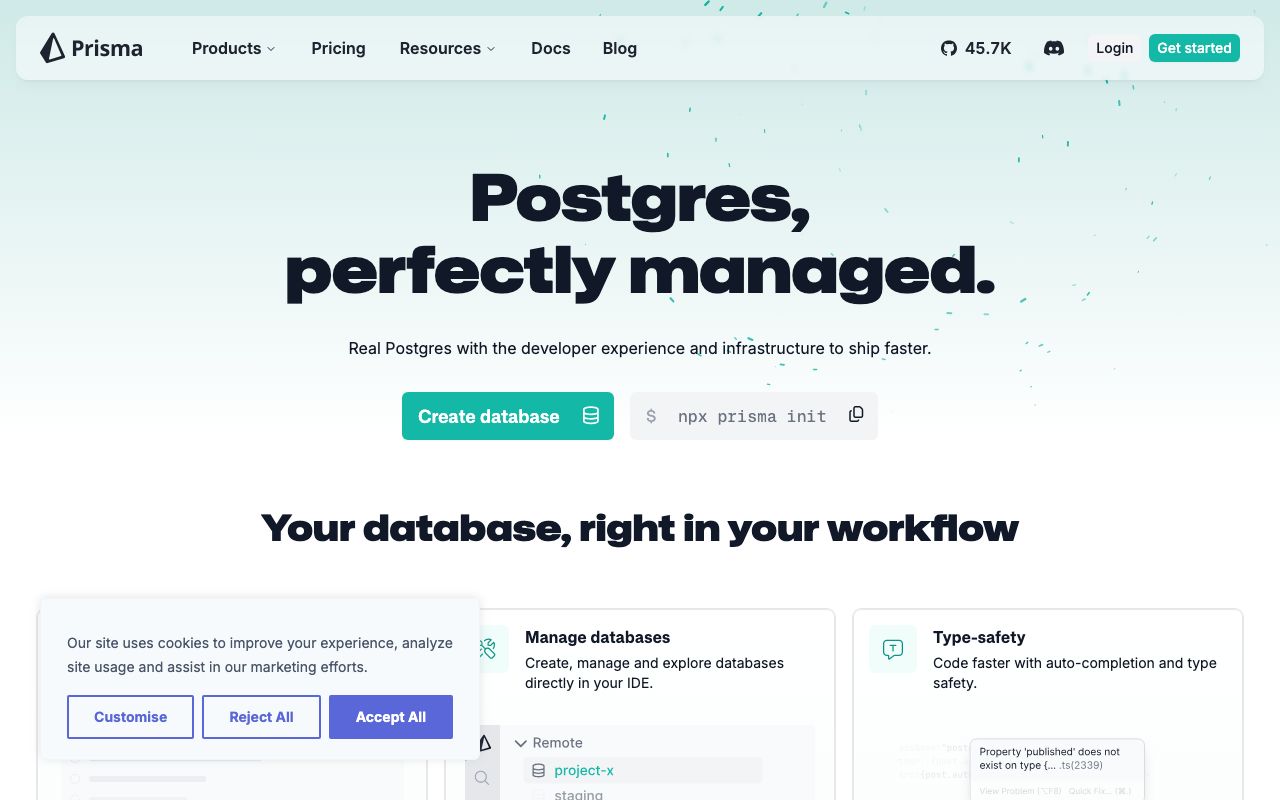
Website Preview
Colors
Primary
#2D3748
Primary text, navigation
#5A67D8
Indigo accent, CTAs
#FFFFFF
Page background
#F7FAFC
Code blocks, surfaces
#A0AEC0
Secondary text
Typography
Barlow
Role
SizeWeightHeight
Display
48px700—
Heading
28px600—
Body
16px400—
JetBrains Mono
Role
SizeWeightHeight
Code
14px400—
DESIGN.md — Prisma
Overview
Prisma's design system is technical and clean, targeting developers building data-driven applications. A dark navy base with indigo accent creates a trustworthy, slightly academic tone. The design emphasizes code readability, schema visualization, and clear developer documentation.
Colors
Primary Palette
| Token | Hex | Usage |
|---|---|---|
color-ink | #2D3748 | Primary text, navigation |
color-brand | #5A67D8 | Indigo accent, CTAs |
color-bg | #FFFFFF | Page background |
color-surface | #F7FAFC | Code blocks, surfaces |
color-muted | #A0AEC0 | Secondary text |
Typography
| Role | Family | Size | Weight |
|---|---|---|---|
| Display | Barlow | 48px | 700 |
| Heading | Barlow | 28px | 600 |
| Body | Barlow | 16px | 400 |
| Code | JetBrains Mono | 14px | 400 |
Components
Schema Viewer
- Model blocks with field definitions
- Type annotations colored by data type
- Relation arrows between models
Prisma Studio Table
- Spreadsheet-like data browser
- Editable cells, inline validation
- Filter bar with field-type-aware operators
Documentation Sidebar
- Collapsible section tree
- Active page highlighted with indigo left border
- Version selector dropdown at top
Do's and Don'ts
Do
- Use indigo for interactive navigation and CTAs
- Display Prisma schema code prominently with syntax highlighting
- Use Barlow for marketing, monospace for all code contexts
Don't
- Don't use indigo for error or warning states
- Don't shrink code blocks to fit layouts — scroll horizontally
- Don't hide the schema context when showing query examples