Slack
Where work happens
5 colors
21 components
Lato
Apr 2, 2026
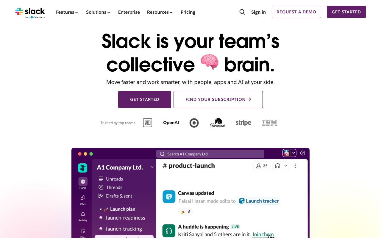
Website Preview
Colors
Primary
#4A154B
Sidebar, brand anchor
#36C5F0
Links, informational
#2EB67D
Online status, success
#ECB22E
Warnings, stars
#E01E5A
Notifications, errors
Typography
Lato
Role
SizeWeightHeight
Display
34px900—
Heading
22px700—
Body
15px400—
Timestamp
12px400—
DESIGN.md — Slack
Overview
Slack's design system balances professionalism with personality. The aubergine sidebar is instantly recognizable, while the messaging canvas stays clean and white. A four-color brand palette (blue, green, yellow, red) supports rich notification and status semantics.
Colors
Primary Palette
| Token | Hex | Usage |
|---|---|---|
color-aubergine | #4A154B | Sidebar, brand anchor |
color-blue | #36C5F0 | Links, informational |
color-green | #2EB67D | Online status, success |
color-yellow | #ECB22E | Warnings, stars |
color-red | #E01E5A | Notifications, errors |
Typography
| Role | Family | Size | Weight |
|---|---|---|---|
| Display | Lato | 34px | 900 |
| Heading | Lato | 22px | 700 |
| Body | Lato | 15px | 400 |
| Timestamp | Lato | 12px | 400 |
Components
Message Bubble
- Left: 36px avatar, right: username (bold) + timestamp
- Message body below, reactions row at bottom
- Hover reveals action toolbar (emoji, thread, bookmark)
Channel Sidebar
- Aubergine background, white text
- Sections: Channels, DMs, Apps
- Unread bold white, muted channels in faded text
Thread Panel
- Right side panel, 400px width
- Original message at top, replies below
- Reply input pinned to bottom
Do's and Don'ts
Do
- Use aubergine for the sidebar — it is Slack's most recognizable element
- Use the four brand colors for status semantics only
- Keep message density comfortable with 20px vertical rhythm
Don't
- Don't use aubergine outside the sidebar context
- Don't render message timestamps larger than 12px
- Don't auto-collapse threads — let users control their view