Discover

Mintlify vs spectr.pm

Two design systems side by side, measured from the live sites — colour, type, shape, depth, components, states and responsive behaviour.
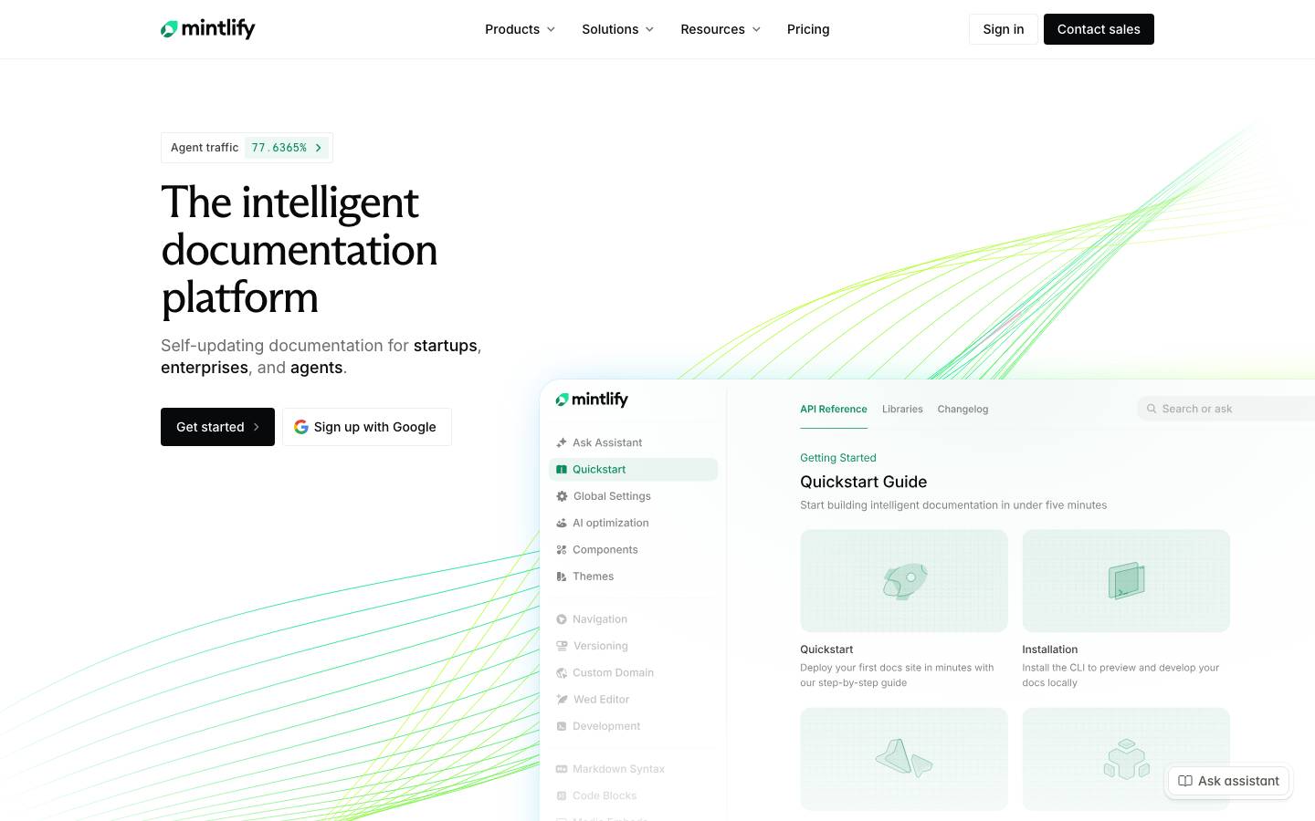
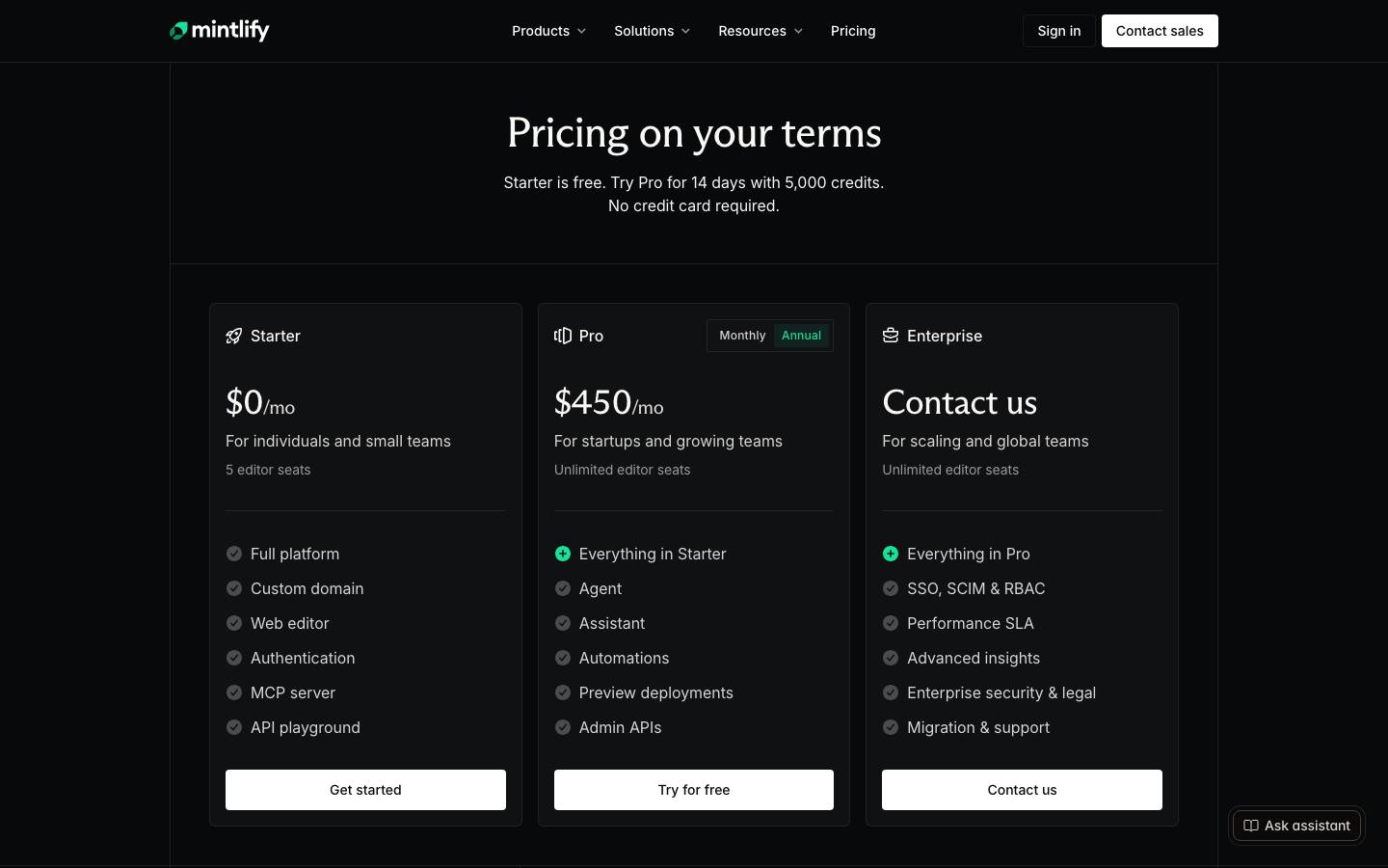
Mintlify: Mintlify - The documentation platform for agents · Above the fold
Mintlify
mintlify.com· read 2026-11-03
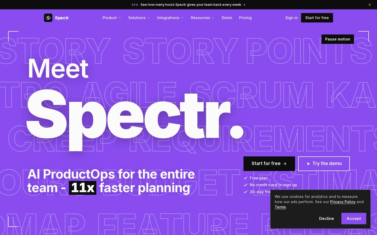
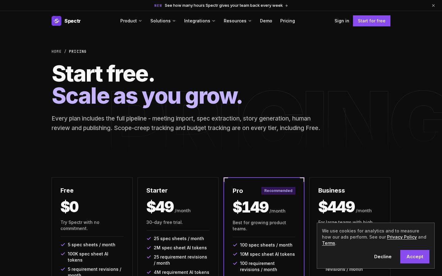
spectr.pm: Spectr - AI Product Ops: Meetings to PRDs, Specs & Stories · Above the fold
spectr.pm
spectr.pm· read 2026-10-14

Ground and ink

Each side painted in its own measured canvas, ink, muted and primary roles.

Mintlify

Heading on canvas

Body copy in the measured muted role.

Primary action
19.5:1 ink on canvas

spectr.pm

Heading on canvas

Body copy in the measured muted role.

Primary action
18.6:1 ink on canvas

Palette

Named roles first, then every colour measured without one.

Mintlify

  • canvas#0A0D0D
  • surface#FAF8F5
  • ink#FFFFFF
  • muted#DFE1E0
  • hairline#000000
  • primary#18E299
  • on-primary#222222

4 more, no measured role

spectr.pm

  • canvas#0D0D0D
  • surface#171717
  • ink#FAFAFA
  • hairline#2E2E2E
  • primary#894DEF
  • on-primary#FAFAFA

10 more, no measured role

Type scale

Set at the measured size, weight, tracking and leading. Brand typefaces are not loaded, so the metrics are real and the letterforms are not.

Mintlify

h1

50px · 400 · shown smaller

display

44px · 400 · shown smaller

display

44px · 500 · shown smaller

h1

44px · 400 · shown smaller

h2

36px · 500

heading

36px · 400

heading

36px · 500

spectr.pm

hero-display

288px · 900 · shown smaller

display

280px · 900 · shown smaller

display

252px · 900 · shown smaller

display

200px · 900 · shown smaller

display

132px · 800 · shown smaller

display

99px · 600 · shown smaller

h2

92px · 800 · shown smaller

Corners

Drawn at the measured radii.

Mintlify

0px

4px

6px

12px

2px

pill

spectr.pm

0px

Spacing

One shared scale across both sides, so the bars are directly comparable.

Mintlify

4
8
12
16
20
24
28
32

spectr.pm

4
8
12
16
24
28
32
40

Depth

Shadows cast on each side's own ground.

Mintlify

sm

md

lg

spectr.pm

sm

Buttons

Rendered from the measured computed styles.

Mintlify

filledfilled-smtexticon

spectr.pm

primaryfilledprimary-smtext

The measured values behind the panels above.

Mintlifyspectr.pm

At a glance

GroundDarkDark
Corners — these differPillSharp
Display size — these differ50px288px
Spacing base4px4px
Accent colours — these differ48
Type families — these differ42
Ink on canvas — these differ19.5:118.6:1
Components — these differ1811

Colour roles

primary — these differ#18E299#894DEF
accent#0C8C5E—
link#121715—
canvas — these differ#0A0D0D#0D0D0D
surface — these differ#FAF8F5#171717
ink — these differ#FFFFFF#FAFAFA
body — these differ#FAF8F5#B8B8B8
muted#DFE1E0—
hairline — these differ#000000#2E2E2E
on-primary — these differ#222222#FAFAFA

Full palette

Every colour each extraction kept, including the ones with no measured role.

All colours — these differ#18E299#0C8C5E#121715#485450#1FA77A#26BD6C#0A0D0D#FAF8F5#FFFFFF#DFE1E0#D9D7D4#222222#000000#9FA1A0#894DEF#A273F2#14532D#78350F#166534#4ADE80#92400E#FBBF24#0D0D0D#171717#FAFAFA#B8B8B8#2E2E2E#6B6B6B#000000#262626
Semantic——

Typography

Families — these differinterarizonaFlarepaperMonoInterInter-e4c28016845df4efJetBrains Mono-33799697913f1f09
hero-display—288px · 900 · 288px · -11.52px · uppercase · Inter-e4c28016845df4ef
h1 — these differ50px · 400 · 52px · -2px · arizonaFlare72px · 800 · 72px · -2.52px · Inter-e4c28016845df4ef
display — these differ44px · 400 · 48px · -0.88px · inter132px · 800 · 198px · -2.64px · Inter-e4c28016845df4ef
h2 — these differ36px · 500 · 40px · -0.72px · inter44px · 800 · 46.2px · -1.32px · Inter-e4c28016845df4ef
h3 — these differ35px · 500 · 40px · -0.35px · inter19px · 600 · 28.5px · 0px · Inter-e4c28016845df4ef
heading — these differ24px · 500 · 28px · -0.24px · inter16px · 600 · 24px · 0px · Inter-e4c28016845df4ef
body — these differ16px · 400 · 24px · 0px · inter15px · 500 · 23.25px · 0px · Inter-e4c28016845df4ef
button — these differ16px · 500 · 24px · 0px · inter15px · 600 · 22.5px · 0px · Inter-e4c28016845df4ef
list-item — these differ16px · 400 · 24px · 0px · inter16px · 500 · 24px · 0px · Inter-e4c28016845df4ef
link — these differ14px · 500 · 16px · 0px · inter14px · 500 · 20px · 0px · Inter-e4c28016845df4ef
quote14px · 400 · 24px · 0px · inter—
code — these differ14px · 400 · 21px · 0px · uppercase · paperMono13px · 600 · 19.5px · 1.82px · uppercase · JetBrains Mono-33799697913f1f09
caption — these differ12px · 500 · 16px · 0.24px · inter12px · 500 · 16.5px · 0px · Inter-e4c28016845df4ef

Shape and rhythm

Radius — these differ0px2px4px6px12px9999px0px
Spacing — these differ4px8px12px16px20px24px28px32px40px48px64px176px4px8px12px16px24px28px32px40px44px48px64px144px
Border widths1px1px

Depth

Strategy — these differlayered-microsingle-tier
Shadows — these differrgba(0, 0, 0, 0) 0px 0px 0px 0px, rgba(0, 0, 0, 0) 0px 0px 0px 0px, rgba(0, 0, 0, 0) 0px 0px 0px 0px, oklab(0.438828 -0.00460601 0.00196934 / 0.3) 0px 0px 0px 0px, rgba(0, 0, 0, 0) 0px 0px 0px 0pxrgba(0, 0, 0, 0) 0px 0px 0px 0px, rgba(0, 0, 0, 0) 0px 0px 0px 0px, rgba(0, 0, 0, 0) 0px 0px 0px 0px, rgba(0, 0, 0, 0) 0px 0px 0px 0px, rgb(0, 0, 0) 0px 0px 0px 0.5px, rgba(0, 0, 0, 0.45) 0px 0.5px 1px 0px, rgba(0, 0, 0, 0.35) 0px 1px 2px 0px, rgba(255, 255, 255, 0.14) 0px 0.5px 0px 0px insetrgba(0, 0, 0, 0) 0px 0px 0px 0px, rgba(0, 0, 0, 0) 0px 0px 0px 0px, rgba(0, 0, 0, 0) 0px 0px 0px 0px, rgba(0, 0, 0, 0) 0px 0px 0px 0px, rgba(0, 0, 0, 0) 0px 0px 0px 0pxrgba(0, 0, 0, 0) 0px 0px 0px 0px, rgba(0, 0, 0, 0) 0px 0px 0px 0px, rgba(0, 0, 0, 0.1) 0px 10px 15px -3px, rgba(0, 0, 0, 0.1) 0px 4px 6px -4px
Gradients — these differhero: linear-gradient(106deg, rgba(68, 174, 255, 0.5) 0%, rgba(24, 226, 153, 0.5) 35%, rgba(186, 255, 36, 0.5) 65%, rgba(24, 226, 153, 0.5) 100%)hero: linear-gradient(rgba(0, 0, 0, 0) 55%, lab(100 0 0) 96%)section: linear-gradient(to top, oklab(0 0 0 / 0.9) 0%, oklab(0 0 0 / 0.4) 50%, rgba(0, 0, 0, 0) 100%)—
Opacity — these differ0.500.300.400.100.650.991.000.700.900.940.650.36
Z-index — these differbase 3dropdown 10dropdown 20dropdown 22dropdown 30dropdown 50dropdown 90sticky 100dropdown 10dropdown 50

Components

Sharedbutton-filledbutton-textcardnavigationfooterlinklink-smbutton-filledbutton-textcardnavigationfooterlinklink-sm
Only here — these differbutton-filled-smbutton-iconbutton-icon-smbutton-outlinecard-featuredcard-featured-smcard-smnavigation-2footer-2badge-textbadge-text-2button-primarybutton-primary-smbutton-text-2card-lg
Signature——

Interaction states

Read from each site's own stylesheets. An empty side means they were cross-origin and unreadable.

Measured — these differother:hoverlink:focus-visiblelink:hoverother:focus-visiblebutton:focus-visiblebutton:disabledbutton:activebutton:hoverother:focusother:activecard:focuslink:focusnav:hoverother:disabledother:focus-visibleinput:hoverother:hovercard:hoverother:focusother:disablednav:hovernav:focus-visible

Responsive

Breakpoints — these differ375→1920px768→1920px1024→1920px · 4col1280→1920px · 5col1440→1920px · 5col375→343px · 6col768→704px · 3col1024→960px · 5col1280→1216px · 5col1440→1376px · 5col

Themes

Measured on the live site, not derived.

SupportSingle themeSingle theme

How this was measured

Differences here are ours, not the brands'.

Pages read66
Extracted — these differ2026-11-032026-10-14
StylesheetsReadableReadable
Roles unassigned — these differ410

Measured by DesignMD from the live sites. Compare two others. Generate a DESIGN.md for your own site.