Discover

spectr.pm vs The Verge

Two design systems side by side, measured from the live sites — colour, type, shape, depth, components, states and responsive behaviour.
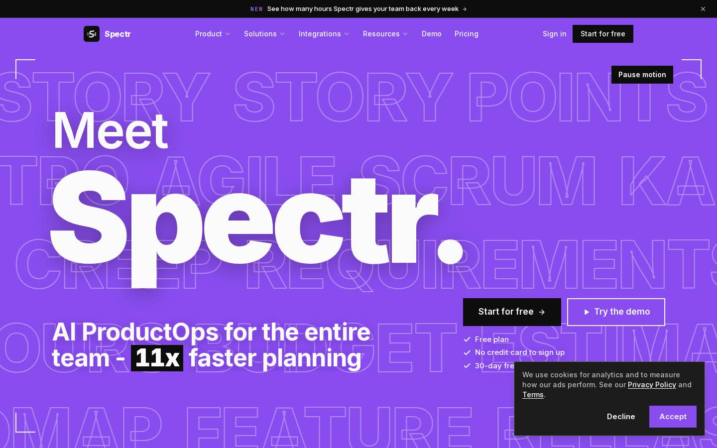
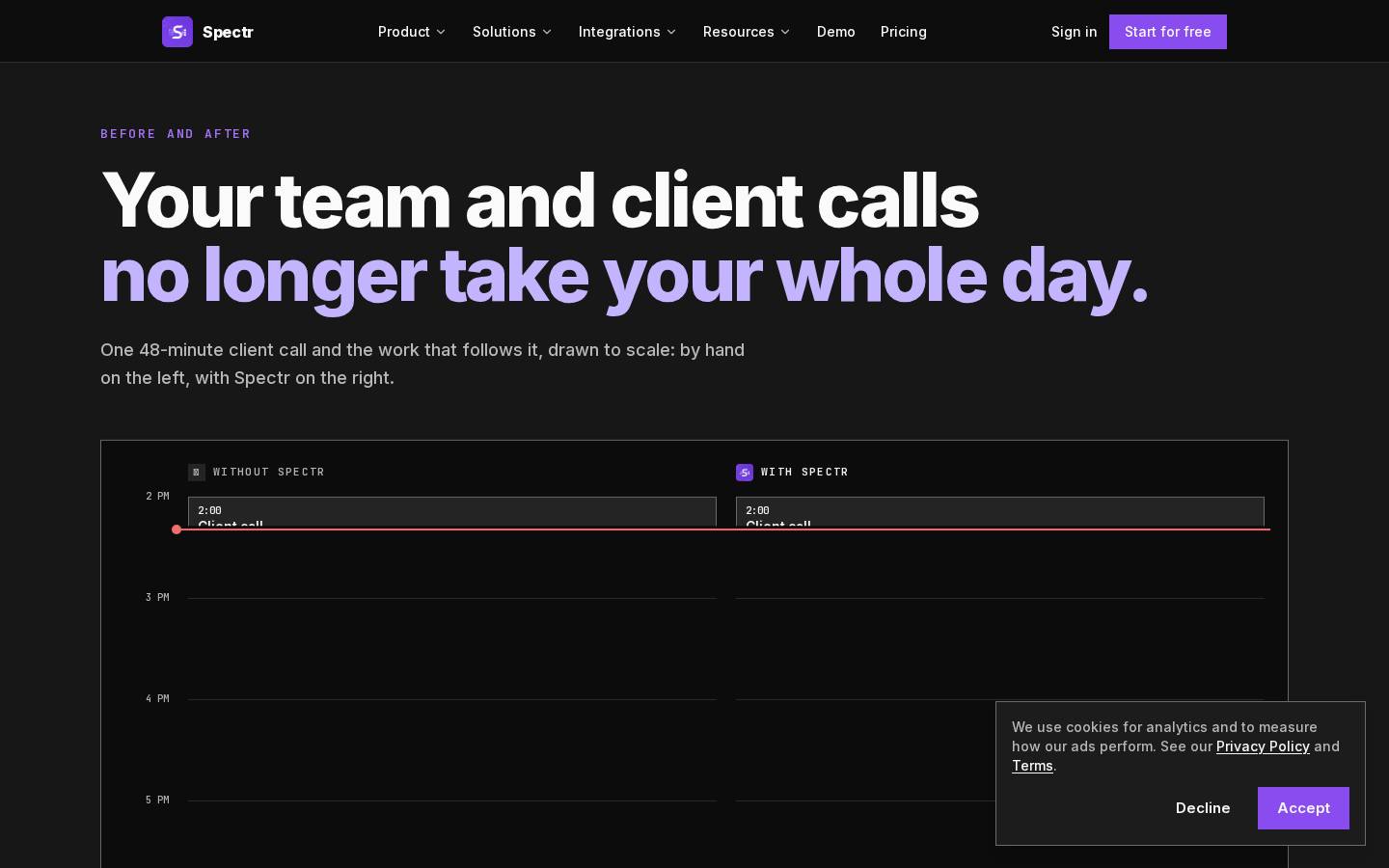
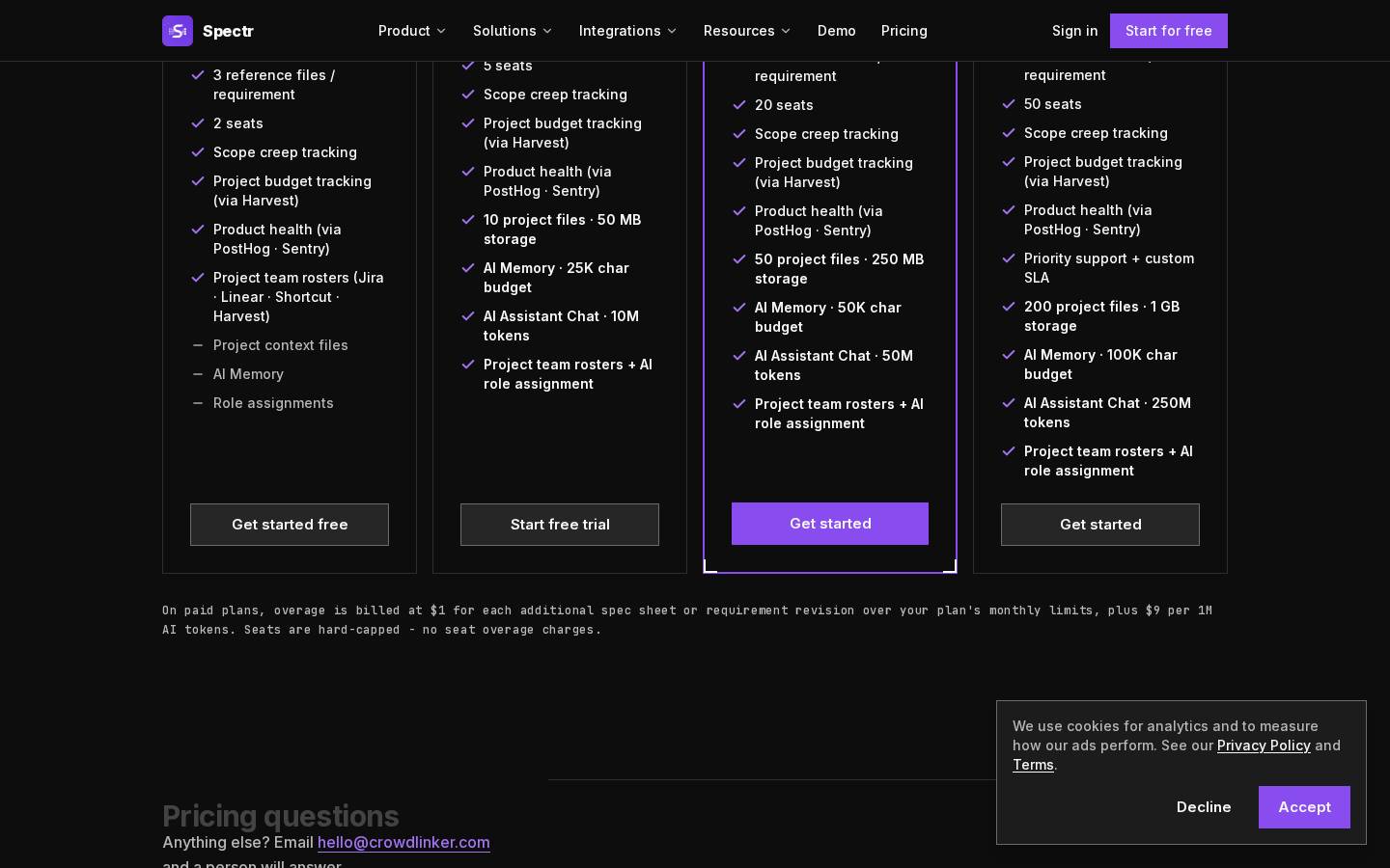
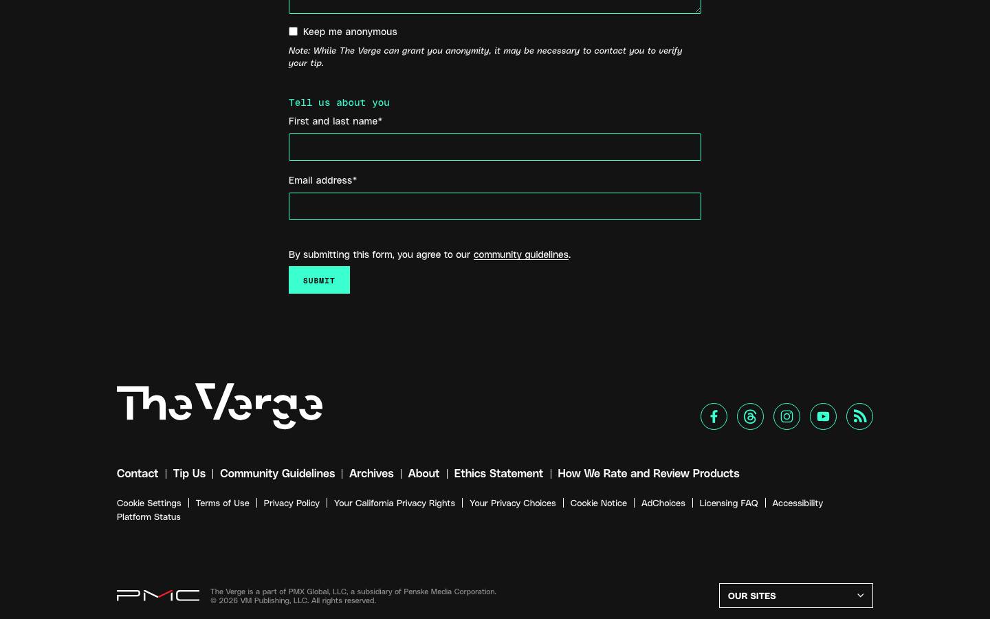
spectr.pm: Spectr - AI Product Ops: Meetings to PRDs, Specs & Stories · Above the fold
spectr.pm
spectr.pm· read 2026-10-14
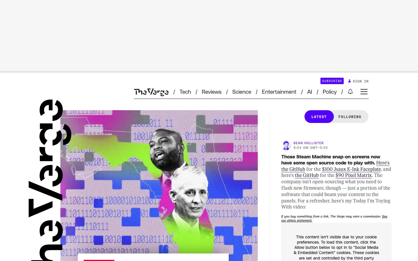
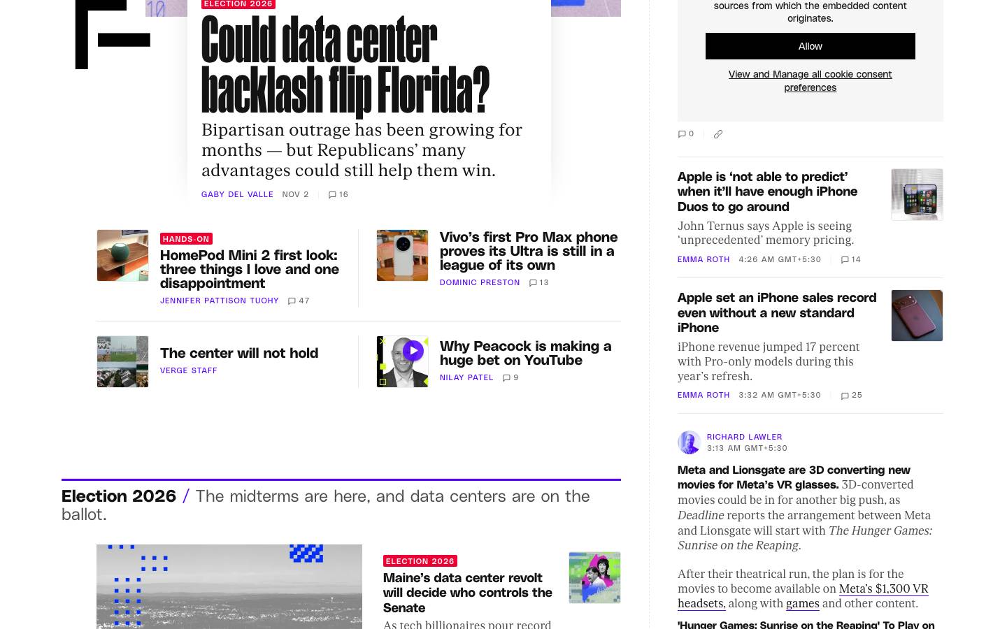
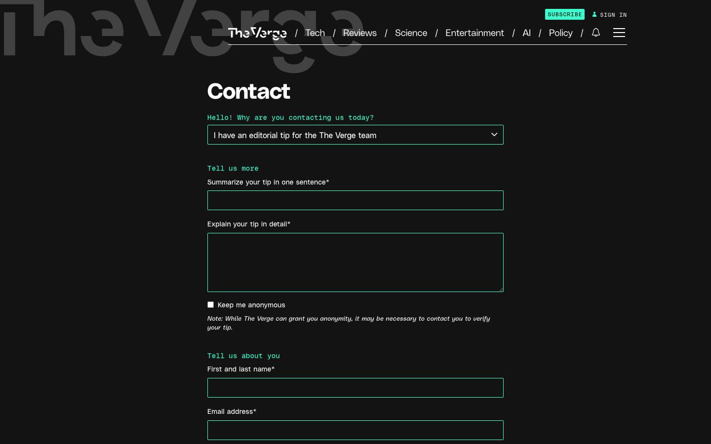
The Verge: The Verge · Above the fold
The Verge
theverge.com· read 2026-11-03

Ground and ink

Each side painted in its own measured canvas, ink, muted and primary roles.

spectr.pm

Heading on canvas

Body copy in the measured muted role.

Primary action
18.6:1 ink on canvas

The Verge

Heading on canvas

Body copy in the measured muted role.

Primary action
18.6:1 ink on canvas

Palette

Named roles first, then every colour measured without one.

spectr.pm

  • canvas#0D0D0D
  • surface#171717
  • ink#FAFAFA
  • hairline#2E2E2E
  • primary#894DEF
  • on-primary#FAFAFA

10 more, no measured role

The Verge

  • canvas#131313
  • ink#FFFFFF
  • muted#949494
  • hairline#313131
  • primary#5200FF
  • on-primary#FFFFFF

3 more, no measured role

Type scale

Set at the measured size, weight, tracking and leading. Brand typefaces are not loaded, so the metrics are real and the letterforms are not.

spectr.pm

hero-display

288px · 900 · shown smaller

display

280px · 900 · shown smaller

display

252px · 900 · shown smaller

display

200px · 900 · shown smaller

display

132px · 800 · shown smaller

display

99px · 600 · shown smaller

h2

92px · 800 · shown smaller

The Verge

display

165px · 1000 · shown smaller

h1

160px · 900 · shown smaller

display

90px · 900 · shown smaller

h1

44px · 700 · shown smaller

heading

34px · 700

h2

34px · 500

heading

31px · 700

Corners

Drawn at the measured radii.

spectr.pm

0px

The Verge

0px

pill

3px

2px

1px

Spacing

One shared scale across both sides, so the bars are directly comparable.

spectr.pm

4
8
12
16
24
28
32
40

The Verge

4
8
12
16
20
24
32
36

Depth

Shadows cast on each side's own ground.

spectr.pm

sm

The Verge

sm

Buttons

Rendered from the measured computed styles.

spectr.pm

primaryfilledprimary-smtext

The Verge

filledprimaryfilled-smprimary-sm

The measured values behind the panels above.

spectr.pmThe Verge

At a glance

GroundDarkDark
Corners — these differSharpPill
Display size — these differ288px165px
Spacing base4px4px
Accent colours — these differ83
Type families — these differ26
Ink on canvas18.6:118.6:1
Components — these differ1113

Colour roles

primary — these differ#894DEF#5200FF
accent—#3CFFD0
canvas — these differ#0D0D0D#131313
surface#171717—
ink — these differ#FAFAFA#FFFFFF
body — these differ#B8B8B8#E9E9E9
muted—#949494
hairline — these differ#2E2E2E#313131
on-primary — these differ#FAFAFA#FFFFFF

Full palette

Every colour each extraction kept, including the ones with no measured role.

All colours — these differ#894DEF#A273F2#14532D#78350F#166534#4ADE80#92400E#FBBF24#0D0D0D#171717#FAFAFA#B8B8B8#2E2E2E#6B6B6B#000000#262626#5200FF#3CFFD0#D6F31F#131313#FFFFFF#E9E9E9#949494#636363#313131#000000#4A4A4A
Semantic——

Typography

Families — these differInter-e4c28016845df4efJetBrains Mono-33799697913f1f09polySanspolySansMonoui-sans-seriffkRomanStandardmanukaRoboto
hero-display288px · 900 · 288px · -11.52px · uppercase · Inter-e4c28016845df4ef—
display — these differ132px · 800 · 198px · -2.64px · Inter-e4c28016845df4ef165px · 1000 · 132px · 1.65px · manuka
h1 — these differ72px · 800 · 72px · -2.52px · Inter-e4c28016845df4ef44px · 700 · 44px · -0.44px · polySans
h2 — these differ44px · 800 · 46.2px · -1.32px · Inter-e4c28016845df4ef14px · 700 · 18.2px · 0px · polySans
h319px · 600 · 28.5px · 0px · Inter-e4c28016845df4ef—
heading — these differ16px · 600 · 24px · 0px · Inter-e4c28016845df4ef34px · 700 · 34px · 0px · polySans
list-item16px · 500 · 24px · 0px · Inter-e4c28016845df4ef—
input—16px · 400 · 16px · 0px · polySans
h4—16px · 400 · 24px · 0px · ui-sans-serif
quote—16px · 400 · 20.8px · 0px · ui-sans-serif
body — these differ15px · 500 · 23.25px · 0px · Inter-e4c28016845df4ef16px · 700 · normal · 0px · polySans
button — these differ15px · 600 · 22.5px · 0px · Inter-e4c28016845df4ef13px · 800 · 13.65px · 0.21px · uppercase · polySans
link — these differ14px · 500 · 20px · 0px · Inter-e4c28016845df4ef11px · 400 · 13px · 1.1px · uppercase · polySansMono
label—14px · 400 · 19.6px · 0.28px · polySans
code — these differ13px · 600 · 19.5px · 1.82px · uppercase · JetBrains Mono-33799697913f1f0911px · 400 · 16.5px · 1.1px · uppercase · polySansMono
caption — these differ12px · 500 · 16.5px · 0px · Inter-e4c28016845df4ef11px · 400 · 13.2px · 1.1px · uppercase · polySans

Shape and rhythm

Radius — these differ0px0px1px2px3px9999px
Spacing — these differ4px8px12px16px24px28px32px40px44px48px64px144px4px8px12px16px20px24px32px36px40px52px152px172px
Border widths1px1px

Depth

Strategysingle-tiersingle-tier
Shadows — these differrgba(0, 0, 0, 0) 0px 0px 0px 0px, rgba(0, 0, 0, 0) 0px 0px 0px 0px, rgba(0, 0, 0, 0.1) 0px 10px 15px -3px, rgba(0, 0, 0, 0.1) 0px 4px 6px -4pxrgba(255, 255, 255, 0.15) 0px 0px 5px 0px
Gradients — these differ—hero: linear-gradient(0deg, rgb(19, 19, 19) 0%, rgb(19, 19, 19) calc(100% - 60px), rgba(19, 19, 19, 0.75) 100%)
Opacity — these differ1.000.700.900.940.650.360.300.200.50
Z-index — these differdropdown 10dropdown 50base 1base 2base 5base 9dropdown 10dropdown 11dropdown 20dropdown 30

Components

Sharedbutton-primarybutton-filledbutton-primary-smcardnavigationfooterlinkbutton-primarybutton-filledbutton-primary-smcardnavigationfooterlink
Only here — these differbutton-textbutton-text-2card-lglink-smbutton-filled-smbutton-outlinecard-smnavigation-2footer-2link-2
Signature——

Interaction states

Read from each site's own stylesheets. An empty side means they were cross-origin and unreadable.

Measured — these differother:focus-visibleinput:hoverother:hovercard:hoverother:focusother:disablednav:hovernav:focus-visibleother:hoverother:disabledother:focuslink:hoverother:focus-visibleinput:focusinput:disabled

Responsive

Breakpoints — these differ375→343px · 6col768→704px · 3col1024→960px · 5col1280→1216px · 5col1440→1376px · 5col375→335px · 5col768→700px · 6col1024→700px · 8col1280→1100px · 8col1440→1100px · 8col

Themes

Measured on the live site, not derived.

SupportSingle themeSingle theme

How this was measured

Differences here are ours, not the brands'.

Pages read66
Extracted — these differ2026-10-142026-11-03
Stylesheets — these differReadablePartly blocked
Roles unassigned — these differ103

Measured by DesignMD from the live sites. Compare two others. Generate a DESIGN.md for your own site.