Clerk
Authentication and user management for the modern web
5 colors
19 components
Inter
Mar 22, 2026
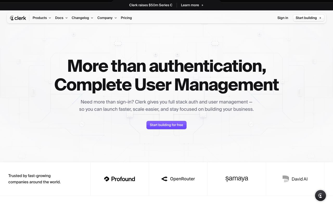
Website Preview
Colors
Primary
#6C47FF
Primary purple
#131316
App background
#1F0256
Purple-tinted surface
#FFFFFF
Primary text
#F4F0FF
Light mode surfaces
Typography
Inter
Role
SizeWeightHeight
Display
48px700—
Heading
32px600—
Body
16px400—
Label
13px500—
DESIGN.md — Clerk
Overview
Clerk's design system bridges developer tooling and end-user polish. A deep purple accent on near-black surfaces creates a premium, security-focused feel. The auth components are designed to be both embeddable and beautiful out of the box.
Colors
Primary Palette
| Token | Hex | Usage |
|---|---|---|
color-brand | #6C47FF | Primary purple |
color-bg | #131316 | App background |
color-surface | #1F0256 | Purple-tinted surface |
color-text | #FFFFFF | Primary text |
color-light | #F4F0FF | Light mode surfaces |
Typography
| Role | Family | Size | Weight |
|---|---|---|---|
| Display | Inter | 48px | 700 |
| Heading | Inter | 32px | 600 |
| Body | Inter | 16px | 400 |
| Label | Inter | 13px | 500 |
Components
Sign In Card
- Centered card, white bg, radius 16px
- Social providers (Google, GitHub, etc.)
- Email/password fields
- "Secured by Clerk" footer badge
User Button
- Avatar circle, click for dropdown
- Shows name, email, sign out option
- Customizable theme
Do's and Don'ts
Do
- Use purple as the single accent color
- Make auth flows feel secure with dark backgrounds
- Support both light and dark theme variants
Don't
- Don't use bright colors for non-interactive elements
- Don't reduce auth form padding below 24px
- Don't hide the security branding