
Plan, write and ship in one place. Every page in your workspace follows the same design system, so nothing drifts.
Fast by default
Pages load in under a second, with nothing to configure.
Built for teams
Shared spaces, comments and roles that match how you work.
Secure from day one
SSO, audit logs and encryption at rest on every plan.
Create your account
Send me product updatesCreate accountnpm install @northwind/sdk
Pro
- Unlimited pages
- Version history
- Priority support
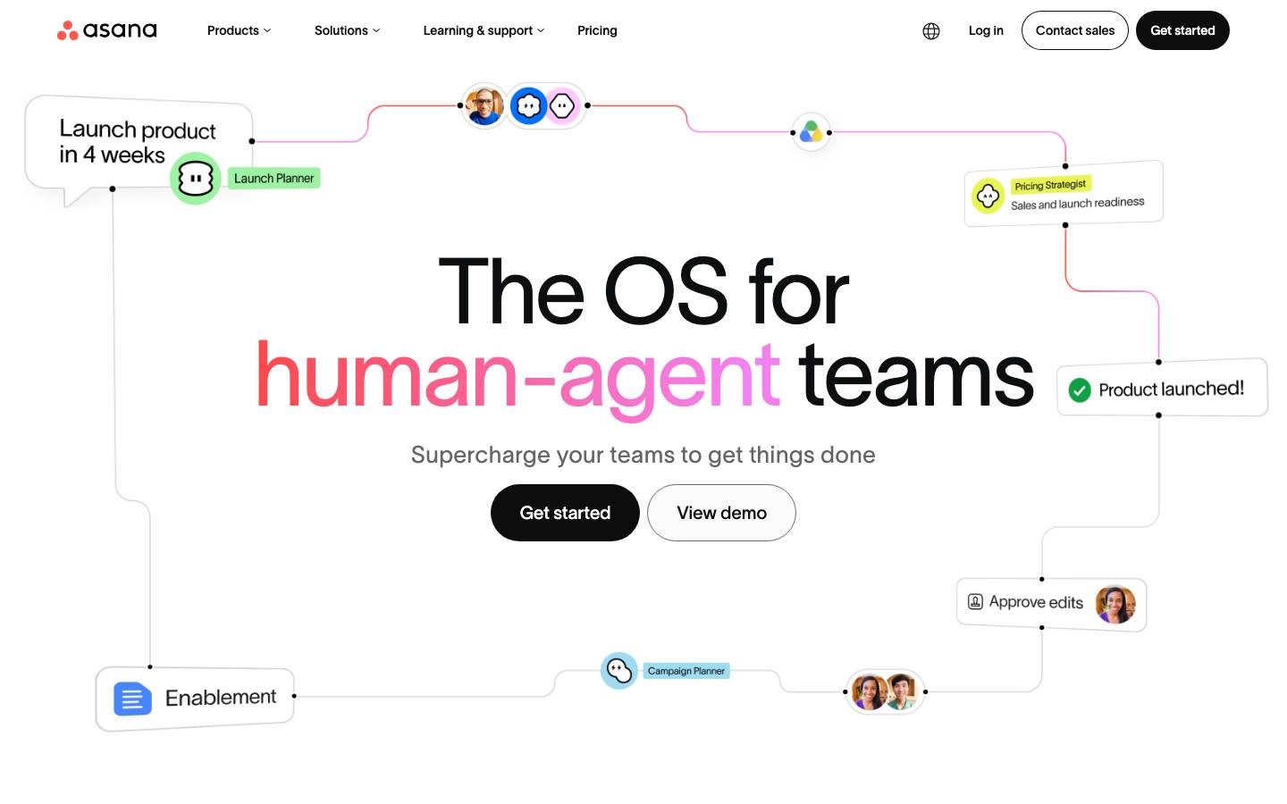
Started from
asana.comPreview
the remixed design systemSwitch between the rendered Visual preview and the Raw DESIGN.md.
Asana Remix
Remix of asana.com. The colors, fonts and shapes were edited in DesignMD. The token block above has the current values. The sections below were written for the original, so they may still mention it.
1. Visual Theme & Atmosphere
Asana's design system embodies a modern, professional work-management aesthetic that balances sophistication with accessibility. The visual identity prioritizes clarity and hierarchy, using a restrained yet confident color palette dominated by deep neutrals and strategically placed accent colors. The design feels intentionally spacious and welcoming, avoiding visual clutter while maintaining a sense of purpose and productivity. Typography is generous and elegant, drawing inspiration from contemporary sans-serif aesthetics that feel both corporate and human-centered. The overall atmosphere communicates reliability and innovation—a platform built for teams that work at scale without sacrificing usability or visual refinement.
Key Characteristics
- Deep neutral foundation with minimal accent color intervention
- Generous whitespace and breathing room throughout layouts
- Strong typographic hierarchy using weight and scale variation
- Clean, rounded button treatments suggesting approachability
- Muted color palette that reduces cognitive load
- Professional yet human-centric visual language
- Emphasis on functional clarity over decorative elements
2. Color Palette & Roles
Primary
- Deep Charcoal (
#0D0E10): Primary text, UI elements, foundational dark mode base; most frequently used color across the system - Pure Black (
#0D0D0D): Alternative dark tone for high-contrast text and primary UI surfaces
Accent Colors
- Sky Blue (
#00B2FF): Primary interactive accent, highlights, and emphasis elements - Light Sky Blue (
#C8EBFC): Soft background tint for secondary information and hover states - Coral Red (
#F06A6A): Status and alert indication, error states, and warning messaging - Slate Purple (
#B08B43): Alternative accent for specialized UI patterns and secondary actions
Interactive
- Charcoal Gray (
#646F79): Secondary text, disabled states, and muted interactive elements - Dark Slate (
#23282F): Interactive element hover states and emphasis borders
Neutral Scale
- Pure White (
#FFFFFF): Primary background, card surfaces, and contrast surfaces - Off-White (
#F5F4F3): Soft background tint and secondary surfaces - Medium Gray (
#6E6E6E): Body text and secondary content - Light Gray (
#6A696A): Tertiary text and muted elements - Border Gray (
#DBDBDB): Dividers and hairline borders - Strong Gray (
#1E1F21): Dense text and high-emphasis typography
Surface & Borders
- Light Border (
#DBDBDB): Primary border color for inputs and separators - Medium Border (
#C1C1C1): Input focus and secondary borders (derived from observed patterns)
3. Typography Rules
Font Family
Primary Font: TWK Lausanne (sans-serif)
Fallback Stack: TWK Lausanne, -apple-system, BlinkMacSystemFont, "Segoe UI", Roboto, "Helvetica Neue", Arial, sans-serif
Secondary Font: Same as primary; system uses a single unified typeface family
Hierarchy
| Role | Font | Size | Weight | Line Height | Letter Spacing | Notes |
|---|---|---|---|---|---|---|
| Display XL | TWK Lausanne | 102px | 300 | 91.8px | Normal | Hero headlines, primary page titles |
| Display Large | TWK Lausanne | 80px | 300 | 80px | Normal | Major section headings |
| Display Medium | TWK Lausanne | 64px | 300 | 64px | Normal | Large hero content |
| Heading XL | TWK Lausanne | 54px | 300 | 54px | Normal | Large section headers |
| Heading Large | TWK Lausanne | 36px | 400 | 36px | Normal | Section headings and major subheads |
| Heading Medium | TWK Lausanne | 30px | 400 | 36px | Normal | Subsection titles |
| Heading Small | TWK Lausanne | 24px | 500 | 28.8px | Normal | Card titles, feature headings |
| Heading XS | TWK Lausanne | 20px | 400 | 30px | Normal | Feature subheadings |
| Body Regular | TWK Lausanne | 16px | 400 | 28px | Normal | Primary body text, descriptions |
| Body Input | TWK Lausanne | 16px | 300 | 24px | Normal | Form input placeholder and value text |
| Body Small | TWK Lausanne | 14px | 500 | 21px | Normal | Secondary text, labels, badges |
| Link | TWK Lausanne | 16px | 500 | 24px | Normal | Hyperlinks and link-style buttons |
| Caption | TWK Lausanne | 13px | 300 | 19.5px | Normal | Metadata, timestamps, helper text |
| UI Label | TWK Lausanne | 14px | 500 | 21px | Normal | Button labels, tag labels, small UI text |
Principles
- Weight as hierarchy: Light (300) weights signal prominence and confidence; medium (400) and bold (500) weights drive attention and structure
- Generous line height: Consistent use of loose line heights (1.4x–1.5x ratio) enhances readability across all sizes
- Scale in 2–4px increments: Fluid progression from 13px through 102px maintains visual balance without jarring jumps
- Single typeface family: Consistent use of TWK Lausanne throughout prevents visual fragmentation
- Font smoothing: Optimize rendering with
-webkit-font-smoothing: antialiasedfor crisp text at all sizes
4. Component Stylings
Buttons
Primary Button
- Background:
#0D0D0D(deep charcoal) - Text Color:
#FFFFFF(white) - Font Size:
14px - Font Weight:
500 - Padding:
8px 24px - Border Radius:
100px - Border:
0px(none) - Height:
44px - Line Height:
36px - Hover State: Background darkens to near-black; opacity increases slightly
- Active State: Increased opacity to
0.9 - Disabled State: Opacity
0.30; cursor not-allowed
Secondary Button (Outline)
- Background: Transparent (
rgba(0, 0, 0, 0)) - Text Color:
#0D0E10(deep charcoal) - Font Size:
14px - Font Weight:
500 - Padding:
8px 24px - Border:
1px solid #0D0E10 - Border Radius:
100px - Height:
44px - Line Height:
36px - Hover State: Background
rgba(13, 13, 13, 0.05) - Active State: Background
rgba(13, 13, 13, 0.10) - Disabled State: Border and text opacity
0.30
Ghost Button (Minimal)
- Background: Transparent
- Text Color:
#646F79(charcoal gray) - Font Size:
14px - Font Weight:
500 - Padding:
0px 10px - Border:
0px(none) - Border Radius:
3px - Height: Auto
- Line Height:
36px - Hover State: Background
rgba(100, 111, 121, 0.08) - Active State: Background
rgba(100, 111, 121, 0.15)
Icon Button
- Background: Transparent
- Text Color:
#FFFFFF(white) or#0D0E10(dark) depending on context - Padding:
0px - Border Radius:
100px - Height:
44px - Width:
44px - Hover State: Subtle background wash
rgba(0, 0, 0, 0.05)torgba(255, 255, 255, 0.1)depending on theme
Cards & Containers
Card (Default)
- Background:
#FFFFFF(white) - Border:
1px solid #DBDBDB - Border Radius:
16px - Padding:
24pxto32px - Box Shadow: None (flat design)
- Text Color:
#0D0E10
Card (Elevated/Featured)
- Background:
#FFFFFF - Border:
1px solid #DBDBDB - Border Radius:
16px - Padding:
32px - Box Shadow:
0 4px 12px rgba(0, 0, 0, 0.08)(inferred) - Hover State: Box shadow increases to
0 8px 24px rgba(0, 0, 0, 0.12)
Pricing Card
- Background:
#FFFFFF - Border:
1px solid #DBDBDB; can shift to accent color on highlight - Border Radius:
16px - Padding:
32px - Text Color:
#0D0E10(body),#646F79(descriptions) - CTA Button: Primary button variant fills 100% width
Inputs & Forms
Text Input (Default)
- Background: Transparent or
#F5F4F3(soft background) - Border:
1px solid #CFCFCF(light gray) - Border Radius:
4px - Padding:
12px 16px - Font Size:
16px - Font Weight:
300 - Height:
50px - Text Color:
#0D0D0D - Placeholder Color:
#646F79(muted) - Focus State: Border color shifts to
#00B2FF(sky blue); box shadow0 0 0 3px rgba(0, 178, 255, 0.1) - Error State: Border
1px solid #F06A6A; text color#F06A6A - Disabled State: Background
#F5F4F3; text opacity0.5; cursor not-allowed
Select/Dropdown Input
- Background: Transparent or
#F5F4F3 - Border:
1px solid #C1C1C1 - Border Radius:
0px - Padding:
0px - Height:
40px - Width:
250px - Font Size:
16px - Font Weight:
400 - Line Height:
28px
Checkbox/Radio
- Size:
16px × 16px - Border Radius:
3px(checkbox),50%(radio) - Border:
1px solid #CFCFCF - Checked State: Background
#0D0D0D, checkmark/dot#FFFFFF - Focus State: Outline
2px solid #00B2FFwith4pxoffset
Label
- Font Size:
14px - Font Weight:
500 - Text Color:
#0D0E10 - Margin Bottom:
8px
Navigation
Header Navigation
- Background:
#FFFFFF(white) - Height:
68px - Padding:
12px 0px(vertical) - Border Bottom:
1px solid #DBDBDB(optional divider) - Nav Link (Default):
16px, weight400, color#646F79 - Nav Link (Active/Hover): Color
#0D0E10, slightly bolder visual weight - Spacing Between Items:
24pxto32px(derived fromgap: 24px)
Breadcrumb Navigation
- Font Size:
14px - Font Weight:
500 - Text Color:
#646F79 - Separator:
/or›in matching color - Spacing:
8pxaround separator
Dropdown Menu
- Background:
#FFFFFF - Border:
1px solid #DBDBDB - Border Radius:
4pxto8px - Padding:
8px 0px - Box Shadow:
0 4px 12px rgba(0, 0, 0, 0.15)(inferred) - Menu Item Padding:
8px 16px - Menu Item Text:
14px, weight400, color#0D0E10 - Menu Item Hover: Background
rgba(0, 0, 0, 0.05)
Badges & Tags
Badge (Default)
- Background:
#C8EBFC(light sky blue) - Text Color:
#00B2FF(sky blue) - Font Size:
12px - Font Weight:
500 - Padding:
4px 12px - Border Radius:
4px - Height: Auto
Badge (Success)
- Background:
rgba(40, 167, 69, 0.1)(green tint, inferred) - Text Color:
#28A745(green, inferred) - Padding:
4px 12px - Border Radius:
4px
Badge (Alert)
- Background:
rgba(240, 106, 106, 0.1)(coral tint) - Text Color:
#F06A6A(coral red) - Padding:
4px 12px - Border Radius:
4px
5. Layout Principles
Spacing System
Base Unit: 4px
Spacing Scale:
4px— micro spacing for inline elements, tight grouping8px— small gap between adjacent controls or text12px— input padding, tight component spacing16px— standard padding for cards and containers, spacing between text and edges20px— medium-sized spacing between sections24px— common gap between UI components and features32px— large spacing between major sections40px— extra-large section padding48px— hero section padding, major vertical rhythm80px— large section separation120px— hero/banner vertical padding
Usage Context:
- Tight grouping:
4pxto8px(related form fields, inline labels) - Component spacing:
12pxto16px(padding inside buttons, cards) - Section spacing:
24pxto32px(between card decks, feature sections) - Hero/full-width:
48pxto120px(vertical rhythm in landing pages)
Grid & Container
Maximum Container Width: 1440px (desktop)
Column Strategy:
- Desktop: 12-column or flexible layout with
24pxto32pxgutters - Tablet (768px–1023px): 8-column with adjusted gutters
- Mobile (320px–767px): 4-column or full-width single column
Section Pattern:
- Hero sections: Full-width with centered content max-width of
1200pxto1280px - Feature grids: Multi-column (2–4 columns) with consistent
24pxgaps - Pricing tiers: 4-column grid (desktop), collapsing to 2 columns (tablet), 1 column (mobile)
Whitespace Philosophy
Asana's design prioritizes abundant whitespace to reduce cognitive load and create visual breathing room. Whitespace is not empty space but active design—it guides the eye, establishes hierarchy, and conveys confidence. Content is intentionally spaced to prevent visual crowding; features and sections have clear separation. Between card decks and feature areas, spacing increases to at least 48px vertically. Horizontal whitespace is equally generous, with text columns typically maxing out at 65–75 characters for optimal readability.
Border Radius Scale
3px— Small UI elements (buttons, inputs, tags)4px— Form inputs, small containers, subtle softness8px— Medium containers, secondary cards (inferred for consistency)16px— Primary cards, image containers, larger components100px— Fully rounded buttons (pill-shaped), icon buttons999px— Extreme rounding (rare, special case treatments)
Border Widths
- Thin:
1px— Primary borders, input borders, dividers - Medium:
2px— Button hover outlines, focus states (inferred)
6. Depth & Elevation
| Level | Treatment | Use |
|---|---|---|
| Base (Flat) | No shadow, box-shadow: none | Cards, buttons, flat UI elements |
| Raised | 0 4px 12px rgba(0, 0, 0, 0.08) | Elevated cards, subtle lift on hover |
| Floating | 0 8px 24px rgba(0, 0, 0, 0.12) | Dropdowns, popovers, featured content |
| Modal Overlay | 0 16px 48px rgba(0, 0, 0, 0.20) | Modals, critical overlays |
Shadow Philosophy:
Asana favors a minimal shadow approach—depth is created through layering and spacing rather than heavy shadows. Shadows are subtle and use low opacity dark overlays (rgba(0, 0, 0, 0.08–0.20)) to maintain the clean, professional aesthetic. Shadows appear primarily on interactive hover states and modal overlays to signal depth and elevation. The design avoids sharp, high-contrast shadows that would feel heavy or dated.
Opacity Levels
- Disabled State:
0.30(30%) — Reduced contrast for non-interactive elements - Hover Overlay:
0.05to0.10(5–10%) — Subtle background wash on interactive elements - Focus State:
0.15(15%) — Moderate overlay for focus indicators - Overlay/Backdrop:
0.50to0.80(50–80%) — Modal backdrops and scrim layers
Z-index / Layering
- Base Layer:
z-index: 1— Default component stacking - Interactive Lift:
z-index: 2— Elevated components (cards on hover, sticky headers) - Sticky/Fixed:
z-index: 3— Sticky navigation, floating action buttons - Dropdown/Popover:
z-index: 100toz-index: 500— Context menus, tooltips - Modal:
z-index: 1001— Primary modal dialogs - Top Modal:
z-index: 9999— Alert dialogs, critical overlays (inferred best practice)
7. Do's and Don'ts
Do
- Use the primary dark color (
#0D0E10) for all body text and primary UI elements; it ensures consistent readability and hierarchy - Leverage generous whitespace extensively to create breathing room and reduce visual fatigue
- Apply the sky blue accent (
#00B2FF) sparingly—only on primary CTAs, focus states, and critical interactive elements - Stack typography using weight variation (300, 400, 500) rather than size alone for nuanced hierarchy
- Use pill-shaped buttons (
border-radius: 100px) consistently for all primary and secondary CTAs - Maintain 44px minimum height for all clickable interactive elements to ensure comfortable touch targeting
- Build card components with 16px border-radius and
1px solid #DBDBDBborders for consistency - Apply focus states with
2pxoutline in sky blue (#00B2FF) and sufficient contrast - Use opacity-based hover states rather than flat color shifts for a refined, cohesive feel
- Prioritize input field clarity with ample padding (
12px 16px), light borders, and blue focus states
Don't
- Don't use multiple accent colors in a single composition; restrict coral red (
#F06A6A) to status/error states only - Don't apply heavy shadows or high-opacity overlays to normal components; reserve depth for modals and critical overlays
- Don't create buttons smaller than 44px in height or text smaller than 12px without explicit accessibility justification
- Don't mix border-radius values inconsistently; stick to the defined scale (
3px,4px,16px,100px) - Don't crowd components without sufficient gap spacing (
24pxminimum between section blocks) - Don't override the TWK Lausanne typeface with alternative fonts; maintain typographic consistency throughout
- Don't use justify-align for body text; always left-align paragraphs for optimal readability
- Don't apply multiple box-shadows to a single element; keep shadows simple and subtle
- Don't reduce line-height below
1.3xfont size; maintain generous line spacing for accessibility - Don't disable interactive elements without clear visual indication (use
opacity: 0.30andcursor: not-allowed)
8. Responsive Behavior
Breakpoints
| Breakpoint Name | Width | Key Changes |
|---|---|---|
| Mobile Small | 320px–479px | Single-column layout, full-width cards, 16px horizontal padding, 24px vertical gap |
| Mobile Large | 480px–767px | Single-column or 2-column for cards, hero text reduces to 48px–54px |
| Tablet | 768px–1023px | 2–3 column grid, max-width 750px, reduced gap: 20px between cards |
| Desktop | 1024px–1439px | 3–4 column grid, max-width 1024px or 1200px, full gap: 24px |
| Desktop Large | 1440px+ | 4-column grid, max-width 1440px, gap: 32px, hero text at full 80px–102px |
Touch Targets
- Minimum Interactive Size:
44px × 44px(buttons, icon buttons, tap targets) - Minimum Tap Target Spacing:
8pxminimum space between adjacent interactive elements to prevent mis-taps - Link/Text Button Padding:
12px 16pxminimum to create comfortable touch zones - Form Input Height:
50pxminimum for text inputs to accommodate finger input comfortably - Checkbox/Radio Size:
16px × 16pxminimum (increase to20px × 20pxon mobile for clarity)
Collapsing Strategy
- Hero Heading: Scales from
102px(desktop large) →80px(desktop) →54px(tablet) →36px–48px(mobile) - Section Heading: Scales from
36px(desktop) →28px(tablet) →24px(mobile) - Body Text: Remains
16pxacross all breakpoints; line-height adjusts from28px→26pxon mobile for tightness - Vertical Spacing: Reduces from
48px–80px(desktop) →32px–48px(tablet) →24px–32px(mobile) - Card Grid: 4 columns (desktop) → 2 columns (tablet) → 1 column (mobile)
- Navigation: Horizontal menu (desktop/tablet) → Hamburger menu or collapsed stack (mobile <768px)
- Padding: Full
40px–80px(desktop sections) →32px(tablet) →16px(mobile)
9. Agent Prompt Guide
Quick Color Reference
- Primary CTA: Deep Charcoal (
#0D0D0D) or Pure Black (#0D0E10) background with white text - Primary Text: Deep Charcoal (
#0D0E10) - Secondary Text: Charcoal Gray (
#646F79) - Accent/Highlights: Sky Blue (
#00B2FF) - Accent Background (Soft): Light Sky Blue (
#C8EBFC) - Error/Alert: Coral Red (
#F06A6A) - Background: Pure White (
#FFFFFF) - Soft Background: Off-White (
#F5F4F3) - Borders: Border Gray (
#DBDBDB) - Heading Text: Deep Charcoal (
#0D0E10) - Disabled State: Gray at
0.30opacity
Iteration Guide
-
Typography Foundation: All text uses TWK Lausanne; establish hierarchy through weight (300 light for emphasis, 400 regular for body, 500 bold for labels) and size (respect the documented scale: 13px–102px).
-
Button Consistency: All primary CTAs are pill-shaped (
border-radius: 100px), minimum44pxheight, with white text on#0D0D0Dbackground. Secondary buttons are transparent with1px solid #0D0E10border. Hover states use opacity shifts (rgba(0, 0, 0, 0.05)) not color swaps. -
Spacing Rhythm: Use the spacing scale (
4px,8px,12px,16px,24px,32px,48px,80px,120px) consistently; avoid arbitrary pixel values. Between major section blocks, always apply at least48pxvertical gap. -
Card Components: Border-radius
16px, border1px solid #DBDBDB, padding24px–32px, white background. Elevate on hover with subtle shadow0 4px 12px rgba(0, 0, 0, 0.08). -
Input Styling:
50pxheight,12px 16pxpadding,1px solid #CFCFCFborder,4pxborder-radius. On focus, shift border to sky blue (#00B2FF) and add box-shadow0 0 0 3px rgba(0, 178, 255, 0.1). -
Color Restraint: Use
#0D0E10and#FFFFFFas the dominant color pair; introduce#00B2FFonly for primary interactive elements and#F06A6Aexclusively for error/status states. -
Depth & Shadows: Avoid heavy shadows; use
0 4px 12px rgba(0, 0, 0, 0.08)for subtle elevation and0 16px 48px rgba(0, 0, 0, 0.20)for modals only. -
Responsive Collapse: At
768px, shift from 4-column to 2-column grids; reduce heading sizes and padding proportionally. Mobile (<768px) uses single-column layout with16pxhorizontal padding and24px–32pxvertical gaps. -
Accessibility Minimum: All interactive elements are
44px × 44pxminimum; text contrast meets WCAG AA (4.5:1 minimum); focus states use2px solid #00B2FFoutline with4pxoffset; disabled state usesopacity: 0.30withcursor: not-allowed. -
Brand Voice in Spacing: The generous whitespace (
48pxbetween sections, loose line-heights of 1.4x–1.5x) is core to Asana's professional yet approachable identity—never compress spacing below documented minimums or the design loses its clarity and confidence.
Make it yours
Change the colors, fonts and corners of Asana Remix, and save your own DESIGN.md. Free.