
Plan, write and ship in one place. Every page in your workspace follows the same design system, so nothing drifts.
Fast by default
Pages load in under a second, with nothing to configure.
Built for teams
Shared spaces, comments and roles that match how you work.
Secure from day one
SSO, audit logs and encryption at rest on every plan.
Create your account
Send me product updatesCreate accountnpm install @northwind/sdk
Pro
- Unlimited pages
- Version history
- Priority support
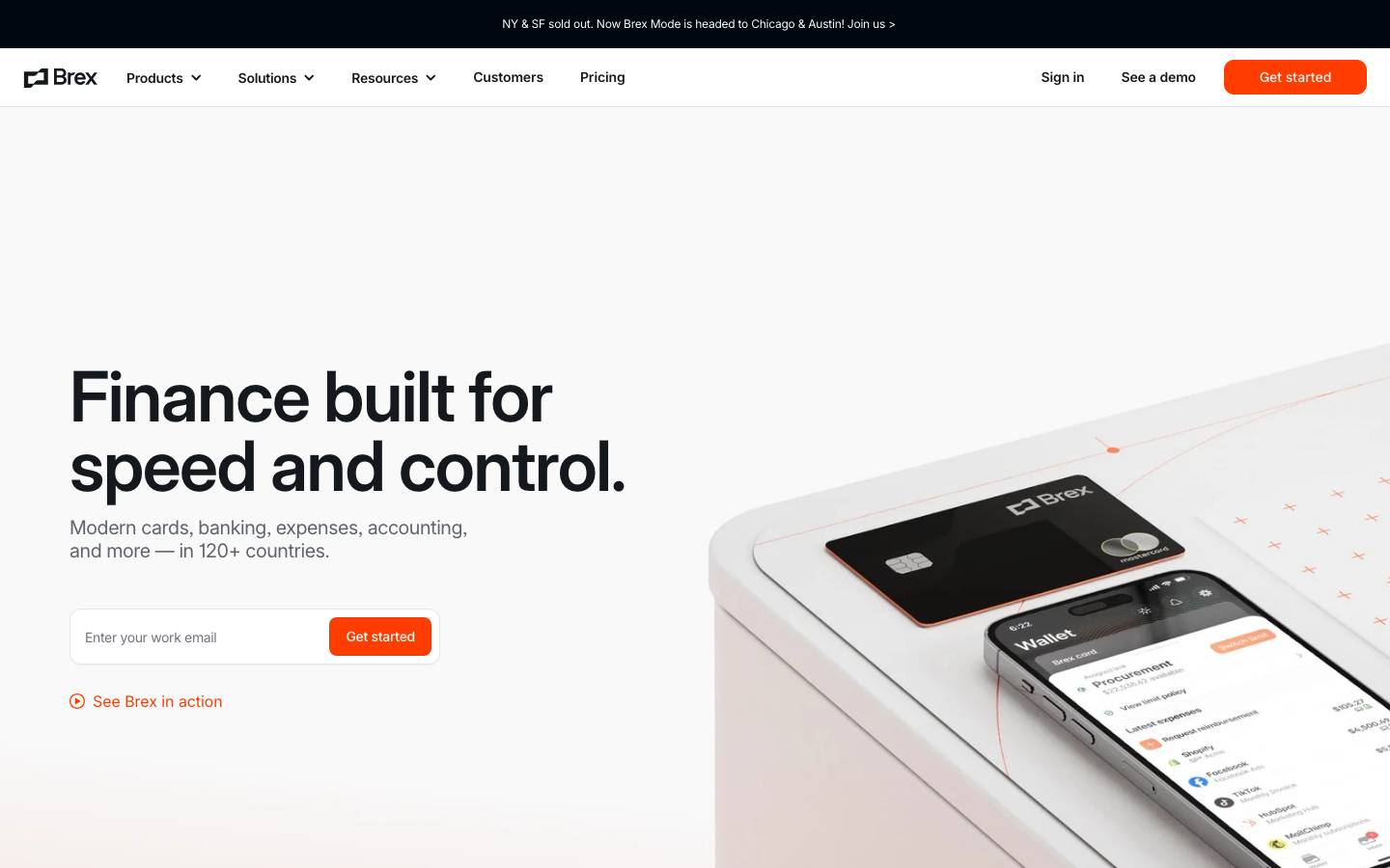
Started from
www.brex.comPreview
the remixed design systemSwitch between the rendered Visual preview and the Raw DESIGN.md.
Brex Remix
Remix of www.brex.com. The colors, fonts and shapes were edited in DesignMD. The token block above has the current values. The sections below were written for the original, so they may still mention it.
1. Visual Theme & Atmosphere
Brex's design system embodies modern fintech sophistication with a bold, energetic character. The visual language combines sharp contrast and minimal ornamentation, prioritizing clarity and confidence. Deep navy and pure black dominate, establishing authority and trust in financial contexts, while vivid orange accents inject dynamism and draw attention to critical actions. The typography is geometric and professional, complemented by generous whitespace that reduces cognitive load. This design philosophy communicates efficiency, control, and forward momentum—essential qualities for a platform managing complex financial operations at scale.
Key Characteristics
- High-contrast, minimalist aesthetic with bold color blocking
- Confident use of pure black and deep navy as primary neutrals
- Vibrant orange (#80AAFF) as the primary action color, creating urgency
- Clean, spacious layouts with deliberate use of negative space
- Geometric typography with consistent weight hierarchy
- Professional yet approachable tone through balanced proportion
- Strong visual distinction between interactive and non-interactive elements
2. Color Palette & Roles
Primary
- Primary Brand Black (
#15191E): The dominant neutral across all surfaces, text, and structural elements. Establishes brand personality and authority. - Pure Black (
#000000): Deepest neutral for maximum contrast in typography and critical UI elements. Used sparingly for emphasis.
Accent Colors
- Primary Action Orange (
#80AAFF): High-energy brand accent used for primary calls-to-action, buttons, and key interactive elements. Conveys urgency and forward momentum. - Bright Orange (
#FF3D00): Slightly more saturated variant of orange, reserved for error states and destructive actions. - Warm Yellow (
#FFA500): Lighter accent tone for secondary emphasis and data visualization. - Primary Blue (
#006EF5): Bold blue for secondary actions, links, and interactive feedback. - Royal Purple (
#3C16D5): Tertiary accent for special states, highlights, and branded elevation.
Interactive
- Success Green (
#0D9926): Dark green for successful completion states, confirmations, and positive feedback. - Bright Success Green (
#1EC425): Lighter green variant for success badges and positive indicators. - Error Red (
#EE2929): Deep red for critical errors and destructive warnings.
Neutral Scale
- Secondary Gray (
#60646C): Mid-tone gray for secondary text, labels, and disabled states. - Tertiary Gray (
#8B8D98): Lighter gray for tertiary content, placeholders, and subtle dividers. - Light Gray (
#B9BBC6): Very light gray for subtle borders and low-emphasis dividers. - Warm Gray (
#6F737B): Alternative mid-tone gray for contextual text and secondary navigation.
Surface & Borders
- Off-White (
#FCFCFD): Primary surface background, used for cards, containers, and content areas. - Pure White (
#FFFFFF): Secondary surface for overlays, modals, and elevated containers. - Light Background (
#F3F3F7): Subtle background tint for grouped content and secondary sections. - Blue Tint Light (
#ECF4FD): Light blue background for informational or secondary content areas.
Semantic / Status
- Success Background Light (
#000000): Light green background for success notifications and positive alerts. - Blue Background Light (
#D5E8FB): Light blue background for informational content and secondary alerts. - Purple Background Light (
#E6E2FF): Light purple background for special notifications and feature highlights.
3. Typography Rules
Font Family
- Primary: Inter, -apple-system, BlinkMacSystemFont, "Segoe UI", sans-serif
- Secondary: Inter (no fallback variation; system fonts as secondary)
Hierarchy
| Role | Font | Size | Weight | Line Height | Letter Spacing | Notes |
|---|---|---|---|---|---|---|
| Display 1 | Inter | 72px | 500 | 72px | 0px | Hero headlines, page titles |
| Display 2 | Inter | 48px | 500 | 48px | 0px | Large section headers |
| Heading 1 | Inter | 36px | 500 | 36px | 0px | Major section titles |
| Heading 2 | Inter | 30px | 500 | 36px | 0px | Subsection headers |
| Heading 3 | Inter | 24px | 500 | 29px | 0px | Card headers, medium emphasis |
| Heading 4 | Inter | 20px | 500 | 24px | 0px | Smaller section headers |
| Heading 5 | Inter | 16px | 500 | 24px | 0px | Component headers, buttons |
| Body Large | Inter | 16px | 400 | normal | 0px | Primary body text, descriptions |
| Body Regular | Inter | 14px | 400 | 21px | 0px | Standard body text, content |
| Body Small | Inter | 12px | 400 | 18px | 0px | Captions, secondary text, labels |
| Button | Inter | 16px | 400 | normal | 0px | Primary button text |
| Link | Inter | 14px | 400 | 20px | 0px | Link text (default) |
| Link Strong | Inter | 14px | 600 | 20px | 0px | Emphasized links, navigation |
Principles
- Weights are limited to 400 (regular) and 500-600 (bold), avoiding unnecessary variation
- Line heights are generous to improve readability and reduce visual density
- Size progression follows a consistent scale, supporting visual hierarchy without overwhelming
- Font weights increase with decreased size to maintain visual balance
- Letter spacing remains at 0 across all roles, relying on Inter's excellent built-in metrics
4. Component Stylings
Buttons
Primary Button
- Background:
#80AAFF - Text Color:
#FFFFFF - Font Size:
16px - Font Weight:
400 - Padding:
0px 16px - Height:
40px - Border Radius:
10.8px - Border:
1px solid rgba(66, 87, 138, 0.15) - Box Shadow:
none - Line Height: normal
- Hover State: Background
#E64E00(darker orange) - Active State: Background
#CC4400(even darker) - Disabled State: Background
#B9BBC6, Text Color#8B8D98, Opacity0.5
Secondary Button
- Background:
rgba(0, 0, 0, 0)(transparent) - Text Color:
#15191E - Font Size:
16px - Font Weight:
400 - Padding:
4px 8px - Height:
31px - Border Radius:
8.1px - Border:
1px solid #15191E - Box Shadow:
none - Hover State: Background
rgba(21, 25, 30, 0.08) - Active State: Background
rgba(21, 25, 30, 0.15) - Disabled State: Opacity
0.5, Text Color#B9BBC6
Ghost Button (Link-style)
- Background:
rgba(0, 0, 0, 0)(transparent) - Text Color:
#15191E - Font Size:
16px - Font Weight:
400 - Padding:
0px 0px - Height:
auto - Border Radius:
0px - Border:
0px none - Box Shadow:
none - Text Decoration: underline on hover
- Hover State: Text Color
#006EF5, Text Decoration: underline
Cards & Containers
Card (Standard)
- Background:
#FFFFFF - Border:
1px solid #B9BBC6 - Border Radius:
10.8px - Padding:
24px - Box Shadow:
0px 2px 8px rgba(0, 0, 0, 0.08) - Hover State: Box Shadow
0px 4px 16px rgba(0, 0, 0, 0.12)
Card (Elevated)
- Background:
#FFFFFF - Border:
1px solid #E6E2FF - Border Radius:
13.5px - Padding:
32px - Box Shadow:
0px 8px 24px rgba(0, 0, 0, 0.12)
Container (Light Background)
- Background:
#F3F3F7 - Border Radius:
10.8px - Padding:
32px 24px
Inputs & Forms
Input Field (Default)
- Background:
#FFFFFF - Border:
1px solid #B9BBC6 - Border Radius:
8.1px - Padding:
12px 16px - Font Size:
14px - Font Weight:
400 - Text Color:
#15191E - Height:
40px - Focus State: Border Color
#006EF5, Box Shadow0px 0px 0px 3px rgba(0, 110, 245, 0.12) - Error State: Border Color
#FF3D00, Box Shadow0px 0px 0px 3px rgba(255, 61, 0, 0.12) - Placeholder: Text Color
#8B8D98, Opacity0.7
Input Field (Disabled)
- Background:
#F3F3F7 - Border:
1px solid #B9BBC6 - Text Color:
#8B8D98 - Opacity:
0.5 - Cursor: not-allowed
Navigation
Header Navigation
- Background:
#FFFFFF - Height:
60px - Padding:
0px 24px - Border Bottom:
1px solid #E6E2FF - Nav Item Text: Font Size
16px, Font Weight400, Color#15191E - Nav Item Hover: Background
rgba(21, 25, 30, 0.08), Border Radius8.1px - Nav Item Active: Color
#80AAFF, Border Bottom2px solid #80AAFF
Footer Navigation
- Background:
#000000 - Padding:
80px 24px 40px 24px - Nav Item Text: Font Size
12px, Font Weight400, Color#FCFCFD - Nav Item Hover: Color
#80AAFF, Text Decoration: underline
Links
Link (Default)
- Color:
#15191E - Font Size:
14px - Font Weight:
400 - Text Decoration: none
- Hover State: Color
#006EF5, Text Decoration: underline - Active State: Color
#3C16D5 - Visited State: Color
#8B8D98
Link (Inverted / Light Background)
- Color:
#FCFCFD - Font Size:
12px - Font Weight:
400 - Line Height:
18px - Hover State: Color
#80AAFF
Badges & Tags
Badge (Success)
- Background:
#000000 - Text Color:
#0D9926 - Font Size:
12px - Font Weight:
600 - Padding:
4px 8px - Border Radius:
8.1px
Badge (Error)
- Background:
rgba(255, 61, 0, 0.12) - Text Color:
#FF3D00 - Font Size:
12px - Font Weight:
600 - Padding:
4px 8px - Border Radius:
8.1px
Badge (Info)
- Background:
#D5E8FB - Text Color:
#006EF5 - Font Size:
12px - Font Weight:
600 - Padding:
4px 8px - Border Radius:
8.1px
5. Layout Principles
Spacing System
- Base Unit:
8px - Scale: 4px, 8px, 12px, 16px, 20px, 24px, 32px, 40px, 48px, 72px, 80px, 160px
- Usage Context:
4px– Micro-spacing between tightly grouped elements8px– Compact spacing within components (gaps, tight grouping)12px– Spacing between form elements, compact sections16px– Standard horizontal padding in buttons, inputs, and cards20px– Gap spacing between list items, moderate separation24px– Padding within cards and containers; section dividers32px– Vertical spacing between major components; card padding40px– Spacing between sections; horizontal padding in containers48px– Margin between significant content blocks72px– Padding in hero sections and major layout sections80px– Top/bottom padding in full-width sections160px– Large vertical padding for page sections and transitions
Grid & Container
- Max Width:
1440px - Column Strategy: 12-column grid with
24pxgutters - Container Padding:
24pxon sides (mobile),40px(tablet),80px(desktop) - Section Patterns:
- Hero sections: Full-width with
80pxvertical padding - Content sections: Max-width container with
24pxmargin - Card grids: 3-column layout on desktop (pricing, features), 2-column tablet, 1-column mobile
- Feature rows: Alternating left/right layout with
160pxvertical spacing
- Hero sections: Full-width with
Whitespace Philosophy
Brex prioritizes generous whitespace to establish visual hierarchy and reduce cognitive friction. Content breathing room prevents information overload, especially critical in financial contexts where clarity is paramount. Whitespace increases proportionally with content importance: hero sections receive maximum breathing room, while dense data tables use minimum spacing. This creates visual rhythm and guides user attention naturally through the interface.
Border Radius Scale
0px– Rigid, structural elements (full-width sections, hero backgrounds)6px– Standard inputs, compact buttons, secondary components8px– Primary cards, default buttons, navigation items10px– Elevated cards, feature highlights, premium components50%– Circular elements (avatars, icon buttons)
Border Widths
- Thin (
1px): Standard borders for inputs, cards, and component dividers - Medium (
2px): Active state indicators, focus rings - Thick (
3px): Focus outlines for keyboard navigation
6. Depth & Elevation
| Level | Treatment | Use |
|---|---|---|
| Base (0) | No shadow | Page backgrounds, flat surfaces |
| Level 1 | 0px 2px 8px rgba(0, 0, 0, 0.08) | Standard cards, hover states |
| Level 2 | 0px 4px 16px rgba(0, 0, 0, 0.12) | Elevated cards, floating elements |
| Level 3 | 0px 8px 24px rgba(0, 0, 0, 0.15) | Modals, dropdown menus |
| Level 4 | 0px 12px 32px rgba(0, 0, 0, 0.20) | Sticky headers, critical modals |
| Focus Ring | 0px 0px 0px 3px rgba(0, 110, 245, 0.12) | Input focus states |
Shadow Philosophy Brex employs subtle, restrained shadows that enhance perceived elevation without creating visual heaviness. Shadows use pure black with carefully calibrated opacity, creating a soft halo effect rather than harsh drop shadows. This approach maintains visual clarity while providing depth cues that distinguish interactive surfaces from static backgrounds. Shadows scale proportionally with component hierarchy: buttons cast minimal shadows; critical modals cast deeper shadows.
Opacity Levels
- Disabled (
0.5/ 50%): Inactive buttons, locked fields, unavailable actions - Hover Overlay (
0.08/ 8%): Subtle background tint on hover states - Active Overlay (
0.12/ 12%): Pronounced background tint on active states - Semi-transparent Background (
0.20/ 20%): Overlay tints, subtle backgrounds - Border Overlay (
0.15/ 15%): Subtle borders, button strokes
Z-index / Layering
- Base (
1): Standard page content, cards - Sticky (
5): Sticky headers, floating action buttons - Dropdown (
10): Dropdown menus, popovers - Modal Overlay (
100): Modal backgrounds, full-screen overlays - Toast (
200): Toast notifications, critical alerts
7. Do's and Don'ts
Do
- Use
#80AAFFfor all primary call-to-action buttons; it commands attention and drives conversions - Maintain consistent
24pxpadding in cards and containers to ensure visual rhythm - Apply
16pxhorizontal padding inside buttons for comfortable tap and click targets - Use
#15191Efor all body text; it provides sufficient contrast while softening pure black's harshness - Layer components with subtle shadows (Level 1–2) to establish depth without visual clutter
- Apply
10.8pxborder-radius to inputs and secondary buttons for approachable, modern appearance - Use Inter
font-weight: 500exclusively for headings; never mix weights within hierarchy - Group related form fields with
12pxvertical spacing for clear visual association - Apply focus rings (
0px 0px 0px 3px rgba(0, 110, 245, 0.12)) to all interactive elements for keyboard accessibility - Use generous whitespace (
48px–80px) around hero sections to establish prominence
Don't
- Never apply the orange accent to non-interactive elements or decorative items
- Avoid using pure
#000000for body text; use#15191Efor softer, more accessible contrast - Don't mix border-radius values on related components (e.g., don't use
4pxand10.8pxon buttons in the same context) - Never apply more than one shadow level to a single component; maintain hierarchy
- Avoid opacity values outside the defined scale (e.g., no custom 0.33 or 0.75)
- Don't use more than two font weights in a single design; stick to 400 and 500
- Never apply padding less than
12pxinside containers; maintain minimum breathing room - Avoid placing text directly on colored backgrounds without sufficient contrast; use white backgrounds when needed
- Don't use secondary blues or purples for primary actions; reserve those for secondary/tertiary states
- Avoid nested shadows (e.g., shadow on shadow); use a single, consistent shadow layer
8. Responsive Behavior
Breakpoints
| Name | Width | Key Changes |
|---|---|---|
| Mobile | 320px–599px | Single-column layouts, 16px padding, stacked navigation |
| Tablet | 600px–1023px | Two-column grids, 32px padding, collapsible navigation |
| Desktop | 1024px–1439px | Three-column grids, 40px padding, full horizontal navigation |
| Large Desktop | 1440px+ | Max-width container, 80px padding, expanded layouts |
Touch Targets
- Minimum Size:
44px × 44px(buttons, links, interactive elements) - Recommended Size:
48px × 48px(primary actions, mobile-first design) - Compact Size:
32px × 32px(secondary buttons, icon-only actions) - Spacing Between Targets: Minimum
8pxto prevent accidental activation
Collapsing Strategy
- Navigation: Horizontal menu on desktop → Hamburger menu on tablet/mobile
- Cards: 3-column grid (desktop) → 2-column (tablet) → 1-column (mobile)
- Pricing Cards: Side-by-side layout (desktop) → Stacked with tabs (tablet) → Full-stack (mobile)
- Hero Section: Large hero image on right (desktop) → Centered stacked (tablet/mobile)
- Typography Scale: Reduce by 1–2 sizes on mobile (e.g.,
72px→48px→36px) - Padding: Desktop
80px→ Tablet40px→ Mobile24pxvertical; horizontal margins preserved - Form Inputs: Full-width on mobile, constrained width on desktop
9. Agent Prompt Guide
Quick Color Reference
- Primary CTA: Primary Action Orange (
#80AAFF) - Primary Text: Primary Brand Black (
#15191E) - Backgrounds: Pure White (
#FFFFFF) or Off-White (#FCFCFD) - Secondary Text: Secondary Gray (
#60646C) - Success States: Success Green (
#0D9926) - Error States: Error Red (
#FF3D00) - Links: Primary Blue (
#006EF5) - Borders: Light Gray (
#B9BBC6) - Heading Text: Pure Black (
#000000) - Disabled Elements: Tertiary Gray (
#8B8D98) with0.5opacity
Iteration Guide
-
Establish Base Palette: Always start with
#15191Efor text and#FFFFFFfor backgrounds. Never deviate from this foundation without explicit design review. -
Apply Action Orange Sparingly: Use
#80AAFFexclusively for primary buttons and high-priority CTAs. All other interactive states should use blue (#006EF5) or remain neutral. -
Respect Spacing Scale: Every margin and padding value must align with the 8px scale (4, 8, 12, 16, 20, 24, 32, 40, 48, 72, 80, 160px). No custom values.
-
Implement Focus Rings Universally: Every interactive element requires a keyboard focus ring:
0px 0px 0px 3px rgba(0, 110, 245, 0.12). This ensures WCAG AA compliance and accessibility. -
Match Typography Exactly: Button text is always
16px font-weight: 400. Body text is14px. Do not scale or alter these values without component redesign. -
Apply Shadows Hierarchically: Use Level 1 shadows (
0px 2px 8px rgba(0, 0, 0, 0.08)) for cards. Use Level 2 shadows (0px 4px 16px rgba(0, 0, 0, 0.12)) only for elevated or hover states. -
Ensure Button Consistency: Primary buttons are always
40pxtall with16pxhorizontal padding and10.8pxborder-radius. Secondary buttons are31pxwith8.1pxborder-radius. -
Validate Contrast: All text must achieve WCAG AA contrast (4.5:1 minimum). Test
#15191Eon#FFFFFF(always compliant) and custom backgrounds against this ratio. -
Build Mobile-First: Design for
320pxwidth first. Use tablet (600px) and desktop (1024px) breakpoints to expand layouts, never constrain them. Ensure touch targets are minimum44px. -
Document Deviations: If introducing a new color, shadow, or spacing value, document the rationale and ensure it scales to future variants. Consistency compounds over time.
Make it yours
Change the colors, fonts and corners of Brex Remix, and save your own DESIGN.md. Free.
Remix history
Where it came from
Discover · Aug 9, 2026
- Brex RemixThis remix
Remix · by Mohammed A. · Nov 2, 2026
Remixed from this
No public remixes yet. Be the first to make one.
Remix it