
Plan, write and ship in one place. Every page in your workspace follows the same design system, so nothing drifts.
Fast by default
Pages load in under a second, with nothing to configure.
Built for teams
Shared spaces, comments and roles that match how you work.
Secure from day one
SSO, audit logs and encryption at rest on every plan.
Create your account
Send me product updatesCreate accountnpm install @northwind/sdk
Pro
- Unlimited pages
- Version history
- Priority support
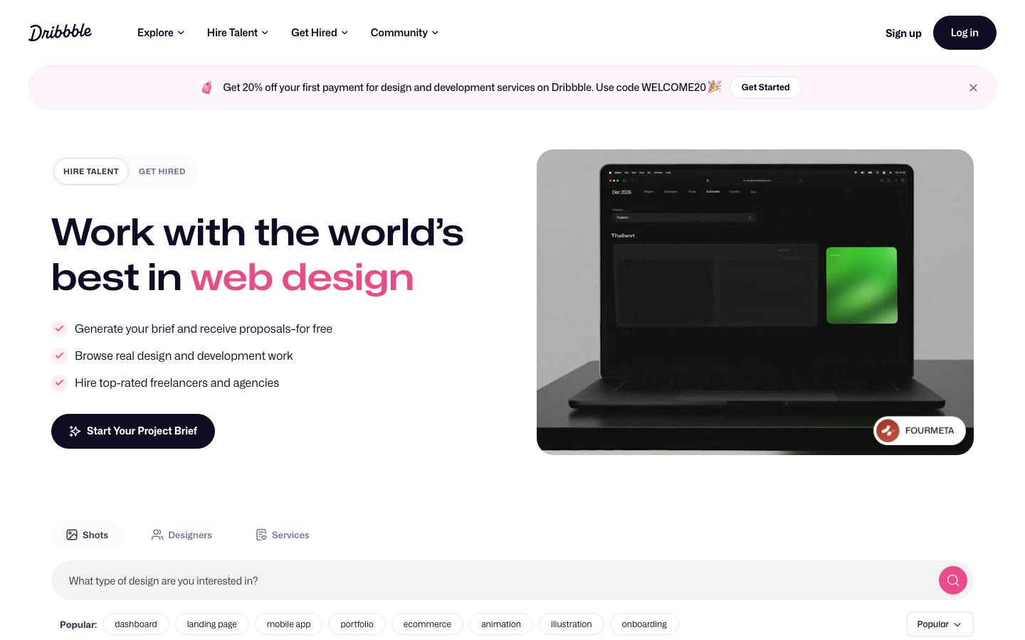
Started from
dribbble.comPreview
the remixed design systemSwitch between the rendered Visual preview and the Raw DESIGN.md.
Dribbble Remix
Remix of dribbble.com. The colors, fonts and shapes were edited in DesignMD. The token block above has the current values. The sections below were written for the original, so they may still mention it.
1. Visual Theme & Atmosphere
Dribbble's design system embodies a sophisticated, creative community identity that balances playful energy with professional polish. The visual language is anchored in deep, rich darks that evoke creativity and focus, complemented by striking pink-magenta accents that command attention and convey energy. The system feels modern and tech-forward, with generous whitespace and elegant typography that prioritizes clarity and readability. This is a design system built for showcasing creative work—clean, refined, and confident—while maintaining warm, approachable moments through strategic use of accent colors and vibrant call-to-action elements.
Key Characteristics
- Deep navy/charcoal dominates, creating visual depth and sophistication
- Vibrant pink (
#EA4C89,#D6336C) used sparingly for high-priority actions and emotional energy - Generous whitespace and breathing room throughout layouts
- Refined typography hierarchy with clear visual distinction between roles
- Subtle shadows and soft elevation for depth without heaviness
- Accessible contrast ratios across neutral and dark backgrounds
- Accent orange (
#FF9902) reserved for warnings and secondary CTAs
2. Color Palette & Roles
Primary
- Deep Navy (
#0D0C22): Primary background color, dominant UI surface; creates core brand identity - Ultra Dark (
#060318): Deepest background layer, used for contrast and depth separation - Black (
#000000): Strong contrast text, high-emphasis elements, brand outlines
Accent Colors
- Hot Pink (
#D6336C): Primary brand accent, hero highlights, emphasized text - Magenta (
#EA4C89): Secondary accent, floating action buttons, icon highlights - Periwinkle (
#3E34D3): Tertiary accent, interactive states, link emphasis
Interactive
- Amber (
#FF9902): Warning states, caution indicators, secondary CTAs
Neutral Scale
- Off-White (
#FFFFFF): Primary text on dark backgrounds, card surfaces, inverted text - Light Gray (
#E0E0E0): Secondary text, disabled states, muted labels - Pale Gray (
#E7E7E9): Light borders, subtle dividers - Silver (
#ECEBF0): Softer borders, form field backgrounds - Dark Gray (
#3A3546): Medium-emphasis text, section headers - Charcoal (
#655C7A): Tertiary text, hints, subdued information - Slate (
#524B63): Quaternary text, fine print, helper text
Surface & Borders
- Card Border (
#F3F3F4): Light card edges, subtle dividers on white surfaces - Muted Border (
#DBDBDE): Secondary borders, less prominent dividers - Softer Gray (
#DBDADE): Tertiary borders, form field outlines
3. Typography Rules
Font Family
- Primary: Mona Sans (
-apple-system, BlinkMacSystemFont, 'Segoe UI', Roboto, sans-serif) - Secondary: Amazon Ember (
-apple-system, BlinkMacSystemFont, 'Segoe UI', Roboto, sans-serif) - Fallback: Arial, sans-serif
Hierarchy
| Role | Font | Size | Weight | Line Height | Letter Spacing | Notes |
|---|---|---|---|---|---|---|
| Display XL | Mona Sans | 52px | 600 | 62.4px | Normal | Hero headlines, page titles |
| Display MD | Amazon Ember | 32px | 400 | 38.4px | Normal | Section introductions |
| H1 | Mona Sans | 24px | 700 | 29px | Normal | Card titles, major headings |
| H3 | Mona Sans | 16px | 700 | 20px | Normal | Subsection headings |
| H4 | Mona Sans | 15px | 700 | 17px | Normal | Small subsections |
| Body | Mona Sans | 14px | 500 | 19.6px | Normal | Primary body text |
| Body Secondary | Amazon Ember | 14px | 400 | 16.8px | Normal | Secondary information |
| Label | Mona Sans | 16px | 500 | 22px | Normal | Form labels, UI labels |
| Input | Mona Sans | 14px | 400 | 28px | Normal | Form input text |
| Link | Mona Sans | 16px | 400 | 28px | Normal | Navigation links |
| Link Bold | Mona Sans | 14px | 600 | 30px | Normal | Emphasized links |
| Button | Amazon Ember | 16px | 700 | Normal | Normal | Primary button text |
| Caption | Arial | 13.33px | 400 | Normal | Normal | Fine print, captions |
Principles
- Hierarchy is established through size and weight; use 52px for hero moments, 24px for card-level sections
- Body text defaults to 14px medium weight for optimal readability on both dark and light backgrounds
- Links use 16px regular weight for easy scanning; emphasize with 600 weight when needed for CTAs
- Form inputs use 14px regular to accommodate varied user input comfortably
- Maintain clear visual distinction: H1 (24px/700) vs. H3 (16px/700) vs. body (14px/500)
4. Component Stylings
Buttons
Primary Solid Button (Hot Pink)
- Background:
#EA4C89 - Text Color:
#FFFFFF - Font: Amazon Ember, 16px, 700
- Padding:
5px 30px - Border Radius:
2px - Border:
1px solid #EA4C89 - Height:
32px - Box Shadow: None
- Hover State: Opacity
0.88 - Active State:
#D6336Cbackground
Primary Solid Button (Rounded)
- Background:
#EA4C89 - Text Color:
#FFFFFF - Font: Mona Sans, 13px, 600
- Padding:
0px - Border Radius:
50% - Border:
1px solid #EA4C89 - Height:
40px - Width:
40px - Box Shadow: None
- Hover State: Opacity
0.9
Secondary Ghost Button
- Background:
rgba(0, 0, 0, 0) - Text Color:
#3A3546 - Font: Mona Sans, 14px, 600
- Padding:
0px 18.5px - Border Radius:
5.6px - Border: None
- Height:
40px - Box Shadow: None
- Hover State: Background
rgba(58, 53, 70, 0.08) - Active State: Background
rgba(58, 53, 70, 0.12)
Tertiary Text Button
- Background:
rgba(0, 0, 0, 0) - Text Color:
rgba(128, 126, 163, 0.6) - Font: Arial, 13.33px, 400
- Padding:
0px 12.8px - Border Radius:
0px - Border: None
- Height:
100% - Box Shadow: None
- Hover State: Color
rgba(128, 126, 163, 0.8)
Cards & Containers
Elevated Card
- Background:
#FFFFFF - Text Color:
#0D0C22 - Font: Mona Sans, 14px, 400
- Padding:
28px - Border Radius:
5.6px - Border:
1px solid #F3F3F4 - Box Shadow:
rgba(18, 22, 25, 0.02) 0px 1px 10px 0px - Line Height:
28px
Flat Container (No Border)
- Background:
rgba(0, 0, 0, 0) - Text Color:
#0D0C22 - Padding:
0px - Border Radius:
0px - Border: None
- Box Shadow: None
Circular Container
- Background:
rgba(0, 0, 0, 0) - Width:
60px - Height:
60px - Border Radius:
50% - Padding:
0px - Border: None
Inputs & Forms
Text Input Field
- Background:
rgba(0, 0, 0, 0)(transparent, with underline in real context) - Text Color:
#060318 - Font: Mona Sans, 14px, 400
- Padding:
0px 0px 0px 24px - Border Radius:
8.4px - Border: None (implicit 1px border in context)
- Height:
54px - Line Height:
28px - Focus State: Border
1px solid #3E34D3 - Placeholder Color:
rgba(6, 3, 24, 0.4)
Compact Input Field
- Background:
rgba(0, 0, 0, 0) - Text Color:
#060318 - Font: Mona Sans, 14px, 400
- Padding:
0px 0px 0px 24px - Border Radius:
8.4px - Border: None
- Height:
40px - Line Height:
28px - Focus State: Border
1px solid #3E34D3, Box Shadowrgba(62, 52, 211, 0.1) 0px 0px 0px 3px
Select Dropdown
- Background:
#FFFFFF - Text Color:
#060318 - Font: Mona Sans, 14px, 400
- Padding:
8px 12px - Border Radius:
4.2px - Border:
1px solid #DBDBDE - Height:
36px - Hover State: Border
1px solid #E0E0E0 - Focus State: Border
1px solid #3E34D3, Box Shadowrgba(62, 52, 211, 0.1) 0px 0px 0px 3px
Navigation
Primary Navigation Menu
- Background:
rgba(0, 0, 0, 0) - Text Color:
#060318 - Font: Mona Sans, 16px, 400
- Padding:
0px - Height:
30px - Line Height:
28px - Active State: Text Color
#EA4C89, Font Weight600 - Hover State: Text Color
#D6336C, Opacity0.9
Secondary Navigation Link
- Background:
rgba(0, 0, 0, 0) - Text Color:
#060318 - Font: Mona Sans, 14px, 600
- Padding:
0px 16px - Height:
30px - Border Radius:
0px - Border: None
- Line Height:
30px - Hover State: Background
rgba(234, 76, 137, 0.1)
Badges
Solid Badge
- Background:
#D6336C - Text Color:
#FFFFFF - Font: Mona Sans, 12px, 600
- Padding:
4px 12px - Border Radius:
2.8px - Border: None
- Height:
20px
Outline Badge
- Background:
rgba(0, 0, 0, 0) - Text Color:
#3A3546 - Font: Mona Sans, 12px, 600
- Padding:
4px 12px - Border Radius:
2.8px - Border:
1px solid #3A3546 - Height:
20px
5. Layout Principles
Spacing System
Base unit: 8px
Spacing scale:
4px: Micro-spacing for inline elements8px: Element padding, tight spacing12px: Form field padding16px: Card gap, component spacing20px: Section margin24px: Medium section spacing28px: Card padding32px: Container padding36px: Large padding40px: Extra-large padding52px: Hero section padding72px: Section separation
Usage contexts:
- Button padding:
5px 30px(internal),0px(circle buttons) - Card padding:
28px - Section padding:
52pxto72px - Gap between grid items:
16pxto24px - Form field gap:
12pxto16px
Grid & Container
- Max Width: Responsive; typically
1280pxfor content containers - Column Strategy: Flexible grid supporting 2, 3, or 4 columns depending on viewport
- Gutter:
16pxto24pxbetween columns - Section Pattern: Full-width sections with contained content inside; whitespace above/below
52pxto72px
Whitespace Philosophy
Generous whitespace is core to the design system. Cards and sections are separated by substantial vertical spacing (28px minimum, 52px typical). Horizontal padding on sections ensures content never touches viewport edges. This creates a spacious, uncluttered feel that emphasizes individual elements and reduces cognitive load.
Border Radius Scale
0px: Sharp edges (text buttons, minimal UI)2px: Slight rounding (action buttons like orange CTA)4px: Badge rounding, small component edges6px: Input field rounding, subtle curves5.6px: Card corners, medium container rounding12px: Large input fields, prominent rounding50%: Fully circular elements (avatar containers, circle buttons)
Border Widths
- Thin:
1px(button borders, card edges, input focus states) - Medium:
2px(emphasis borders, strong dividers) — inferred - Thick:
3px(prominent borders) — inferred
Primary usage:
- Card borders:
1px - Button borders:
1px - Input borders (focus):
1px - Dividers:
1px
6. Depth & Elevation
| Level | Treatment | Use |
|---|---|---|
| Base | No shadow | Body text, flat containers, base surfaces |
| Raised | rgba(6, 3, 24, 0.01) 0px 4px 4px 0px | Dropdown menus, modals |
| Card | rgba(18, 22, 25, 0.02) 0px 1px 10px 0px | Cards, panels, elevated containers |
| Floating | rgba(6, 3, 24, 0.1) 0px 2px 4px 0px | Buttons, interactive elements on hover |
| Deep | rgba(0, 0, 0, 0.15) 0px 8px 16px 0px | Modals, overlays, prominent floating elements |
Shadow Philosophy: Shadows are minimal and subtle, creating visual separation without heaviness. The system uses low-opacity shadows with small blur values to suggest elevation incrementally. Darker elements use softer shadows to avoid harsh contrast, while light surfaces use stronger shadows to stand out. Shadows reinforce hierarchy—base elements have no shadow, cards have subtle shadows, and floating actions have gentle shadows that increase on hover.
Opacity Levels
- 0% / Fully Transparent (
0.00): Hidden, inactive states - 28% / Muted (
0.28): Disabled text, reduced emphasis - 60% / Medium (
0.60): Secondary colors, tertiary text - 100% / Fully Opaque (
1.00): Active, emphasized, primary elements
Usage:
- Disabled button text:
rgba(color, 0.28) - Secondary text:
rgba(#3A3546, 0.60)torgba(#655C7A, 0.60) - Placeholder text:
rgba(#060318, 0.4) - Hover states: Increase opacity by
0.1to0.15from base
Z-index / Layering
- Base/Ground:
z-index: 1— Content, cards, sections - Elevated:
z-index: 2— Dropdowns, tooltips - Mid-Layer:
z-index: 5— Sticky header, persistent elements - Sticky:
z-index: 999— Navigation bar, sticky footer - Modal:
z-index: 9995— Modal backdrop/underlay - Modal:
z-index: 9996— Modal dialog - Modal:
z-index: 9997— Modal focus trap, keyboard interaction layer - Toast:
z-index: 10000— Toast notifications, alerts, topmost layer
Stacking strategy: Base elements sit at z: 1. Modals and overlays jump significantly to z: 9995+ to ensure nothing accidentally overlays them. Toasts sit at the absolute top (10000) to remain accessible at all times.
7. Do's and Don'ts
Do
- Use the deep navy (
#0D0C22,#060318) as dominant background for a sophisticated, focused user environment - Apply hot pink (
#EA4C89,#D6336C) sparingly and deliberately for primary CTAs and brand moments - Maintain generous whitespace (
28pxto72px) between major sections; it is a core part of the identity - Leverage the full typography hierarchy; don't collapse sizes or weights together
- Use
14pxas the default body text size for optimal readability across devices - Apply subtle shadows (
0px 1px 10px 0pxfor cards) to create depth without overwhelming - Stack form fields vertically with
16pxgap; inputs should feel spacious and accessible - Reserve orange (
#FF9902) for warnings and secondary actions only - Use the light gray (
#E0E0E0) for disabled states and secondary labels - Ensure 4.5:1 contrast ratio minimum on all text for accessibility; test against dark and light backgrounds
Don't
- Don't overuse pink/magenta; it should punctuate the interface, not dominate it
- Don't reduce padding below
8pxor gaps below16px; the system is built on generous spacing - Don't use shadows heavier than
rgba(18, 22, 25, 0.02) 0px 1px 10px 0pxfor standard elements - Don't collapse the typography hierarchy; maintain clear size/weight distinction between roles
- Don't apply border radius greater than
8.4pxon inputs or5.6pxon cards without strategic intent - Don't place text directly against dark backgrounds without 80+ WCAG contrast
- Don't override the primary font (Mona Sans) with non-system fonts outside documented fallbacks
- Don't mix multiple accent colors in a single component; choose one per interaction moment
- Don't reduce line height below
1.4xfont size for body text - Don't apply animations longer than
300msfor microinteractions; keep the interface snappy
8. Responsive Behavior
Breakpoints
| Name | Width | Key Changes |
|---|---|---|
| Mobile | 320px–479px | Single column, full-width cards, touch targets 48px, padding 16px, stacked nav |
| Small | 480px–767px | Single or 2-column layouts, card width 100% or calc(50% - 8px) |
| Tablet | 768px–1023px | 2–3 column grid, container max-width 720px, nav horizontal |
| Desktop | 1024px–1439px | 3–4 column grid, container max-width 1024px, full navigation |
| Wide | 1440px+ | 4-column grid, container max-width 1280px, expanded sidebars |
Touch Targets
- Minimum touch size:
48px × 48pxfor all interactive elements on mobile - Button height:
40pxto48pxdepending on priority and context - Spacing between targets: Minimum
12pxto prevent mis-taps - Link padding:
8pxvertical,12pxhorizontal minimum - Input field height:
54pxon mobile,40pxon desktop for comfortable input
Collapsing Strategy
- Navigation: Hamburger menu on mobile (breakpoint <
768px); horizontal nav on tablet+ - Cards: Full width on mobile; 2-column on tablet; 3–4 column on desktop
- Padding:
16pxon mobile,24pxon tablet,32pxon desktop - Typography: Reduce heading sizes by 4–8px on mobile (e.g., H1: 32px → 20px)
- Modals: Full-screen on mobile; centered with max-width
600pxon desktop - Images:
100%width on mobile with aspect ratio containers; fixed widths on desktop - Spacing: Reduce vertical gaps by 25% on mobile to maximize content visibility
9. Agent Prompt Guide
Quick Color Reference
- Primary CTA: Hot Pink (
#EA4C89) — use for primary buttons, focal points - Background (Dark): Deep Navy (
#0D0C22) — dominant background, primary surface - Background (Light): White (
#FFFFFF) — card surfaces, inverted text areas - Heading Text: Deep Navy (
#0D0C22) or Black (#000000) — maximum contrast - Body Text: Off-White (
#FFFFFF) on dark, Deep Navy (#0D0C22) on light - Secondary Text: Light Gray (
#E0E0E0) — subtle information, labels - Borders: Card Border (
#F3F3F4) or Muted Border (#DBDBDE) — dividers, edges - Warning/Alert: Amber (
#FF9902) — caution, secondary CTAs - Accent (Tertiary): Periwinkle (
#3E34D3) — interactive states, link emphasis - Disabled: Light Gray (
#E0E0E0) at 28% opacity — inactive elements
Iteration Guide
-
Start with navy backgrounds (
#0D0C22or#060318) for major UI sections; this establishes the Dribbble brand immediately. -
Reserve hot pink (
#EA4C89,#D6336C) for exactly one primary CTA per screen; don't pepper it throughout. Use sparingly. -
Set typography base to Mona Sans at 14px/500 for body, 24px/700 for section H1s, and 16px/400 for links. Maintain this hierarchy strictly.
-
Space components generously: Cards
28pxpadding, sections52px–72pxseparation, form fields16pxgap. Whitespace is not wasted—it's intentional. -
Apply subtle shadows (
rgba(18, 22, 25, 0.02) 0px 1px 10px 0px) to elevated cards only; avoid heavy shadows that flatten the interface. -
Use border radius consistently: Inputs
8.4px, cards5.6px, buttons5.6pxor50%for circles, badges2.8px. No rounding >8.4pxunless circular. -
Ensure contrast: Dark text on light (
#0D0C22on#FFFFFF= 17:1 ✓), light text on dark (#FFFFFFon#0D0C22= 17:1 ✓). Test with contrast checker. -
Build responsive touch targets at
48pxminimum on mobile; reduce to40pxon desktop if space-constrained. Always include minimum12pxspacing between interactive elements. -
Implement layering via z-index: Base (
1), sticky nav (999), modals (9996), toasts (10000). No gaps in the middle; this keeps stacking predictable. -
Test opacity states: Disabled text at
rgba(color, 0.28), hover states at0.88–0.9opacity. Opacity shifts should feel smooth, not jarring.
Make it yours
Change the colors, fonts and corners of Dribbble Remix, and save your own DESIGN.md. Free.
Remix history
Where it came from
Discover · Aug 9, 2026
- Dribbble RemixThis remix
Remix · by Saad B. · Oct 28, 2026
Remixed from this
No public remixes yet. Be the first to make one.
Remix it