
Plan, write and ship in one place. Every page in your workspace follows the same design system, so nothing drifts.
Fast by default
Pages load in under a second, with nothing to configure.
Built for teams
Shared spaces, comments and roles that match how you work.
Secure from day one
SSO, audit logs and encryption at rest on every plan.
Create your account
Send me product updatesCreate accountnpm install @northwind/sdk
Pro
- Unlimited pages
- Version history
- Priority support
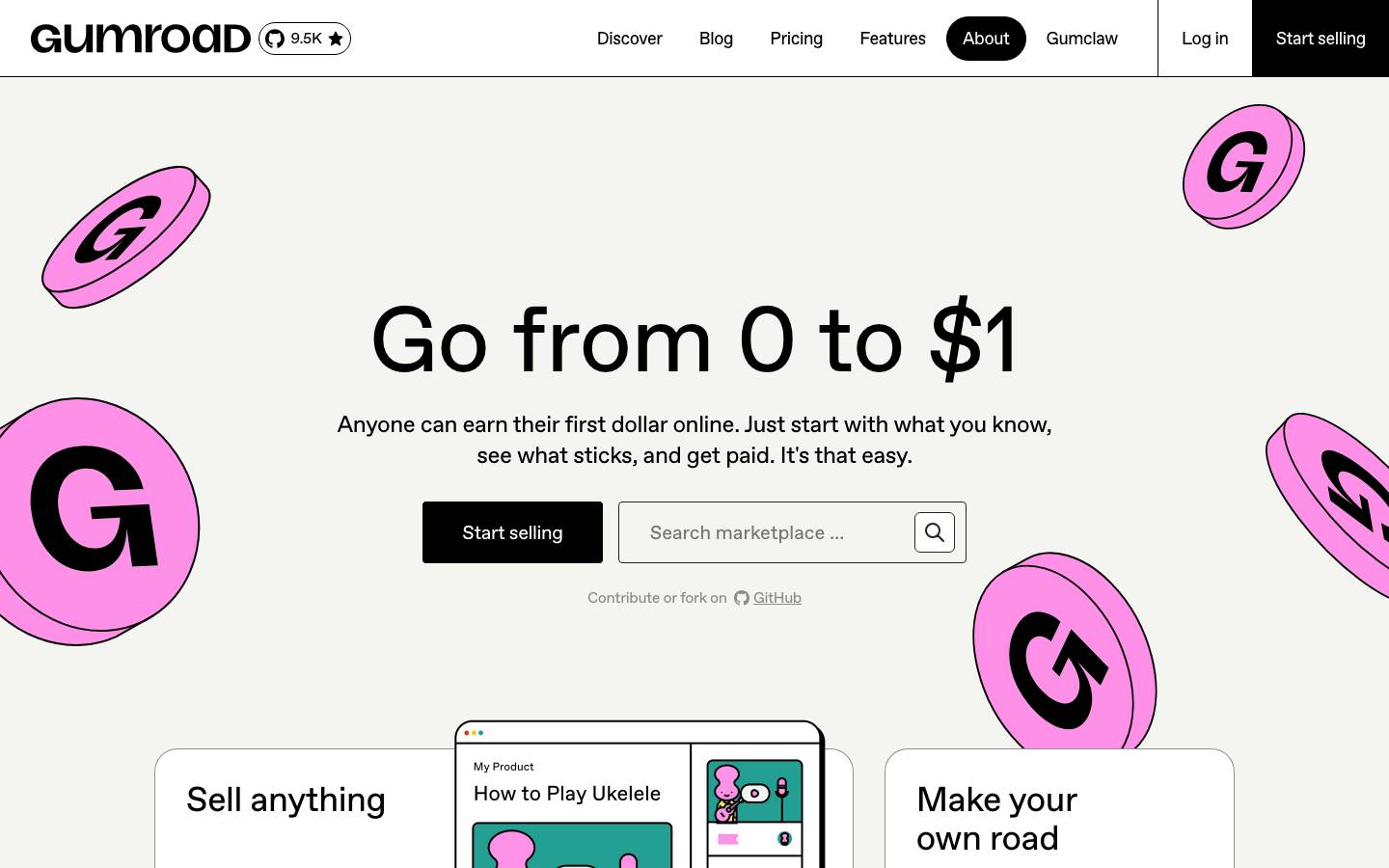
Started from
gumroad.comPreview
the remixed design systemSwitch between the rendered Visual preview and the Raw DESIGN.md.
Dryan Lab · A+B Lab Pop
Remix of gumroad.com. The colors, fonts and shapes were edited in DesignMD. The token block above has the current values. The sections below were written for the original, so they may still mention it.
1. Visual Theme & Atmosphere
Gumroad's design system embodies playful accessibility and entrepreneurial optimism. The visual identity combines bold, saturated accent colors—particularly vibrant magenta and electric yellow—with a clean, minimalist foundation of pure black and white. This creates a youthful yet professional aesthetic that feels approachable for first-time sellers while maintaining credibility. The system embraces high contrast, generous whitespace, and deliberately simple components that prioritize clarity over decoration. Illustrated 3D coin and document motifs add personality and warmth, humanizing the financial transaction narrative. The overall mood is confident, transparent, and empowering—designed to inspire action and reduce friction for users earning their first dollar online.
Key Characteristics
- Bold, saturated accent palette (magenta, yellow, blue) against neutral foundations
- High-contrast typography for legibility and hierarchy
- Minimalist component styling with clean borders and subtle shadows
- Generous whitespace and spacious layouts
- Playful illustration elements (coin graphics, document icons) for personality
- Direct, transparent communication through typography and color
- Accessible color combinations with strong visual separation
- Professional yet approachable and welcoming tone
2. Color Palette & Roles
Primary
- Black (
#000000): Primary text, dominant UI element background, high-emphasis content (used 3800 times—core to the system) - White (
#FFFFFF): Primary background, card surfaces, contrast surface for dark text (used 782 times)
Accent Colors
- Magenta (
#FF90E8): Primary brand accent, call-to-action elements, hero sections, emphasis highlights - Yellow (
#FFC900): Secondary accent, warning and alert states, section dividers, visual excitement - Light Yellow (
#F1F333): Bright highlight, secondary warning indicator - Orange Warning (
#F3A642): Tertiary warning tone, milder alert states
Interactive
- Periwinkle (
#90A8ED): Interactive states, hover feedback, secondary CTAs, subtle interactive affordance (used 23 times) - Blue Primary (
#4087FC): Links, hover states, secondary interactive elements - Deep Blue (
#625BF6): Tertiary interactive state, accent on dark backgrounds - Navy (
#00457C): Darker interactive emphasis, high-contrast interactive text - Facebook Blue (
#4267B2): Social integration, secondary link treatment
Neutral Scale
- Dark Gray (
#242423): Secondary text, subtle borders, disabled states (used 103 times) - Light Gray (
#F4F4F0): Subtle background tints, very light surface variation (used 20 times) - Pale Gray (
#F0F0F0): Additional surface variation, minimal contrast backgrounds (used 6 times) - Medium Gray (
#8A8A85): Tertiary text, placeholder text, secondary UI elements (used 6 times)
Surface & Borders
- White Surface (
#FFFFFF): Default card and container background, form field backgrounds - Off-White (
#F4F4F0): Input backgrounds, subtle container fills - Black Border (
#000000): Primary border stroke, strong visual separation
Semantic / Status
- Error Red (
#DC341E): Error states, critical alerts, destructive actions (used 11 times) - Warning Yellow (
#FFC900): Warning alerts, non-critical notices - Warning Light (
#F1F333): Secondary warning highlight
3. Typography Rules
Font Family
Primary Font: ABC Favorit (with fallback Arial, sans-serif)
- Used for all headings, body text, buttons, and navigation
- Provides consistent, modern sans-serif aesthetic
- Supports weights: 400 (Regular), 500 (Medium), 700 (Bold)
Fallback Stack: ABC Favorit, Arial, -apple-system, BlinkMacSystemFont, 'Segoe UI', sans-serif
Hierarchy
| Role | Font | Size | Weight | Line Height | Letter Spacing | Notes |
|---|---|---|---|---|---|---|
| Display Large | ABC Favorit | 96px | 500 | 86.4px | 0 | Hero headlines, main page titles |
| Display Medium | ABC Favorit | 96px | 400 | 96px | 0 | Alternative hero treatment |
| Display Small | ABC Favorit | 72px | 400 | 72px | 0 | Large section headers |
| Heading 1 | ABC Favorit | 60px | 500 | 60px | 0 | Major section titles |
| Heading 2 | ABC Favorit | 48px | 400 | 60px | 0 | Sub-section headers |
| Heading 3 Large | ABC Favorit | 48px | 500 | 48px | 0 | Feature cards, prominent subsections |
| Heading 3 Medium | ABC Favorit | 36px | 400 | 45px | 0 | Secondary subsection headers |
| Heading 3 Small | ABC Favorit | 24px | 700 | 32px | 0 | Tertiary headers, bold emphasis |
| Heading 4 | ABC Favorit | 18px | 700 | 28px | 0 | Component headers, list titles |
| Body Large | ABC Favorit | 24px | 400 | 32px | 0 | Large body text, prominent copy |
| Body Regular | ABC Favorit | 16px | 400 | 24px | 0 | Standard paragraph text |
| Body Medium Emphasis | ABC Favorit | 16px | 500 | 16px | 0 | Emphasized inline text, labels |
| Body Small | ABC Favorit | 18px | 400 | 28px | 0 | List items, secondary body text |
| Input Text | ABC Favorit | 20px | 400 | 28px | 0 | Form input placeholder and value text |
| Caption | ABC Favorit | 13.3333px | 400 | normal | 0 | Fine print, meta information |
Principles
- Hierarchy through weight and size: Bold weights (700, 500) are reserved for headlines and emphasis; regular weight (400) dominates body copy.
- Generous line heights: Body text uses 150% line height (1.5) for comfort; headlines use tighter spacing aligned to the baseline grid.
- ABC Favorit as primary: All typographic roles default to ABC Favorit for consistency; Arial is only used as a system fallback in edge cases.
- Contrast-driven: Large, bold headlines (48px–96px) create visual hierarchy against lighter body text (16px–24px).
- Accessible sizing: Minimum body text size is 16px; inputs are sized at 20px for legibility and touch target compatibility.
4. Component Stylings
Buttons
Primary Button (CTA)
- Background:
#FF90E8(Magenta) - Text Color:
#000000(Black) - Font: ABC Favorit, 16px, 400
- Padding:
0px 24px(vertical 0, horizontal 24px) - Border Radius:
8px - Border:
1px solid #000000(Black) - Height:
48px - Line Height:
24px - Box Shadow: none
- Hover State: Opacity
0.90, maintain border
Secondary Button (Light)
- Background:
#FFFFFF(White) - Text Color:
#000000(Black) - Font: Arial, 13.3333px, 400
- Padding:
8px 8px - Border Radius:
12px - Border:
1px solid #242423(Dark Gray) - Height:
42px - Width:
42px - Box Shadow: none
- Hover State: Background opacity
0.90
Ghost Button (Minimal)
- Background:
rgba(0, 0, 0, 0)(Transparent) - Text Color:
#000000(Black) - Font: ABC Favorit, 16px, 400
- Padding:
0px 0px - Border Radius:
0px - Border: none
- Height:
32pxor26px(context-dependent) - Box Shadow: none
- Hover State: Text color changes to
#90A8ED(Periwinkle)
Icon Button (Circular)
- Background:
#000000(Black) orrgba(0, 0, 0, 0)(Transparent) - Text Color:
#000000(Black, if transparent background) - Font: ABC Favorit, 16px, 400
- Padding:
0px 0px - Border Radius:
3.35544e+07px(Fully rounded / circle) - Border:
1px solid #000000(Black) - Height:
16px - Width:
16px - Box Shadow: none
Cards & Containers
Default Card
- Background:
rgba(0, 0, 0, 0)(Transparent) or#FFFFFF(White) - Text Color:
#000000(Black) - Font: ABC Favorit, 16px, 400
- Padding:
0px 0px(varies by context; often none for full-bleed sections) - Border Radius:
0px(sharp edges; no rounding) - Border: none or
1px solid #000000(minimal borders) - Box Shadow: none
- Line Height:
26px - Typical dimensions: flexible width, varies by layout
Elevated/Featured Card
- Background:
#FF90E8(Magenta) for featured containers - Text Color:
#000000(Black) - Padding:
24pxto56px(varies by content) - Border Radius:
8pxor12px - Border:
1px solid #000000(optional, for definition) - Box Shadow: Custom offset shadow
rgb(0, 0, 0) 4px 4px 0px 0px(for depth)
Inputs & Forms
Text Input (Default)
- Background:
#F4F4F0(Off-White) - Text Color:
#000000(Black) - Font: ABC Favorit, 20px, 400
- Padding:
0px 32px(vertical 0, horizontal 32px left; right adjusted for icon space) - Border Radius:
8px - Border:
1px solid #242423(Dark Gray) - Height:
64px - Line Height:
28px - Box Shadow: none
- Placeholder Color:
#8A8A85(Medium Gray) - Focus State: Border color changes to
#4087FC(Blue Primary), background remains#F4F4F0
Text Input (Dark/Inverted)
- Background:
rgba(0, 0, 0, 0)(Transparent) - Text Color:
#FFFFFF(White) - Font: ABC Favorit, 16px, 400
- Padding:
0px 16px - Border Radius:
8px - Border:
1px solid oklab(0.999994 0.0000455678 0.0000200868 / 0.3)(White with 30% opacity) - Height:
48px - Line Height:
24px - Focus State: Border opacity increases to 100%
Search Input (Compact)
- Background:
#FFFFFF(White) - Text Color:
#000000(Black) - Font: ABC Favorit, 16px, 400
- Padding:
12px 16px - Border Radius:
8px - Border:
1px solid #000000(Black) - Height:
48px - Line Height:
22px - Placeholder Color:
#8A8A85(Medium Gray)
Navigation
Nav Link (Default)
- Background:
rgba(0, 0, 0, 0)(Transparent) - Text Color:
#000000(Black) - Font: ABC Favorit, 16px, 400
- Padding:
0px 0px - Border Radius:
0px(no rounding) - Border: none
- Line Height:
26px - Hover State: Text color changes to
#90A8ED(Periwinkle) - Active State: Font weight becomes
500(Medium), color remains#000000
Nav Link (Rounded Button Style)
- Background:
rgba(0, 0, 0, 0)(Transparent) - Text Color:
#000000(Black) - Font: ABC Favorit, 16px–18px, 400
- Padding:
6px 6pxor8px 16px - Border Radius:
3.35544e+07px(Fully rounded) - Border:
1px solid #000000(Black outline) - Height:
34pxor46px(varies by variant) - Line Height:
26pxor28px - Hover State: Background becomes
#000000, text becomes#FFFFFF
Nav Link (Active Highlight)
- Background:
#000000(Black) - Text Color:
#FFFFFF(White) - Font: ABC Favorit, 18px, 400
- Padding:
8px 16px - Border Radius:
3.35544e+07px(Fully rounded) - Height:
46px - Line Height:
28px
5. Layout Principles
Spacing System
- Base Unit:
4px(micro-interactions, fine adjustments) - Minor Scale:
8px(gaps between small elements),12px(compact padding),16px(standard padding) - Medium Scale:
24px(moderate spacing),32px(section padding),40px(medium gaps) - Major Scale:
56px(large padding),64px(large gaps),96px(margin between major sections),128px(padding for hero sections) - Full Scale:
172px(max spacing for separated content blocks)
Usage Context:
8px–12px: Button/input internal padding, tight component spacing16px–24px: Standard section padding, moderate gaps32px–64px: Feature spacing, card gaps in grids96px–172px: Hero sections, full-width spacing between distinct page areas
Grid & Container
- Max Width: Container-based layouts without a strict fixed max-width; sections adapt to viewport
- Column Strategy: Flexible, responsive columns; appears to use CSS Grid or Flexbox with 1–3 columns depending on breakpoint
- Section Patterns: Full-width hero sections (often with background colors like
#FFC900or#FF90E8), centered content containers with generous horizontal padding, grid-based feature cards
Whitespace Philosophy
Gumroad embraces abundant whitespace to reduce cognitive load and guide user attention. Large vertical gaps (64px–172px) separate distinct content sections. Horizontal padding is generous (32px–128px on large screens). Typography is large and spaced well vertically (line-height 1.5 on body text). This approach creates a breathing, premium feel that avoids visual clutter and prioritizes one action per screen.
Border Radius Scale
- Sharp:
0px(default for most containers, buttons, and inputs) - Subtle Rounding:
8px(buttons, inputs, slightly rounded containers) - Medium Rounding:
6px(secondary buttons, refinement) - Full Circle:
3.35544e+07px(icon buttons, circular link badges, fully rounded pill shapes)
Border Widths
- Thin (Outline):
1px(standard borders for buttons, inputs, and card definitions) - All borders in the system use
1pxstroke width; no thicker borders observed
6. Depth & Elevation
| Level | Treatment | Use |
|---|---|---|
| Base | No shadow | Default backgrounds, most surfaces |
| Lifted | Custom offset rgb(0, 0, 0) 4px 4px 0px 0px | Featured cards, CTA sections, elevated components |
| Interactive | Shadow + opacity change on hover | Buttons, clickable cards |
| Modal/Overlay | Implied (not explicitly extracted) | Modals, dropdowns, sticky elements above base content |
Shadow Philosophy:
The system employs a deliberate, minimal approach to shadows. Rather than soft, diffuse shadows, Gumroad uses a hard offset shadow (4px 4px 0px) that creates a playful, graphic quality. This "cut-out" style reinforces the youthful, bold aesthetic and maintains legibility without introducing visual softness. Shadows are used sparingly—primarily on featured cards and CTAs—to avoid visual noise.
Opacity Levels
- Full Opacity:
1.0(100%) – default for all text and primary UI elements - Strong Opacity:
0.90(90%) – hover states on buttons and interactive elements; maintains visibility while indicating state change - Disabled/Muted: Would typically be
0.5(50%) or lower, though not explicitly extracted; infer for disabled input states
Z-index / Layering
- Base Layer:
z-index: 1– default background and foundational content - Elevated Layer:
z-index: 2– floating elements, cards above base - High Layer:
z-index: 3– prominent floating content - Dropdown/Popover:
z-index: 10– dropdown menus - Overlay Layer:
z-index: 20– overlay backgrounds, secondary modals - Modal/Dialog:
z-index: 50– primary modals, critical overlays - Sticky/Fixed:
z-index: 100– sticky headers, persistent navigation
7. Do's and Don'ts
Do
- Use bold, saturated accent colors (
#FF90E8magenta,#FFC900yellow) on white backgrounds for maximum contrast and visual impact - Prioritize large, readable typography – headlines start at 48px; body text is never below 16px
- Apply the 4px offset shadow (
rgb(0, 0, 0) 4px 4px 0px) to featured sections and elevated components for playful depth - Maintain high contrast between text and background; always use
#000000text on light surfaces and#FFFFFFon dark - Use abundant whitespace – minimum 64px vertical spacing between major sections
- Apply 90% opacity on hover for interactive feedback without color change
- Embrace sharp edges (
0pxor8pxborder radius) to maintain the clean, graphic aesthetic - Stack elements with clear visual hierarchy using type weight and size changes
- Include illustrative elements (coins, documents, icons) to humanize financial concepts
Don't
- Don't use thin, decorative fonts – stick to ABC Favorit (or Arial fallback) for all typography
- Don't mix too many accent colors in a single view; limit to one or two per section
- Don't reduce type size below 16px for body text or below 13.3333px for captions
- Don't apply soft, blurred shadows – use only the hard offset shadow treatment
- Don't add unnecessary border radius – keep containers sharp (0px) unless specifically a button or rounded element
- Don't use low-contrast color combinations (e.g., gray text on white); always verify WCAG AA contrast
- Don't overcrowd layouts – respect the spacing system and allow cards/sections to breathe
- Don't deviate from the primary font stack without strong justification; system cohesion depends on ABC Favorit
- Don't use opacity for primary interactions – only for hover feedback (0.90)
- Don't forget the offset shadow on featured and CTA components; it's a signature element
8. Responsive Behavior
Breakpoints
| Breakpoint Name | Width | Key Changes |
|---|---|---|
| Mobile | < 640px | Single-column layout, reduced padding (24px–32px), increased touch target sizes to 48px minimum, font sizes remain constant, full-width sections |
| Tablet | 640px–1024px | Two-column grids for feature cards, moderate padding (40px–56px), navigation shifts to abbreviated labels or icons, input widths become 100% of container |
| Desktop | > 1024px | Multi-column layouts (2–3 columns), generous padding (64px–128px), full-width hero sections with horizontal padding, flex/grid-based card layouts, large typography remains unchanged |
Touch Targets
- Minimum Size:
48px × 48px(buttons, interactive icon buttons) - Standard Button Height:
48px(large) or42px(compact) - Navigation Link Padding: Minimum
8pxfor clickable area (inferred from 34px total height) - Form Input Height:
64px(primary search),48px(secondary input) - Spacing Between Touchable Elements: Minimum
8pxgap to prevent accidental activation
Collapsing Strategy
- Navigation: Primary nav links remain visible on desktop; collapse to hamburger menu or abbreviated labels on mobile
- Cards: Full-width single column on mobile; 2 columns at tablet; 3+ columns at desktop
- Typography: Font sizes remain constant across breakpoints (no reduction below 16px body); line heights remain generous
- Padding: Horizontal padding reduces from 128px (desktop) → 64px (tablet) → 32px (mobile); vertical padding remains generous throughout
- Hero Sections: Full-width colored backgrounds; content centers and reflows to accommodate mobile viewports
- Forms: Input fields become full-width on mobile; remain constrained on desktop
- Spacing: Large vertical gaps (96px–172px) reduce to 64px on tablet, 40px–56px on mobile
9. Agent Prompt Guide
Quick Color Reference
- Primary CTA Background: Magenta (
#FF90E8) - CTA Text: Black (
#000000) - Primary Background: White (
#FFFFFF) - Primary Text: Black (
#000000) - Heading Text: Black (
#000000) - Secondary Accent: Yellow (
#FFC900) - Interactive Hover: Periwinkle (
#90A8ED) - Borders: Black (
#000000) - Disabled/Muted: Dark Gray (
#242423) - Input Background: Off-White (
#F4F4F0) - Error States: Error Red (
#DC341E) - Warning States: Yellow (
#FFC900)
Iteration Guide
- All typography must use ABC Favorit (fallback Arial) in weights 400 (regular), 500 (medium), or 700 (bold); minimum body text size is 16px.
- Color contrast is non-negotiable: Black text on white/light backgrounds; white text on black/dark backgrounds; always verify WCAG AA compliance.
- Apply the signature hard offset shadow (
rgb(0, 0, 0) 4px 4px 0px 0px) only to featured cards and elevated CTAs; omit from standard UI. - Border radius is minimal: Use
0pxfor containers and cards,8pxfor buttons and inputs, and3.35544e+07px(full circle) for icon buttons and rounded badges. - Maintain generous whitespace: Vertical spacing between sections is 64px–172px on desktop; horizontal padding is 32px–128px; this breathing room is essential to the aesthetic.
- Button styling is consistent: Primary buttons are magenta (
#FF90E8) with black text and a 1px black border; secondary buttons are white with dark gray border; ghost buttons are transparent. - Input fields have fixed dimensions: Primary search input is 64px tall with 20px font; standard inputs are 48px tall with 16px font; all have 8px border radius and dark gray borders.
- Interactive feedback uses 90% opacity: On hover, apply
opacity: 0.90to buttons; do not change colors unless specified (e.g., nav links shift to periwinkle on hover). - Responsive scaling follows breakpoints: Mobile < 640px (single column, 32px padding), Tablet 640–1024px (2 columns, 56px padding), Desktop > 1024px (3+ columns, 128px padding).
- Icons and illustrations are a key brand element: Incorporate 3D coin graphics and document icons in accent colors to humanize the financial/selling narrative; use them as visual anchors in hero sections.
Make it yours
Change the colors, fonts and corners of Dryan Lab · A+B Lab Pop, and save your own DESIGN.md. Free.
Remix history
Where it came from
Discover · Aug 9, 2026
- Dryan Lab · A+B Lab PopThis remix
Remix · by alejanro H. · Nov 5, 2026
Remixed from this
No public remixes yet. Be the first to make one.
Remix it