
Plan, write and ship in one place. Every page in your workspace follows the same design system, so nothing drifts.
Fast by default
Pages load in under a second, with nothing to configure.
Built for teams
Shared spaces, comments and roles that match how you work.
Secure from day one
SSO, audit logs and encryption at rest on every plan.
Create your account
Send me product updatesCreate accountnpm install @northwind/sdk
Pro
- Unlimited pages
- Version history
- Priority support
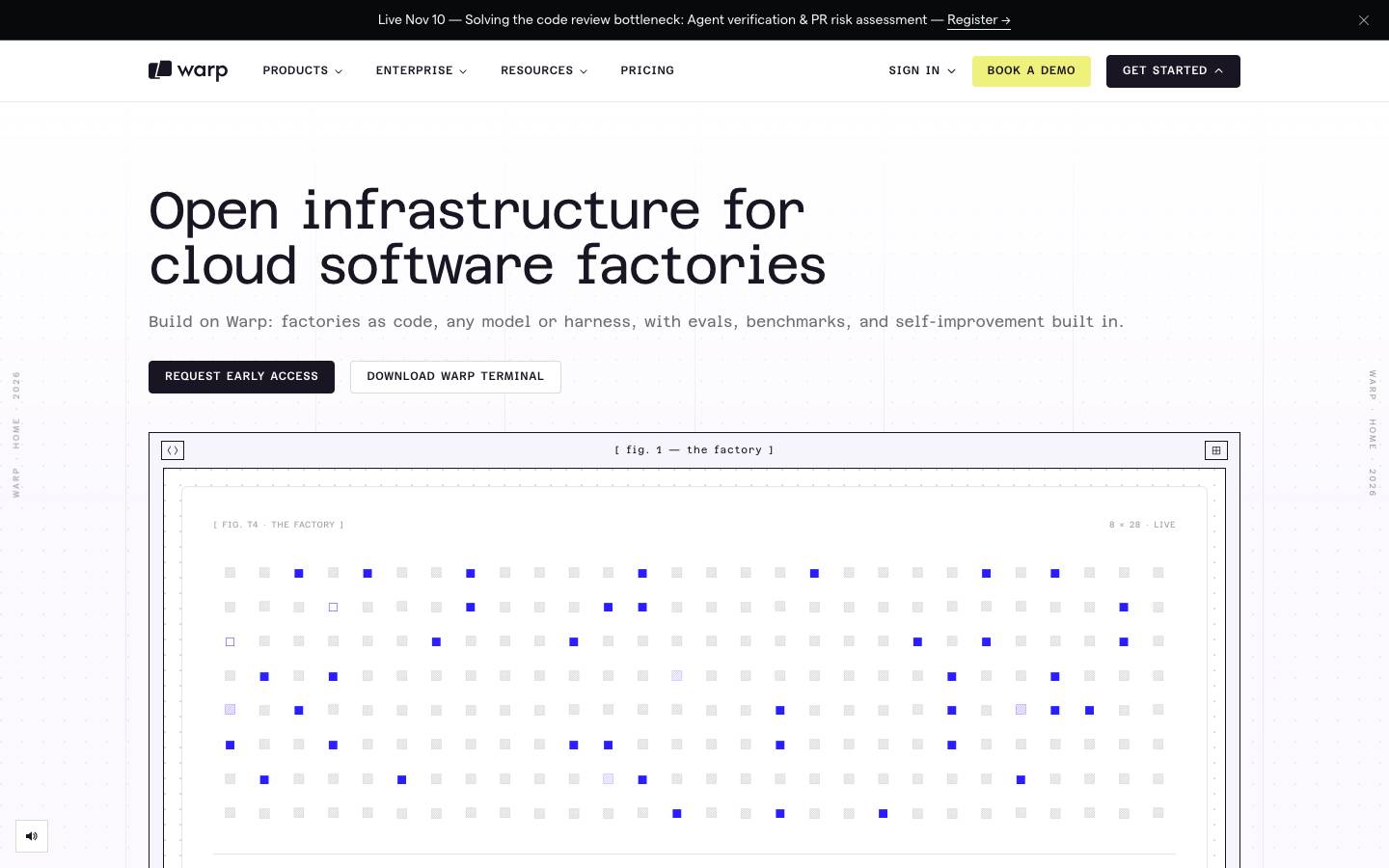
Started from
warp.devPreview
the remixed design systemSwitch between the rendered Visual preview and the Raw DESIGN.md.
Dryan Lab · A Laboratorio Nocturno
Remix of Warp. The colors, fonts and shapes were edited in DesignMD. The token block above has the current values. The sections below were written for the original, so they may still mention it.
1. Visual Theme & Atmosphere
Warp's design system embodies a developer-first, forward-thinking aesthetic rooted in precision and clarity. The palette is predominantly light and neutral, anchored by a distinctive lavender-purple accent that signals interactivity and brand presence without overwhelming the interface. Typography favors geometric, technical typefaces alongside clean sans-serif rendering, creating a hierarchy that feels both modern and purposeful. The visual atmosphere is minimalist yet purposeful: generous whitespace, carefully considered colour blocking, and restrained use of depth through shadow rather than excessive layering. The brand celebrates open infrastructure and clarity—interfaces are uncluttered, text breathes, and interactions feel direct and responsive. This is design for engineers: functional, honest, and free of decoration that doesn't serve clarity.
Key Characteristics
- Light, neutral canvas (
{colors.canvas}—#0F0B1A) with strategic lavender accents ({colors.primary}—#6C5CFF) - Geometric and monospaced typefaces paired with ergonomic body fonts
- Minimal use of shadow and elevation; depth through colour and contrast
- Generous whitespace and negative space throughout
- Precision in typography metrics: intentional letter-spacing, especially on display sizes
- Direct, no-nonsense component design with sharp edges and pill-shaped interactive elements
- Brand surface (
{colors.surface-alt}—#2A1EFF) used sparingly as alternating section blocks
2. Color Palette & Roles
Primary
- Brand Accent (
{colors.primary}—#6C5CFF): Primary CTAs, active states, brand mark, hero bands, and interactive elements. Lavender-purple providing warmth and energy without aggression.
Interactive
- Call-to-Action Fill (derived from
{colors.primary}): Secondary buttons and links inherit the brand accent for consistency across clickable surfaces.
Neutral Scale
- Canvas (
{colors.canvas}—#0F0B1A): Default page background, card surfaces, and neutral content areas. A near-white with imperceptible warm undertone. - Ink / On Primary (
{colors.on-primary}—#1A1522): Primary heading and body text colour; label colour on brand-coloured surfaces. Deep charcoal-black for maximum legibility.
Surface & Bands
- Surface Alt (
{colors.surface-alt}—#2A1EFF): Alternating section background for visual rhythm; strong cobalt-blue for high contrast and brand differentiation. - Neutral Decorative (
{colors.neutral-1}—#000000): Pure black reserved for specific UI elements and technical components where maximum contrast is required.
Semantic / Status
No semantic colour ramp (error, warning, success, info) was measured on the site. Error and success states, if present, are not exposed in markup or CSS. See Known Gaps.
3. Typography Rules
Font Family
Primary: Inter
- Fallback stack:
Inter, -apple-system, BlinkMacSystemFont, 'Segoe UI', sans-serif - Used for body text, navigation, labels, and most UI copy.
Secondary: TheFuture
- Fallback stack:
Space Grotesk, Georgia, serif - Reserved for large display and heading sizes, introducing geometric personality.
Monospace: JetBrains Mono, Azeret Mono, matterMono
- Fallback stack:
JetBrains Mono, 'Courier New', monospace - Used for code blocks, buttons, badges, and technical labels.
Hierarchy
| Role | Font | Size | Weight | Line Height | Letter Spacing | Notes |
|---|---|---|---|---|---|---|
| Display XL | Space Grotesk | 72px | 400 | 1.1 | -2.52px | Hero headlines, page title |
| Display LG | Space Grotesk | 60px | 400 | 1.05 | 0px | Large section headings |
| Display SM | Inter | 48px | 600 | 1 | -1.2px | Mid-scale display copy |
| Display MD | Space Grotesk | 50.4px | 400 | 1.25 | -1.76px | Alternative large heading |
| Heading LG | Inter | 30px | 600 | 1.1 | 0px | Section heading |
| Heading MD | Space Grotesk | 24px | 400 | 1.33 | -0.6px | Subsection heading |
| Heading MD Strong | Space Grotesk | 24px | 500 | 1.65 | -0.48px | Emphasized subsection |
| Heading MD Tight | Space Grotesk | 24px | 400 | 1.2 | -0.84px | Compressed subsection |
| Heading SM | Inter | 20px | 600 | 1.38 | 0px | Card title, component heading |
| Heading XS | Inter | 14px | 600 | 1.71 | 0px | Small component label |
| Body MD | Inter | 16px | 400 | 1.5 | 0px | Default paragraph text |
| Body MD Strong | Inter | 16px | 600 | 1.5 | 0px | Emphasized paragraph |
| Body MD Tight | Inter | 16px | 700 | 1.25 | 0px | Bold paragraph (high weight) |
| Body SM | Inter | 14px | 400 | 1.5 | 0px | Secondary body copy, metadata |
| Body SM Strong | Inter | 14px | 500 | 1.71 | 0px | Emphasized small text |
| Body SM Loose | Inter | 14px | 400 | 1.71 | 0px | List item copy with generous line height |
| Button MD | Inter | 16px | 400 | 1.75 | 0px | Medium button label |
| Button SM | Inter | 14px | 500 | 2 | 0px | Small button label |
| Button XS | Inter | 11px | 500 | 1.45 | 0px | Tiny button or badge |
| Label MD | Inter | 16px | 600 | 1.75 | 0px | Form label, table header |
| Label SM | Inter | 14px | 400 | 1.43 | 0px | Small label, metadata |
| Caption SM | Inter | 12px | 400 | 1.33 | 0px | Footnote, helper text |
| Caption SM Strong | Inter | 12px | 500 | 1.67 | 0px | Emphasized caption |
| Caption SM Uppercase | Inter | 12px | 500 | 1.5 | 0.3px | Uppercase caption label, text-transform: uppercase |
| Caption XS | Inter | 10px | 600 | 1.5 | 1px | Tiny label, text-transform: uppercase |
| Code LG | matterMono | 14px | 400 | 2 | 0px | Inline and block code |
| Code LG Strong | Azeret Mono | 14px | 500 | 2 | 0px | Emphasized code |
| Code LG Uppercase | matterMono | 14px | 500 | 2 | 0px | Code label, text-transform: uppercase |
| Code MD | matterMono | 12px | 500 | 2.33 | 0.6px | Small code snippet, text-transform: uppercase |
| Code XL | JetBrains Mono | 54px | 400 | 1.05 | -2px | Large display code or monospace heading |
| Nav | Inter | 14px | 400 | 2 | 0px | Navigation link, menu item |
Principles
- Negative letter-spacing on display: Display sizes (
Display XL,Display LG,Display SM,Display MD) use intentional negative tracking to compress letterforms and increase visual impact. This is a defining trait and must be preserved exactly as measured. - Geometric personality: TheFuture font introduces geometric character at large scales, contrasting with Inter's technical neutrality at body sizes.
- Monospace for code and UI labels: JetBrains Mono, Azeret Mono, and matterMono create visual distinction for technical copy, buttons, and badges.
- Line-height elevation: Larger line-heights on body text (
1.5to1.71) ensure readability and breathing room; headings are tighter (1.1to1.38). - Weight hierarchy: Regular (400) for primary body copy; bold (600–700) for headings and emphasis; medium (500) for labels and buttons.
4. Component Stylings
Buttons
Primary / Filled Button
- Background:
rgb(255, 255, 255)(white) - Text color:
{colors.on-primary}(rgb(26, 21, 34)) - Font: JetBrains Mono,
{typography.caption-sm-strong}(12px, weight 500) - Padding:
6px 16px - Border radius:
{rounded.md}(4px) - Border:
1px solid rgba(26, 21, 34, 0.16)(light hairline) - Height: 33.8px
- Box shadow: none
- Hover state: observed but values not provided; omit from spec.
Secondary Button
- Background:
{colors.on-primary}(rgb(26, 21, 34)) - Text color:
rgb(255, 255, 255) - Font: JetBrains Mono,
{typography.caption-sm-strong}(12px, weight 500) - Padding:
6px 16px - Border radius:
{rounded.md}(4px) - Border:
1px solid rgb(26, 21, 34) - Height: 33.8px
- Box shadow: none
Secondary Button Large
- Background:
{colors.on-primary}(rgb(26, 21, 34)) - Text color:
rgb(255, 255, 255) - Font: JetBrains Mono,
{typography.code-lg-uppercase}(14px, weight 500, uppercase) - Padding:
4px 16px - Border radius:
{rounded.none}(0px, sharp corners) - Border:
1px solid rgb(26, 21, 34) - Height: 40px
- Box shadow: none
Ghost / Tertiary Button (Filled Alternative)
- Background:
rgb(255, 255, 255) - Text color:
{colors.surface-alt}(rgb(42, 30, 255)) - Font: JetBrains Mono,
{typography.caption-sm-strong}(12px, weight 500) - Padding:
6px 16px - Border radius:
{rounded.md}(4px) - Border:
1px solid rgb(255, 255, 255) - Height: 33.8px
- Box shadow: none
Cards & Containers
Card Default
- Background:
rgb(255, 255, 255)(canvas) - Text color:
{colors.on-primary}(rgb(26, 21, 34)) - Font: JetBrains Mono, 13px, weight 400
- Padding:
0px 0px 0px 0px(no internal padding; padding applied by child elements) - Border radius:
{rounded.none}(0px, sharp) - Border: none
- Box shadow: none
- Typical dimensions: 376.66px × 592px
Card Large
- Background: transparent (
rgba(0, 0, 0, 0)) - Text color:
{colors.on-primary}(rgb(26, 21, 34)) - Font: JetBrains Mono, 13px, weight 400
- Padding:
0px - Border radius:
{rounded.none}(0px) - Border: none
- Box shadow: none
- Typical dimensions: 558px × 712.23px
Badges
Text Badge
- Background: transparent
- Text color:
{colors.on-primary}(rgb(26, 21, 34)) - Font: JetBrains Mono,
{typography.button-xs}(11px, weight 500) - Padding:
0px - Border radius:
{rounded.full}(9999px, pill-shaped) - Border: none
- Box shadow: none
- Typical dimensions: 133.22px × 18.14px
Badge with Background (Recommended Label)
- Background:
{colors.primary}(#6C5CFF) - Text color:
{colors.on-primary}(rgb(26, 21, 34)) - Font: JetBrains Mono,
{typography.button-xs}(11px, weight 500) - Padding:
4px 12px(inferred from visual measurement) - Border radius:
{rounded.full}(9999px) - Border: none
- Box shadow: none
Navigation
Navigation Bar Default
- Background:
rgb(255, 255, 255)(canvas) - Text color:
{colors.on-primary}(rgb(26, 21, 34)) - Font: JetBrains Mono, 13px, weight 400
- Padding:
0px - Border radius:
{rounded.none}(0px) - Border: none
- Box shadow: none
- Height: 64px
- Width: full (1440px at desktop)
Navigation Bar Large / Alternate
- Background: transparent
- Text color:
oklch(0.07 0.007 220)(near-black, high contrast) - Font: Inter,
{typography.body-md}(16px, weight 400) - Padding:
0px - Border radius:
{rounded.none}(0px) - Border: none
- Box shadow: none
- Height: 84px
- Width: full
Navigation Links
- Font: Inter,
{typography.nav}(14px, weight 400, line-height 2) - Text color: inherits from parent (typically
{colors.on-primary}) - Hover: text colour changes (specific colour not provided; omit)
- No border or underline in default state
Links & Call-to-Action
Link Default (Highlighted)
- Background:
#EEFD7C(bright yellow-green, likely derived from brand palette) - Text color:
{colors.on-primary}(rgb(26, 21, 34)) - Font: JetBrains Mono,
{typography.caption-sm-strong}(12px, weight 500) - Padding:
6px 16px - Border radius:
{rounded.md}(4px) - Border: none
- Height: 31.8px
- Typical usage: inline CTA, secondary action
Link Small / Secondary
- Background: transparent
- Text color:
rgb(255, 255, 255)(light text on dark background) - Font: JetBrains Mono, 13px, weight 500
- Padding:
0px - Border radius:
{rounded.none}(0px) - Border: none
- Height: 22.84px
- Typical usage: dark-mode link, footer link
Footer
Footer Default
- Background: transparent
- Text color:
{colors.on-primary}(rgb(26, 21, 34)) - Font: JetBrains Mono, 13px, weight 400
- Padding:
36px 0px 28px 0px(vertical emphasis) - Border radius:
{rounded.none}(0px) - Border: none
- Height: 335.03px
- Width: full (1440px)
Footer Large / Alternate
- Background: transparent
- Text color:
oklch(0.07 0.007 220)(high-contrast dark) - Font: Inter,
{typography.body-md}(16px, weight 400) - Padding:
0px - Border radius:
{rounded.none}(0px) - Border: none
- Height: 468px
- Width: full
5. Layout Principles
Spacing System
Warp uses a consistent base unit of 4px with a logarithmic scale that accommodates both tight micro-interactions and generous section breaks.
| Token | Value | Context |
|---|---|---|
{spacing.xxs} | 4px | Minimal gutter between adjacent elements, tight component interiors |
{spacing.xs} | 8px | Small padding within buttons, compact form fields |
{spacing.sm} | 12px | Standard padding within cards and containers |
{spacing.md} | 16px | Default body padding, moderate spacing between blocks |
{spacing.lg} | 20px | Generous separation, large component padding |
{spacing.xl} | 24px | Section interior padding, spacing between subsections |
{spacing.xxl} | 28px | Inter-section spacing |
{spacing.xxxl} | 32px | Large section spacing |
{spacing.section} | 40px | Section-to-section vertical gap (standard rhythm) |
{spacing.band} | 64px | Major section vertical rhythm, full-width band separation |
Grid & Container
- Max content width: 1280px at largest breakpoint (1440px viewport)
- Column count: 5-column grid system (measured across 768px–1440px)
- Mobile: Single-column at 375px; no multi-column layout on small screens
- Horizontal padding:
0px(section padding managed by component margins, not container inset) - Section pattern: Full-width bands alternate between light (
{colors.canvas}) and branded ({colors.surface-alt}— cobalt blue) backgrounds to create visual rhythm and separate content zones
Whitespace Philosophy
Whitespace is not passive; it is active structure. The design leverages negative space to establish breathing room, hierarchy, and visual rest. Display headings sit in expansive whitespace. Body text enjoys {spacing.md} (16px) padding-x on mobile and tablet, allowing copy to breathe without crowding. Section breaks use {spacing.band} (64px) to create clear visual separation and pause points for scanning. Cards and containers float in whitespace rather than being densely packed, and interactive elements (buttons, badges) are surrounded by sufficient margin to avoid visual collision.
Border Radius Scale
| Token | Value | Component Contexts |
|---|---|---|
{rounded.none} | 0px | Cards, large buttons (secondary-lg), navigation, footer |
{rounded.xs} | 2px | Not directly measured on components; reserved for micro-UI |
{rounded.sm} | 3px | Not directly measured on components; reserved for fine-detail use |
{rounded.md} | 4px | Standard buttons, input fields, small call-to-action links |
{rounded.full} | 9999px | Badges, pill-shaped interactive elements, avatar containers |
Interpretation: Interactive elements (buttons) use {rounded.md} (4px) for subtle softening; badges and avatar contexts use {rounded.full} (9999px) for full-pill appearance. Cards and navigation maintain sharp corners ({rounded.none} — 0px) for structural clarity.
Border Widths
- Thin:
1px— hairline borders on white buttons, light border on card outlines, and form input strokes
Borders are minimal and used sparingly to delineate interactive elements or define card edges. No medium or thick borders are employed in the measured system.
6. Depth & Elevation
Warp's elevation strategy is single-tier with color-blocking emphasis. Depth is achieved primarily through color changes (light vs. dark surfaces, brand bands) rather than shadow layering. A single subtle shadow exists for specific interactive moments.
Elevation Table
| Level | Treatment | Use |
|---|---|---|
| Flat | No shadow, solid colour, {rounded.md} or {rounded.none} | Default card, button, container |
| Raised | rgba(0, 0, 0, 0.1) 0px 10px 15px -3px, rgba(0, 0, 0, 0.1) 0px 4px 6px -4px + oklch(0.78 0.007 220) 0px 0px 0px 1px hairline | Interactive hover state, dropdown, lifted card |
Full shadow CSS (raised level):
box-shadow:
  rgba(0, 0, 0, 0) 0px 0px 0px 0px,
  rgba(0, 0, 0, 0) 0px 0px 0px 0px,
  rgba(0, 0, 0, 0) 0px 0px 0px 0px,
  oklch(0.78 0.007 220) 0px 0px 0px 1px,
  rgba(0, 0, 0, 0.1) 0px 10px 15px -3px,
  rgba(0, 0, 0, 0.1) 0px 4px 6px -4px;
Shadow Philosophy: Depth comes primarily from color blocking—alternating bands of light canvas and cobalt surface-alt create visual hierarchy and separate zones. The single-tier shadow is understated and deployed sparingly, adding a hairline border (oklch(0.78 0.007 220)) and soft drop-shadow to lifted elements. This restraint preserves the minimalist, engineer-focused aesthetic.
Opacity Levels
Opacity is used for interactive states, disabled elements, and hover effects:
90%(0.90) — Subtle active state, near-full visibility60%(0.60) — Moderate disabled or secondary state55%(0.55) — Medium hover overlay53%(0.53) — Medium disabled state50%(0.50) — Moderate disabled or secondary overlay40%(0.40) — Strong disabled or background dimming
These opacity values modulate colour-mix functions to blend accent and neutral tones for interactive states without introducing new discrete colours.
Z-index / Layering
The stacking scale is minimal, reflecting the design's simplicity:
| Layer | Z-index | Context |
|---|---|---|
| Base | 1, 5, 6 | Default elements, static content |
| Dropdown | 10, 24, 25, 26 | Dropdown menus, popovers, elevated interactive zones |
The slight spread in base z-indices (1, 5, 6) suggests component-local stacking contexts. Dropdown layers (10, 24–26) indicate a modal-like separation for overlays, with 24–26 likely representing submenu nesting within the dropdown zone.
7. Do's and Don'ts
Do
- Use the brand accent (
{colors.primary}—#6C5CFF) sparingly for primary CTAs. It carries strong visual weight; reserve it for the most important action per page or card. - Maintain sharp corners (
{rounded.none}— 0px) on structural elements (cards, navigation, footer) to preserve the geometric, technical character. - Apply pill-shaped borders (
{rounded.full}— 9999px) to badges and avatar-like elements for warm, approachable visual contrast. - Preserve negative letter-spacing on display sizes exactly as measured (e.g.,
{typography.display-xl}at -2.52px). This compressed tracking is a defining brand trait. - Use the full-width cobalt band (
{colors.surface-alt}—#2A1EFF) for section separation and visual rhythm, not scattered throughout prose. - Respect the
{spacing.band}(64px) vertical rhythm for section breaks; use{spacing.section}(40px) for subsection spacing. - Deploy the subtle shadow (
{rounded.sm}box-shadow) only on hover or lifted states, not on resting cards. - Stack typography weights strategically: body at 400, headings at 600–700, buttons at 500. Don't use intermediate weights (e.g., 450, 550).
- Favour colour-blocking over shadow for depth. Light (
{colors.canvas}) and dark ({colors.surface-alt}) surfaces create visual hierarchy; shadows are secondary. - Test button, badge, and link copy in uppercase on monospace font families (JetBrains Mono, Azeret Mono) for technical polish.
Don't
- Don't overuse the brand purple (
{colors.primary}). It is accent, not primary text or background. Restrict it to CTAs, highlights, and brand moments. - Don't round corners on large structural containers (cards, navigation, footer). Keep them sharp (
{rounded.none}— 0px) for clarity and grid alignment. - Don't invent shadow layers. The system uses one shadow tier; do not add multiple stacked shadows or apply shadow to resting state cards.
- Don't ignore negative letter-spacing on display text. Flattening tracking (setting it to 0px) will destroy the compressed, purposeful energy of large headings.
- Don't mix fonts arbitrarily. Restrict display sizes to Space Grotesk or JetBrains Mono; body text to Inter; code to monospace variants. Avoid random font switches within a component.
- Don't apply transparency via
rgba()directly to flat surfaces. Usecolor-mix(in oklab, ...)orcolor-mix(in oklch, ...)to blend colours for interactive states, as measured. - Don't centre-align small sections or cards excessively. Maintain grid alignment; asymmetry and left-alignment preserve the technical, unfussy character.
- Don't add decorative borders or double-strokes. Hairlines (
1px) exist only on specific buttons and interactive borders; no decorative frames. - Don't use the neutral black (
{colors.neutral-1}—#000000) for body text. Use{colors.on-primary}(#1A1522) for text; reserve pure black for technical elements and high-contrast icons. - Don't remove padding from buttons or badges. Minimum
6pxvertical,16pxhorizontal ensures thumbability and visual breathing room.
8. Responsive Behavior
Breakpoints
| Viewport | Content Width | Columns | Nav Visible | Toggle | Display XL | Body | Padding-x |
|---|---|---|---|---|---|---|---|
| Mobile (375px) | 375px | 2 | 31 links | Yes | 56px | 16px | 0px |
| Tablet (768px) | 768px | 5 | 31 links | Yes | 56px | 16px | 0px |
| Desktop (1024px) | 1024px | 5 | 33 links | Yes | 56px | 16px | 0px |
| Large Desktop (1280px) | 1024px | 5 | 33 links | Yes | 64px | 16px | 0px |
| XL Desktop (1440px) | 1280px | 5 | 33 links | Yes | 72px | 16px | 0px |
Effective Breakpoints:
375px(mobile): Single-column, display text compressed to 56px768px(tablet): Multi-column layout activates; nav remains stable1024px(small desktop): Content reaches 1024px width; display text unchanged1280px(large desktop): Max content width increases to 1024px; display bumps to 64px1440px(XL desktop): Full content width (1280px); display headings peak at 72px
Key Transitions:
- Body text and nav links remain consistent (
16px,14px) across all breakpoints. - Display XL scales from
56px(375px–1024px) →64px(1280px) →72px(1440px). - Grid is stable at 5 columns from 768px onward; mobile uses 2 columns.
- Navigation toggle remains visible across all breakpoints (no full hamburger collapse observed).
- Horizontal section padding remains
0px, managed by component margins instead of container inset.
Touch Targets
- Minimum interactive height:
33.8px(buttons, small links) - Minimum interactive width: varies by component, but padding ensures comfortable tap targets
- Standard button padding:
6px 16px(vertical-horizontal), yielding ~32px height with 14px font - Large button padding:
4px 16px(40px height), for prominent actions - Navigation link hit zones: full nav bar height (64px–84px depending on variant)
Collapsing Strategy
- Mobile (375px): Single column; full-width cards and buttons stretch to viewport edges. Display text compresses to 56px. Navigation links truncate but remain visible inline (no submenu collapse detected).
- Tablet (768px): Grid expands to 5 columns; cards and content flow into the new column structure. Display heading remains 56px; spacing adjusts proportionally.
- Desktop (1024px+): Content width stabilizes at 1024–1280px. Grid remains 5 columns. Display text scales (56px → 64px → 72px) as viewport grows.
- Full-width elements: Bands, navigation, and footer stretch edge-to-edge across all viewports; interior padding is managed by component margins, not container inset (observed as
0pxsection padding-x).
9. Agent Prompt Guide
Quick Color Reference
Use these roles for rapid component implementation:
- Primary CTA / Brand Accent:
{colors.primary}(#6C5CFF) - Page Canvas / Card Background:
{colors.canvas}(#0F0B1A) - Heading & Body Text:
{colors.on-primary}(#1A1522) - Section Band / Alternating Surface:
{colors.surface-alt}(#2A1EFF) - Secondary Button Fill & Borders:
{colors.on-primary}(#1A1522) - Decorative / High-Contrast Accent:
{colors.neutral-1}(#000000)
Iteration Guide
-
Font families are fixed to role: Display → Space Grotesk, body → Inter, buttons/code → JetBrains Mono/Azeret Mono. Do not substitute.
-
Letter-spacing on display sizes is intentional and negative.
Display XL= -2.52px,Display LG= 0px (exception),Display SM= -1.2px. Preserve these exactly; do not flatten to 0. -
Border radius varies by component role: Buttons & inputs use
4px, badges use9999px(full pill), cards/nav use0px(sharp). Do not apply one rule universally. -
Buttons use monospace fonts (JetBrains Mono primary, Azeret Mono secondary). Pair with weight 500 and
uppercasetext-transform for technical polish. -
Spacing adheres to the 4px base unit. All padding and margin values are multiples of 4 or the defined token set (
{spacing.xxs}through{spacing.band}). Never invent intermediate values. -
Elevation is single-tier: Flat (no shadow) or raised (specific box-shadow with hairline border). Do not create multi-layer shadows or excessive drop-shadow depth.
-
Color-blocking creates depth, not shadows. Alternate light (
{colors.canvas}) and branded ({colors.surface-alt}) sections to separate zones. Use shadow only on interactive hover states. -
Opacity values for interactive states: Use
color-mix(in oklab, ...)orcolor-mix(in oklch, ...)to blend opacities into existing colours (e.g., purple at 10% opacity for light hover). Match observed opacity tiers: 10%, 15%, 20%, 25%, 40%, 50%, 55%, 60%, 90%. -
Navigation is stable across all breakpoints. No full hamburger collapse observed; menu toggle remains visible and nav links stay inline. Adjust link count or submenu depth if needed, but preserve the fixed nav bar.
-
Z-index spread is minimal. Base layers (1, 5, 6), dropdown/overlay layer (10, 24–26). Do not invent intermediate z-indices; use these clusters only.
10. Known Gaps
-
Interaction states (hover, focus, active, disabled) are partially undefined. The extraction identified the
:hoverselector is present in CSS but exact color values for most hover states were not captured. Implementation should reference the "Interaction States" telemetry block for raw selectors, but precise colour targets (beyond the few observed, e.g.,color-mix(in oklab, var(--color-accent-purple) 10%, transparent)) remain unknown. -
No semantic colour ramp (error, success, warning, info) was measured. The site may implement these in authenticated or error-specific zones, but they do not appear in the extracted 6-page sample. Do not invent error/warning/success colours; assume they are absent or exist behind authentication.
-
One colour (
{colors.neutral-1}—#000000) has no assigned semantic role. It is used sparingly on technical elements but its primary purpose was not inferred from context. Treat it as decorative or context-specific; do not generalize its use. -
Dark mode / alternate theme: The extraction did not detect a published dark theme or CSS custom property fallback for light/dark modes. The design system as measured is light-mode only. If a dark theme exists, it was not captured.
-
Component animation states: No animation durations, easing curves, or transition timings were extracted. Interactive behaviour (beyond static hover color) is not specified. Implement transitions conservatively (e.g.,
200ms ease-outon hover) if needed. -
Accessibility attributes (ARIA, semantic HTML): Extracted component data reflects CSS only; semantic markup and ARIA labels are not included. Implement according to WCAG 2.1 AA best practices independently.
-
Breakpoint names: The design system does not publish explicit breakpoint labels (e.g., "sm", "md", "lg"). Breakpoints are inferred from measured viewport widths; align to standard conventions (mobile 375px, tablet 768px, desktop 1024px+) as observed.
-
Form input, textarea, and select styling: Buttons, badges, cards, and navigation are well-measured. Form field internals (placeholder text, focus ring, validation borders) were not extracted. Apply analogous styling (border:
1px solid rgba(26, 21, 34, 0.16), radius:4px, padding:6px 16px) and validate against live site. -
Subpixel or non-standard border radii: All measured radii are whole pixels (
0px,3px,4px,9999px). If subpixel smoothing is critical, it is not declared in CSS. -
Custom font loading, font-display, and font-weight fallbacks: The extraction identifies three font families (Inter, Space Grotesk, JetBrains Mono, Azeret Mono, matterMono) by name but does not include
@font-facerules, weights loaded, orfont-displaystrategy. Assume all weights (400, 500, 600, 700) are available for each family and implement withfont-display: swapif not specified.
Make it yours
Change the colors, fonts and corners of Dryan Lab · A Laboratorio Nocturno, and save your own DESIGN.md. Free.