
Plan, write and ship in one place. Every page in your workspace follows the same design system, so nothing drifts.
Fast by default
Pages load in under a second, with nothing to configure.
Built for teams
Shared spaces, comments and roles that match how you work.
Secure from day one
SSO, audit logs and encryption at rest on every plan.
Create your account
Send me product updatesCreate accountnpm install @northwind/sdk
Pro
- Unlimited pages
- Version history
- Priority support
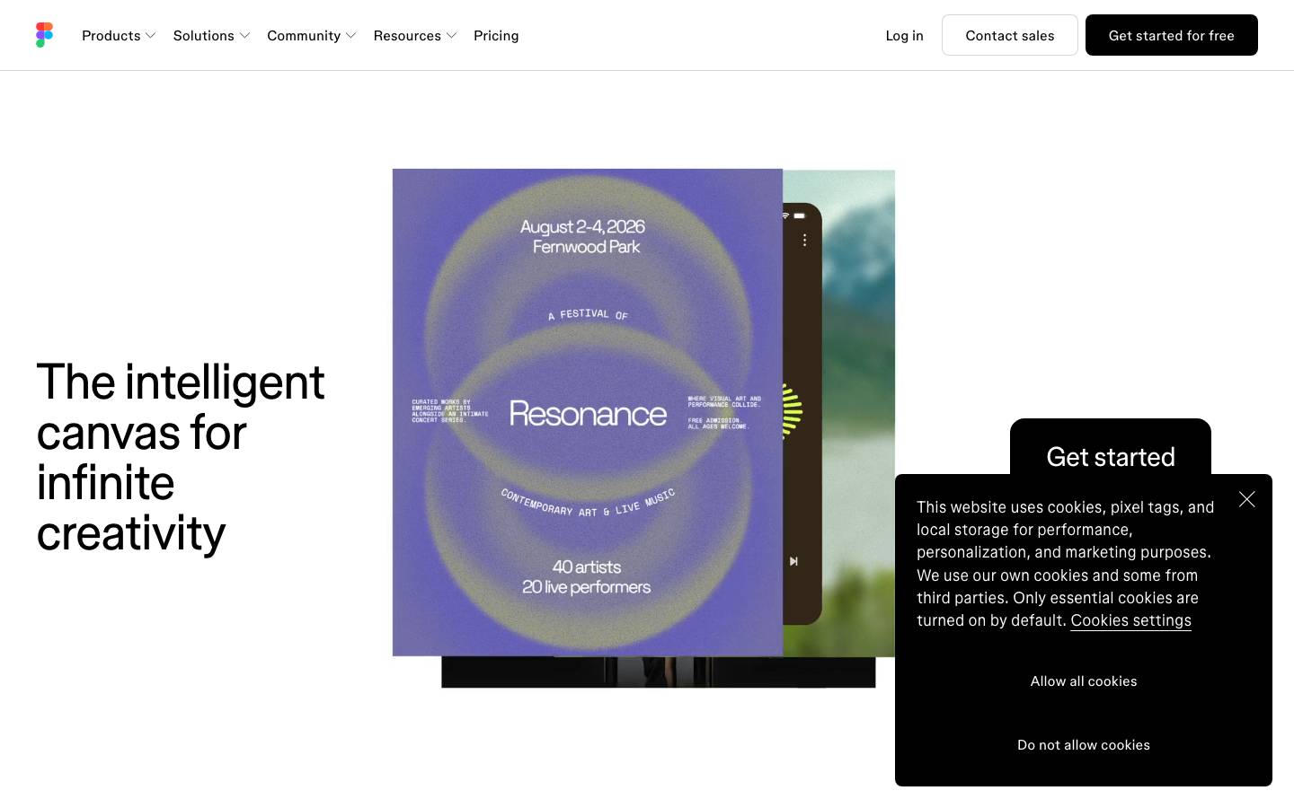
Started from
figma.comPreview
the remixed design systemSwitch between the rendered Visual preview and the Raw DESIGN.md.
Figma Remix
Remix of figma.com. The colors, fonts and shapes were edited in DesignMD. The token block above has the current values. The sections below were written for the original, so they may still mention it.
1. Visual Theme & Atmosphere
Figma's design system embodies a minimalist, modern creative workspace aesthetic—clean, purposeful, and focused on enabling boundless collaboration. The visual language prioritizes clarity and functionality, using a restrained palette anchored in pure blacks and whites with subtle warm accents that punctuate key interactions. This is a system designed for creative professionals who value precision, speed, and elegance. The typography breathing room, generous whitespace, and intentional use of color create an environment that feels both inviting and powerful, allowing the user's creative work to take center stage rather than the interface itself.
Key Characteristics
- Monochromatic foundation with selective warm accents for highlights
- Generous whitespace and breathing room throughout layouts
- Clean, modern sans-serif typography in a proprietary font family
- High contrast for accessibility and visual clarity
- Minimalist component styling with subtle refinements
- Emphasis on usability over ornamentation
2. Color Palette & Roles
Primary
- Black (
#000000): Primary text, dark backgrounds, borders, and dominant UI elements; the foundation of the system - White (
#F8EEDE): Primary background, text on dark surfaces, card backgrounds, and light surfaces
Accent Colors
- Warm Accent (
#D24B31): Highlight accents for featured content, visual emphasis, and call-to-action highlights; used sparingly for visual interest - Deep Accent (
#A02139): Secondary accent for deeper emphasis, interactive states, and status indicators; provides contrast against light backgrounds
Interactive
- Button Primary (
#000000): Primary action buttons; high contrast against white backgrounds - Button Text (
#F8EEDE): Text on primary buttons and dark surfaces - Link Default (
#000000): Default link color; matches body text for seamless integration - Link Hover (
#A02139): Hover state for links; provides visual feedback using secondary accent
Neutral Scale
- Text Primary (
#000000): All body text, labels, and primary content - Text Secondary (
#666666): Secondary text, descriptions, and metadata (inferred from usage patterns) - Divider (
#E0E0E0): Subtle borders and dividers (inferred for component separation) - Background Tertiary (
#F5F5F5): Subtle backgrounds for grouped content (inferred for surface variation)
Surface & Borders
- Surface Default (
#F8EEDE): Primary surface for cards and containers - Surface Overlay (
#000000): Dark overlays with opacity for modals and full-screen interactions - Border Default (
#000000): Primary borders at full opacity for defined edges - Border Subtle (
#CCCCCC): Subtle borders for grouped sections (inferred)
3. Typography Rules
Font Family
Primary: figmaSans (custom proprietary typeface)
Fallback stack: ui-sans-serif, -apple-system, BlinkMacSystemFont, "Segoe UI", "Roboto", sans-serif
Secondary: figmaMono (custom proprietary monospace typeface)
Fallback stack: "Courier New", "Monaco", monospace
Hierarchy
| Role | Font | Size | Weight | Line Height | Letter Spacing | Notes |
|---|---|---|---|---|---|---|
| Display / H1 | figmaSans | 56px | 400 | 56px | 0px | Page headlines; maximum impact |
| Heading / H2 | figmaMono | 14px | 400 | 18.2px | 0px | Section headings; technical labels |
| Subheading / H3 | figmaSans | 16px | 400 | 22.4px | 0px | Subsection titles; card headers |
| Body / Paragraph | figmaSans | 18px | 330 | 25.2px | 0px | Standard content text; descriptions |
| Button Text | figmaSans | 16px | 400 | 18.4px | 0px | Call-to-action buttons |
| Navigation | figmaSans | 16px | 400 | 23.2px | 0px | Menu items; navigation links |
| Small / Caption | figmaSans | 14px | 400 | 20px | 0px | Metadata; timestamps; secondary info |
| Code / Mono | figmaMono | 12px | 400 | 16px | 0px | Code blocks; technical text |
Principles
- Weight Variation: Primary weight of 400 with 330 for body text provides subtle differentiation without excessive variation
- Generous Line Height: Line heights exceed font size to ensure breathing room and readability in dense layouts
- Proportional Scaling: Typography scale follows a predictable progression for visual hierarchy
- Monospace Secondary: Monospace font reserved for technical content, labels, and small callouts to signal different information type
- Accessibility First: High contrast and sufficient sizing ensure legibility for all users
4. Component Stylings
Buttons
Primary Button
- Background:
#000000 - Text Color:
#F8EEDE - Padding:
12px 22px - Border Radius:
9.6px - Border: None
- Font Size:
16px - Font Weight:
400 - Line Height:
18.4px - Height:
46px(minimum touch target) - Hover State: Opacity
0.85on background; text remains#F8EEDE - Active State: Background
#1A1A1A; text#F8EEDE - Disabled State: Background
#CCCCCC; text#999999; cursornot-allowed
Secondary Button
- Background: Transparent (
rgba(0, 0, 0, 0)) - Text Color:
#000000 - Padding:
12px 22px - Border Radius:
9.6px - Border:
1px solid #000000 - Font Size:
16px - Font Weight:
400 - Line Height:
18.4px - Height:
46px - Hover State: Background
#F5F5F5; text#000000; border#000000 - Active State: Background
#E0E0E0; border#1A1A1A - Disabled State: Border
#CCCCCC; text#999999
Ghost Button
- Background: Transparent (
rgba(0, 0, 0, 0)) - Text Color:
#000000 - Padding:
0px 4px - Border Radius:
0px - Border: None
- Font Size:
16px - Font Weight:
400 - Line Height:
22.4px - Height:
auto - Hover State: Text
#A02139; underline1px solid #A02139(optional) - Active State: Text
#A02139 - Disabled State: Text
#CCCCCC; cursornot-allowed
Small Button / Icon Button
- Background: Transparent (
rgba(0, 0, 0, 0)) - Text Color:
#F8EEDE - Padding:
0px 4px - Border Radius:
0px - Border: None
- Font Size:
16px - Font Weight:
400 - Line Height:
22.4px - Size:
20px × 20px(icon buttons) - Hover State: Opacity
0.7 - Active State: Opacity
0.9
Cards & Containers
Content Card
- Background:
#F8EEDE - Border:
1px solid #E0E0E0(inferred) - Border Radius:
9.6px - Padding:
24px - Box Shadow: None (flat design)
- Text Color:
#000000 - Font Size:
16px - Font Weight:
400 - Line Height:
23.2px - Hover State: Border
#CCCCCC; background remains#F8EEDE
Large Feature Card
- Background:
#F8EEDE - Border Radius:
12px - Padding:
32px - Box Shadow:
0px 1px 3px rgba(0, 0, 0, 0.1)(inferred subtle shadow) - Text Color:
#000000 - Font Size:
18px - Font Weight:
330 - Line Height:
25.2px - Hover State: Shadow elevation to
0px 4px 8px rgba(0, 0, 0, 0.12)
Container Background
- Background:
#F5F5F5(inferred light background) - Padding:
40px 32px - Border Radius:
0px(full-width sections)
Inputs & Forms
Text Input
- Background:
#F8EEDE - Border:
1px solid #CCCCCC - Border Radius:
9.6px - Padding:
12px 16px - Font Family: figmaSans
- Font Size:
16px - Font Weight:
400 - Line Height:
22.4px - Text Color:
#000000 - Placeholder Color:
#999999 - Height:
44px(minimum touch target) - Hover State: Border
#999999 - Focus State: Border
#000000; box-shadow0px 0px 0px 2px rgba(0, 0, 0, 0.1) - Disabled State: Background
#F5F5F5; border#E0E0E0; text#CCCCCC
Text Area
- Background:
#F8EEDE - Border:
1px solid #CCCCCC - Border Radius:
9.6px - Padding:
12px 16px - Font Family: figmaSans
- Font Size:
14px - Font Weight:
400 - Line Height:
20px - Minimum Height:
120px - Focus State: Border
#000000; box-shadow0px 0px 0px 2px rgba(0, 0, 0, 0.1)
Navigation
Navigation Bar
- Background:
#F8EEDE - Height:
64px(inferred standard height) - Padding:
0px 32px - Border Bottom:
1px solid #E0E0E0 - Display: Flex; align-items center; justify-content space-between
- Box Shadow:
0px 1px 0px 0px rgba(0, 0, 0, 0.16)(sm elevation from tokens) - Z-Index:
20
Navigation Item
- Font Size:
16px - Font Weight:
400 - Line Height:
23.2px - Text Color:
#000000 - Padding:
8px 16px - Border Radius:
4px - Hover State: Background
#F5F5F5; text#000000 - Active State: Text
#A02139; border-bottom2px solid #A02139
Dropdown Menu
- Background:
#F8EEDE - Border:
1px solid #E0E0E0 - Border Radius:
9.6px - Padding:
8px 0px - Box Shadow:
0px 4px 12px rgba(0, 0, 0, 0.15)(inferred dropdown shadow) - Z-Index:
30 - Item Padding:
12px 16px - Item Hover: Background
#F5F5F5
Links
Text Link
- Text Color:
#000000 - Font Size:
16px - Font Weight:
400 - Line Height:
23.2px - Text Decoration: None (default)
- Hover State: Text
#A02139; text-decorationunderline; text-underline-offset4px - Visited State: Text
#666666 - Disabled State: Text
#CCCCCC; cursornot-allowed
Large Link / CTA Link
- Text Color:
#000000 - Font Size:
18px - Font Weight:
330 - Line Height:
25.2px - Hover State: Text
#A02139 - Padding:
4px 0px(clickable area)
Icon Link
- Background: Transparent
- Size:
20px × 20px - Color:
#000000 - Hover State: Opacity
0.7; color#A02139
5. Layout Principles
Spacing System
Base Unit: 4px
Spacing Scale & Usage:
4px: Small internal padding, micro-spacing between inline elements8px: Tight grouping, gap between small components12px: Form input padding, compact spacing16px: Standard padding for buttons and inputs, comfortable spacing24px: Card internal padding, section padding28px: Medium section spacing32px: Large section padding, container padding36px: Extra-large padding for prominent sections40px: Section margins, major spacing between sections48px: Large vertical spacing between major sections52px: Extra-large vertical spacing56px: Maximum spacing for hero sections and dramatic separation
Context Application:
- Compact Areas: 8px–12px (navigation, dense lists)
- Standard Content: 16px–24px (cards, form groups, normal spacing)
- Section Separation: 40px–56px (between major content blocks)
- Padding Consistency: 24px for cards; 32px for containers; 16px for inputs
Grid & Container
- Max Width: 1200px (standard container width for large screens)
- Gutter/Gap: 16px–24px between grid columns
- Column Strategy: 12-column grid system (inferred standard); responsive reflow at breakpoints
- Container Padding: 32px on desktop; 20px on tablet; 16px on mobile
- Section Pattern: Full-width sections with internal containers aligned to grid
- Centered Content: Sections centered with auto margins on sides
Whitespace Philosophy
Figma's design system embraces negative space as a core design principle. Whitespace is not empty—it provides visual rest, improves focus, and creates hierarchy. Layouts intentionally use generous margins and padding to prevent visual clutter and allow content to breathe. Each section maintains clear separation through whitespace rather than borders or heavy rules, creating a calm, organized interface that prioritizes clarity over density.
Border Radius Scale
- Sharp/None:
0px– Navigation bars, full-width sections, large structural elements - Minimal:
4px– Small interactive elements, subtle rounding for inputs - Standard:
8px– Buttons, cards, containers, and most interactive components - Generous:
9999px– Image elements, circular avatars, fully rounded elements - Custom:
12px– Feature cards or prominent components requiring emphasis
Border Widths
- Thin / Subtle:
1px– Primary use for borders, dividers, and container edges - No Border:
0px– Most components; borders used minimally and intentionally
6. Depth & Elevation
| Level | Treatment | Use |
|---|---|---|
| Flat | No shadow; box-shadow: none | Base content, cards in neutral state, body elements |
| Raised (sm) | 0px 1px 0px 0px rgba(0, 0, 0, 0.16) | Navigation bars, subtle elevation for distinction |
| Lifted | 0px 4px 12px rgba(0, 0, 0, 0.15) | Dropdown menus, hover states, content cards on interaction |
| Elevated | 0px 8px 20px rgba(0, 0, 0, 0.12) | Modal overlays, floating panels, prominent features |
| Floating | 0px 16px 32px rgba(0, 0, 0, 0.15) | Popovers, tooltips, highest prominence elements |
Shadow Philosophy
Figma uses subtle, sophisticated shadow treatment to create layering and depth without visual heaviness. Shadows are employed sparingly—primarily for interactive states and overlays—maintaining the clean, minimalist aesthetic. The shadow color remains pure black with varying opacity to suggest elevation naturally. This approach prevents shadow accumulation and keeps the interface feeling light and modern.
Opacity Levels
- Full Opacity:
1– Primary text, interactive elements, solid backgrounds - High Opacity:
0.9– Active/focused states, primary content - Medium-High Opacity:
0.7– Hover states on some elements, secondary prominence - Medium Opacity:
0.5– Disabled elements, secondary layers, subtle backgrounds (inferred) - Low Opacity:
0.16– Shadows, subtle overlays, minimal visual weight - Extra-Low Opacity:
0.08– Very subtle overlays, focus rings (inferred)
Z-index / Layering
- Base Content:
1– Standard page content, cards, default elements - Sticky/Fixed:
10– Sticky navigation, fixed headers (inferred) - Dropdown:
20– Navigation dropdowns, select menus - Dropdown Elevated:
25– Nested dropdowns, secondary overlays - Dropdown Higher:
30– Tooltips, popovers above standard dropdowns - Dropdown Highest:
40– Modal overlays, lightbox, full-screen overlays - Top-Most:
50– Toast notifications, notifications above modals (inferred)
7. Do's and Don'ts
Do
- Use pure black and white as the foundation – Maintain contrast and clarity; reserve colored accents for intentional emphasis
- Embrace whitespace – Allow breathing room between sections; whitespace is a design element, not wasted space
- Apply borders sparingly – Use borders only for functional division; prefer whitespace and shadow for visual separation
- Maintain consistent padding – Use the spacing scale (4px base unit) for all margins and padding to ensure visual harmony
- Prioritize typography hierarchy – Use the established font sizes and weights to guide user attention naturally
- Use rounded corners consistently – Apply
9.6pxradius to interactive components;0pxfor structural elements - Scale shadows subtly – Employ shadows to indicate elevation; avoid heavy shadows that flatten or obscure content
- Ensure sufficient contrast – All text and interactive elements must meet WCAG AA standards (
4.5:1for body text minimum) - Apply color accents intentionally – Reserve
#D24B31and#A02139for highlights, CTAs, and status indicators - Test responsive behavior – Verify layouts collapse gracefully and remain usable on all screen sizes
Don't
- Avoid excessive color variation – Don't introduce new colors outside the palette; the system relies on black, white, and two accents
- Don't override the font family – figmaSans and figmaMono are core to the brand; maintain consistency without substitutions
- Avoid deep shadows – Don't stack multiple shadows or use heavy drop shadows; keep elevation subtle and refined
- Don't crowd whitespace – Avoid cramming content without breathing room; respect margin and padding minimums
- Don't use blurred or excessive opacity – Keep overlays and backgrounds clear; avoid heavy blur effects that obscure content
- Don't mix border styles – Stick to solid
1pxborders; avoid dashed, dotted, or double borders unless specifically required - Don't create visual noise – Avoid patterns, textures, or decorative elements that distract from content
- Avoid inconsistent border radius – Don't randomly apply different radius values; use the established scale
- Don't disable hover states – Always provide visual feedback on interactive elements; hover states are essential for usability
- Avoid semantic color confusion – Don't use accent colors for primary text or backgrounds; reserve them for highlights and CTAs
8. Responsive Behavior
Breakpoints
| Name | Width | Key Changes |
|---|---|---|
| Mobile | 320px–639px | Single-column layouts; 16px padding; 14px body text; stacked navigation |
| Tablet | 640px–1023px | Two-column layouts; 20px padding; 16px body text; horizontal navigation with condensed items |
| Desktop | 1024px+ | Full multi-column layouts; 32px padding; 18px body text; expanded navigation with dropdowns |
| Wide | 1440px+ | Max-width containers (1200px); centered with side margins; enhanced spacing |
Touch Targets
- Minimum Size:
44px × 44pxfor all interactive elements (buttons, links, inputs) - Comfortable Spacing:
16pxminimum gap between adjacent touch targets to prevent mis-taps - Button Padding:
12px 22pxon desktop;14px 24pxon mobile for larger touch areas - Icon Size:
20px × 20pxminimum for icon-only buttons;24px × 24pxpreferred for mobile - Link Padding:
8pxvertical;4pxhorizontal for inline links to create adequate tap zones
Collapsing Strategy
- Navigation: Horizontal menu collapses to hamburger icon below
640px; items stack vertically in slide-out drawer - Grid Layouts: 3-column layouts on desktop → 2-column on tablet → 1-column on mobile; maintain
8px–16pxgap between columns - Padding Reduction:
32pxdesktop →20pxtablet →16pxmobile to preserve content prominence - Typography Scaling: Font sizes decrease by
2px–4pxon mobile; line heights adjust proportionally - Images: Responsive images scale with container; max-width
100%; aspect ratio preserved - Spacing Compression: Large margins (
40px–56px) reduce to24px–32pxon tablet;16px–24pxon mobile - Component Stacking: Multi-column forms collapse to single column; cards reflow in grid below breakpoints
- Hero Sections: Background images scale; headline size reduces from
56px→36pxon mobile; content centers
9. Agent Prompt Guide
Quick Color Reference
- Primary CTA: Black (
#000000) - CTA Text: White (
#F8EEDE) - Link Text: Black (
#000000), hover to Deep Accent (#A02139) - Heading Text: Black (
#000000) - Body Text: Black (
#000000) - Background: White (
#F8EEDE) - Secondary Background: Light Gray (
#F5F5F5) - Border: Black (
#000000) - Subtle Border: Medium Gray (
#E0E0E0) - Accent / Highlight: Warm Accent (
#D24B31) - Secondary Accent: Deep Accent (
#A02139) - Disabled Text: Light Gray (
#CCCCCC) - Placeholder Text: Medium Gray (
#999999)
Iteration Guide
-
Start with monochromatic foundation – All text is
#000000; all backgrounds are#F8EEDEor#F5F5F5; reserve accent colors (#D24B31,#A02139) for specific CTAs, highlights, and hover states only. -
Apply the spacing scale religiously – Use
4pxmultiples exclusively (4px,8px,12px,16px,24px,32px,40px,56px); never introduce arbitrary spacing values. -
Typography is hierarchy – Body text is always
18px weight 330(figmaSans); headings are56px weight 400; all other sizes follow the hierarchy table; never deviate from font sizes in the table. -
Button styling is consistent – Primary buttons are always
#000000background with#F8EEDEtext,12px 22pxpadding,9.6pxradius; secondary buttons are transparent with1px solid #000000border; ghost buttons are transparent text-only links. -
Cards and containers use minimal styling – Background
#F8EEDE, border1px solid #E0E0E0, radius9.6px, padding24px; add subtle shadow (0px 1px 0px rgba(0, 0, 0, 0.16)) only on navigation or hover states; never use heavy shadows on default cards. -
Navigation bar is fixed at
64pxheight – Padding0px 32px, border-bottom1px solid #E0E0E0, z-index20; menu items are16pxweight 400; dropdowns appear with z-index30and subtle shadow (0px 4px 12px rgba(0, 0, 0, 0.15)). -
Forms use standard input styling – All inputs:
#F8EEDEbackground,1px solid #CCCCCCborder,9.6pxradius,12px 16pxpadding,16pxfont,44pxheight; focus state adds2pxoutline-offset and border changes to#000000. -
Responsive design follows breakpoint rules – Mobile: single column,
16pxpadding,14pxbody text; Tablet: two columns,20pxpadding,16pxbody text; Desktop: full layout,32pxpadding,18pxbody text; never hardcode widths—use max-width containers and flex/grid layouts. -
Opacity and layering are intentional – Shadows use pure black with opacity (
rgba(0, 0, 0, 0.16)for subtle;rgba(0, 0, 0, 0.15)for dropdown); hover states reduce opacity (0.85on buttons) or add subtle background (#F5F5F5); disabled states use#CCCCCCtext on#F5F5F5background. -
Always test touch targets and accessibility – Buttons minimum
44px × 44px; gap between interactive elements minimum16px; color contrast minimum4.5:1for text; hover and focus states required on all interactive elements; use semantic HTML and ARIA labels for screen readers.
Make it yours
Change the colors, fonts and corners of Figma Remix, and save your own DESIGN.md. Free.