
Plan, write and ship in one place. Every page in your workspace follows the same design system, so nothing drifts.
Fast by default
Pages load in under a second, with nothing to configure.
Built for teams
Shared spaces, comments and roles that match how you work.
Secure from day one
SSO, audit logs and encryption at rest on every plan.
Create your account
Send me product updatesCreate accountnpm install @northwind/sdk
Pro
- Unlimited pages
- Version history
- Priority support
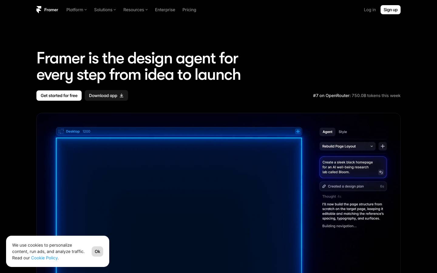
Started from
framer.comPreview
the remixed design systemSwitch between the rendered Visual preview and the Raw DESIGN.md.
Framer Remix
Remix of framer.com. The colors, fonts and shapes were edited in DesignMD. The token block above has the current values. The sections below were written for the original, so they may still mention it.
1. Visual Theme & Atmosphere
Framer's design system embodies a bold, futuristic aesthetic rooted in premium minimalism and high contrast. The foundation is pure black and white, creating a sleek, professional canvas that emphasizes clarity and innovation. Neon accents—particularly electric blue (#0099FF) and vibrant primary blue (#0000EE)—inject energy and forward momentum, evoking AI-driven intelligence and cutting-edge technology. The system layers semi-transparent white overlays and subtle depth to create sophistication without visual clutter. Typography is generous and authoritative, leveraging modern sans-serif families (GT Walsheim and Inter) to communicate confidence. The overall mood is tech-native, aspirational, and unapologetically digital—designed for creators and developers who expect nothing less than excellence.
Key Characteristics
- Stark black-and-white foundation with electric blue accents
- High contrast for accessibility and visual hierarchy
- Minimalist component styling with minimal borders
- Generous, confident typography
- Neon accent colors signal interactivity and AI/tech positioning
- Semi-transparent overlays for depth without decoration
- Purpose-built for no-code and developer audiences
2. Color Palette & Roles
Primary
- Primary CTA Blue (
#0000EE): Core interactive element; buttons, links, and active states. Dominates the system (922 uses across pages). - Bright Accent Blue (
#0099FF): Secondary emphasis; hover states, highlights, and accents (146 uses). Lighter, more vibrant alternative to primary.
Interactive
- White Overlay Strongest (
#FFFC): 75% opacity white; used for buttons, hover states, and interactive overlays. - White Overlay Strong (
#FFF9): 60% opacity white; semi-transparent layers for UI containers. - White Overlay Medium (
#FFF6): 38% opacity white; subtle interactive backgrounds. - White Overlay Light (
#FFF3): 19% opacity white; lightest overlay for minimal contrast.
Neutral Scale
- Black Primary (
#000000): Dominant background and text color (4565 uses). The core neutral anchor. - White Primary (
#FFFFFF): Secondary text and surface (1391 uses). - Charcoal Dark (
#242424): Slightly lighter black for nested backgrounds or secondary containers (304 uses). - Dark Gray (
#212121): Darkest secondary neutral for fine contrast. - Charcoal Medium (
#303030): Mid-tone dark neutral (147 uses). - Gray Tertiary (
#666666): Medium gray for secondary text and borders (77 uses). - Gray Quaternary (
#999999): Light gray for disabled and tertiary text (154 uses). - Black Deep (
#1A1A1A): Darkest neutral, used sparingly for maximum contrast (41 uses).
Surface & Borders
- White Surface (
#FFFFFF): Primary surface for cards and containers. - Dark Surface (
#000000): Dark mode surface; most of Framer is dark. - Border Gray (
#666666): Input borders and subtle dividers.
Semantic / Status
- Success Green (
#4CD963): Positive actions, confirmations, and success states (22 uses). - Warning Lime (
#CBFF00): Caution and warning states (12 uses).
3. Typography Rules
Font Family
Primary Display & Headings: GT Walsheim Medium and GT Walsheim Framer Medium
- Fallback stack:
'GT Walsheim', 'GT Walsheim Framer Medium', system-ui, -apple-system, sans-serif - Premium, geometric, modern sans-serif with strong presence
Body & UI: Inter and Inter Variable with Inter Framer Regular variant
- Fallback stack:
'Inter', 'Inter Variable', system-ui, -apple-system, sans-serif - Neutral, highly legible, purpose-built for screens
Code: JetBrains Mono and Azeret Mono
- Fallback stack:
'JetBrains Mono', 'Azeret Mono', 'Courier New', monospace - Monospace for technical content and code blocks
Hierarchy
| Role | Font | Size | Weight | Line Height | Letter Spacing | Notes |
|---|---|---|---|---|---|---|
| Display XL | GT Walsheim Framer Medium | 160px | 500 | 136px | Normal | Hero headlines; extreme scale |
| Display | GT Walsheim Medium | 74px | 500 | 70.3px | Normal | Page titles; primary messaging |
| Heading 1 | GT Walsheim Medium | 54px | 500 | 54px | Normal | Section headers |
| Heading 2 | GT Walsheim Medium | 44px | 500 | 48.4px | Normal | Subsection headers |
| Heading 3 | Inter Variable | 24px | 400 | 31.2px | Normal | Card titles |
| Heading 4 | Inter Variable | 18px | 400 | 24.3px | Normal | Smaller headlines |
| Heading 5 | Inter | 20px | 600 | 24px | Normal | Bold small headings |
| Heading 6 | Inter | 12px | 400 | 14.4px | Normal | Captions and labels |
| Body | Inter Variable | 15px | 400 | 20.25px | Normal | Primary reading text |
| Body Small | Inter Variable | 14px | 400 | 14px | Normal | Secondary body text |
| Body Span | Inter | 14px | 500 | 21px | Normal | Emphasized body text |
| Button | Inter | 16px | 500 | 16px | Normal | Button text; medium weight |
| Button Small | sans-serif | 12px | 400 | Normal | Normal | Compact button text |
| Link | sans-serif | 12px | 400 | Normal | Normal | Default link styling |
| Code Block | JetBrains Mono | 14px | 400 | 18.2px | Normal | Code display |
| Code Inline | Azeret Mono | 14.4px | 400 | 19.44px | Normal | Inline code snippets |
| Input | Inter Framer Regular | 16px | 400 | 16px | Normal | Form input text |
Principles
- Display Hierarchy: Three-tier system (Display XL, Display, Heading 1) establishes dramatic visual hierarchy for hero sections and primary messaging.
- Geometric & Modern: GT Walsheim's structured letterforms pair with Inter's neutrality to feel both premium and accessible.
- Weight over Size: At body and UI scales, weight shifts (400 to 500 to 600) drive emphasis, not size alone.
- Generous Spacing: Line heights are consistently loose (1.0–1.4× of font size), improving readability and elegance.
- Monospace for Technical: Code uses JetBrains Mono for high readability in developer-facing contexts; Azeret Mono for smaller inline snippets.
4. Component Stylings
Buttons
Primary CTA Button
- Background:
#0000EE - Text Color:
#FFFFFF - Padding:
12px 20px - Border Radius:
0px - Border:
0px - Font Size:
16px - Font Weight:
500 - Font Family:
Inter - Line Height:
16px - Box Shadow:
rgba(0, 0, 0, 0.2) 0px 2px 6px 0px - Hover: Background
#0099FF, maintain shadow - Active: Background
#0000CC, shadow intensify torgba(0, 0, 0, 0.4) 0px 4px 12px 0px - Disabled: Opacity
0.50, cursor not-allowed
Secondary Button (Dark)
- Background:
rgba(34, 34, 34, 0.8) - Text Color:
#000000 - Padding:
5px 10px - Border Radius:
0px - Font Size:
12px - Font Weight:
400 - Font Family:
sans-serif - Line Height:
normal - Box Shadow:
rgba(0, 0, 0, 0.2) 0px 2px 6px 0px - Border:
0px - Hover: Background
rgba(50, 50, 50, 0.95), shadow increases - Active: Background
rgba(20, 20, 20, 1)
Ghost Button (Light)
- Background:
#FFFFFF - Text Color:
#000000 - Padding:
0px 10px - Border Radius:
0px - Font Size:
12px - Font Weight:
400 - Font Family:
sans-serif - Line Height:
normal - Border:
0px - Box Shadow:
none - Height:
30px - Hover: Background
#F5F5F5, add subtle shadowrgba(0, 0, 0, 0.1) 0px 1px 3px 0px - Active: Background
#E8E8E8
Icon Button
- Background:
rgba(255, 255, 255, 0.3) - Text Color:
#000000 - Padding:
0px 0.5px - Border Radius:
5px - Border:
0px - Font Size:
12px - Height:
20px - Width:
20px - Box Shadow:
none - Hover: Background
rgba(255, 255, 255, 0.5)
Cards & Containers
Primary Card (Dark Mode)
- Background:
#000000 - Border:
1px solid #303030 - Border Radius:
0px - Padding:
24px - Box Shadow:
rgba(0, 0, 0, 0.2) 0px 2px 6px 0px
Secondary Card (Medium Dark)
- Background:
#1A1A1A - Border:
1px solid #303030 - Border Radius:
0px - Padding:
20px - Box Shadow:
none
Surface Container (Light)
- Background:
#FFFFFF - Border:
1px solid #999999 - Border Radius:
0px - Padding:
16px - Box Shadow:
rgba(0, 0, 0, 0.1) 0px 1px 2px 0px
Overlay Container
- Background:
rgba(255, 255, 255, 0.1) - Backdrop Filter:
blur(4px)(inferred from modern design patterns) - Border:
1px solid rgba(255, 255, 255, 0.2) - Border Radius:
0px - Padding:
16px
Inputs & Forms
Text Input (Light)
- Background:
#FFFFFF - Border:
2px solid #666666 - Border Radius:
0px - Padding:
8px 12px - Font Size:
15px - Font Weight:
400 - Font Family:
Inter - Color:
#000000 - Line Height:
15px - Height:
40px - Focus: Border Color
#0000EE, box-shadow#0099FF 0px 0px 0px 2px inset - Placeholder: Color
#999999
Text Input (Dark)
- Background:
rgba(255, 255, 255, 0.1) - Border:
1px solid rgba(255, 255, 255, 0.2) - Border Radius:
24px - Padding:
10px 15px 10px 17px - Font Size:
16px - Font Weight:
400 - Font Family:
Inter Framer Regular - Color:
#FFFFFF - Line Height:
16px - Height:
40px - Focus: Box Shadow
#0099FF 0px 0px 0px 2px inset - Placeholder: Color
rgba(255, 255, 255, 0.5)
Textarea
- Background:
rgba(0, 0, 0, 0) - Border:
0px none - Border Radius:
0px - Padding:
0px - Font Size:
12px - Font Weight:
500 - Font Family:
Inter - Color:
#FFFFFF - Line Height:
16.8px - Resize: vertical
Select Input
- Background:
rgba(0, 0, 0, 0) - Border:
0px none - Font Size:
12px - Font Weight:
500 - Color:
#FFFFFF - Appearance: none (custom styled)
- Cursor: pointer
Navigation
Header Navigation Bar
- Background:
rgba(0, 0, 0, 0)(transparent) - Height:
64px - Padding:
0px 20px - Display:
flex - Align Items:
center - Border Bottom:
1px solid rgba(255, 255, 255, 0.1)(inferred from standard practice)
Navigation Link
- Font Size:
12px - Font Weight:
400 - Font Family:
sans-serif - Color:
#000000 - Text Decoration:
none - Padding:
0px 8px - Hover: Color
#0000EE, smooth transition0.2s - Active: Color
#0000EE, font-weight500
Navigation Link (Blue)
- Color:
#0000EE - Font Size:
12px - Font Weight:
400 - Hover: Color
#0099FF - Active: Font Weight
500
Links
Default Link
- Color:
#0000EE - Text Decoration:
none - Font Size:
12px - Font Weight:
400 - Font Family:
sans-serif - Cursor:
pointer - Hover: Text Decoration:
underline, Color:#0099FF - Active: Color:
#000099
Dark Link
- Color:
#000000 - Font Size:
12px - Font Weight:
400 - Hover: Color
#0000EE, Text Decorationunderline
Badges
Success Badge
- Background:
#4CD963 - Color:
#FFFFFF - Padding:
4px 8px - Border Radius:
0px - Font Size:
12px - Font Weight:
500
Warning Badge
- Background:
#CBFF00 - Color:
#000000 - Padding:
4px 8px - Border Radius:
0px - Font Size:
12px - Font Weight:
500
5. Layout Principles
Spacing System
Base Unit: 4px
Scale:
4px– Micro gaps (between inline elements)8px– Tight spacing (button padding, small component gaps)12px– Small padding (compact card padding)16px– Standard padding (default padding within components)20px– Medium padding (navigation, card headers)24px– Large padding (primary card padding, section spacing)32px– Extra large (section spacing, container padding)40px– XL padding (hero padding)60px– Section gap (between major sections)72px– Large section gap (between feature sections)100px– Hero padding (top/bottom of full-width hero sections)120px– Maximum section padding (rare, for dramatic hero sections)
Usage Context:
- Buttons:
12px 20px(horizontal-heavy) - Cards:
24pxinterior,16pxbetween card items - Section spacing:
60pxto120pxvertical - Form inputs:
8pxto16pxinternal padding
Grid & Container
Max Width: 1440px (full HD optimal viewing)
- Inferred from navigation width
1440px
Column Strategy:
- 12-column grid (standard web practice)
- Sections typically use
3-columnor4-columnlayouts for content - Hero sections: full-width or centered max-width container
Container Padding:
- Desktop:
40pxto60pxhorizontal - Tablet:
24pxto32pxhorizontal - Mobile:
16pxhorizontal
Section Patterns:
- Hero: Full-width background with centered max-width text content
- Feature cards: 3-4 column grid with
24pxgaps - Pricing: 4-column card grid with
32pxgaps - Testimonial: 2-column grid or single column with overflow scroll
Whitespace Philosophy
Framer employs generous, purposeful whitespace to create breathing room and emphasize hierarchy. The extreme black-and-white contrast means whitespace isn't negative—it's a design material. Large gaps between sections (60–120px) signal transitions and thematic breaks. Internal component padding ranges from 12px to 24px, never crowding text or interactive elements. This approach maintains visual clarity in a high-information environment and respects user attention.
Border Radius Scale
4px– Images, minor containers, small UI elements0px– Cards, containers, standard component radius8px– Buttons, inputs, mid-size components10px– Large inputs, prominent containers15px– Decorative images, featured visual elements18px– Extra-large images, hero images24px– Pill-shaped inputs (fully rounded horizontally)
Border Widths
- Thin:
1px– Subtle borders on inputs, containers, and light dividers - Medium:
2px– Prominent input borders, emphasized form elements
6. Depth & Elevation
| Level | Treatment | Use |
|---|---|---|
| Flat (Base) | No shadow | Text, icons, flat backgrounds |
| Raised (1) | rgba(0, 0, 0, 0.2) 0px 2px 6px 0px | Buttons, cards, interactive surfaces |
| Floating (2) | rgba(0, 0, 0, 0.4) 0px 4px 12px 0px | Hovered buttons, dropdowns, modals |
| Modal (3) | rgba(0, 0, 0, 0.6) 0px 8px 24px 0px | Overlay modals, top-level popovers |
Shadow Philosophy
Framer uses minimal, functional shadows that signal interactivity and depth without distraction. The primary shadow (rgba(0, 0, 0, 0.2) 0px 2px 6px 0px) appears on nearly all interactive elements (buttons, cards, elevated containers). Heavier shadows are reserved for modals and overlays. The black background means shadows remain subtle and refined; they enhance without overpowering. Shadows are slightly offset vertically (2–8px) and bloom softly (6–24px blur), following modern material design principles adapted for Framer's minimalist aesthetic.
Opacity Levels
- 0% (0.0): Fully transparent; hidden state
- 20% (0.20): Near-transparent; very subtle overlays
- 30% (0.30): Light overlay; secondary backgrounds
- 50% (0.50): Semi-transparent; disabled states, moderate overlays
- 60% (0.60): Strong semi-transparency; interactive backgrounds
- 66% (0.66): Two-thirds opaque; mid-tone overlays
- 98% (0.98): Nearly opaque; almost solid surfaces
Usage:
- Disabled elements:
opacity: 0.50 - Hover overlays:
rgba(255, 255, 255, 0.1)torgba(255, 255, 255, 0.3) - Dark overlays:
rgba(0, 0, 0, 0.2)torgba(0, 0, 0, 0.6)
Z-index / Layering
- Base Layer (1): Content, default component stacking
- Elevated (2): Lifted cards, slightly raised surfaces
- Interactive (3): Hover states, transient highlights
- Dropdown (4): Select menus, popovers, tooltips
- Sticky (5): Fixed headers, sticky sidebars
- Modal (6): Modal overlays, off-canvas panels
- Modal Content (8): Content within modals, high-priority overlays
- Toast/Alert (9): Toast notifications, alerts, top-most layer
Rationale: Gaps (missing 7) allow future intermediate layers. Modals use 6 and 8 to separate backdrop from content. Toasts occupy 9 as the absolute top layer for visibility.
7. Do's and Don'ts
Do
- Use primary blue (
#0000EE) for all primary CTAs and interactive states. It's the system's dominant accent and signals action. - Maintain high contrast. Black text on white or white text on black; avoid mid-tone text on mid-tone backgrounds.
- Leverage generous spacing. Use
24pxto60pxgaps between major sections; internal padding should never feel cramped. - Favor weight over size for typography emphasis. Use
font-weight: 600for emphasis rather than increasing font size by more than 1–2 sizes. - Apply the standard shadow (
rgba(0, 0, 0, 0.2) 0px 2px 6px 0px) to interactive elements. It signals depth and affordance. - Use semi-transparent white (
rgba(255, 255, 255, 0.1)to0.3)) for dark-mode overlays and hover states. - Choose GT Walsheim for display text and Inter for body/UI. Never mix serif with these families.
- Round button corners at
0px. Maintain consistency with card and container radius. - Use
0pxborder radius as the default for most UI components. Scale up only for specific purposes (pills, hero images). - Test form inputs at small sizes. Minimum touch target is
40pxheight;36pxmay be acceptable for desktop-only contexts.
Don't
- Don't use bright blue for non-interactive elements. Reserved for buttons, links, and active states; gray for passive text.
- Don't mix opacity levels carelessly. Stick to the opacity scale (20%, 30%, 50%, 60%, 66%, 98%); custom values feel unprofessional.
- Don't center-align long text blocks. Titles yes; body text no. Center alignment reduces readability for paragraphs.
- Don't add colored borders to everything. Use borders sparingly; let whitespace and shadow create separation.
- Don't use fonts outside the core three (GT Walsheim, Inter, JetBrains Mono). Avoid web-safe fallbacks; they break the aesthetic.
- Don't scale shadows too large. Blur radius above
12pxstarts looking soft and unfocused; keep shadows sharp. - Don't nest more than two levels of containers without increasing padding proportionally. Three nested
16pxpaddings feels cramped; scale up. - Don't use opacity on text below
0.50. Very faint text (opacity0.2–0.3) fails accessibility and is hard to read. - Don't create clickable elements smaller than
36px×36px. Touch targets must be at least44px×44pxon mobile. - Don't break the grid. Maintain alignment to the 12-column grid; asymmetry reads as error, not intentionality.
8. Responsive Behavior
Breakpoints
| Name | Width | Key Changes |
|---|---|---|
| Mobile | 320px – 640px | Single column, 16px padding, font scale down 10–15%, stack all components vertically, hide secondary nav |
| Tablet | 641px – 1024px | 2-column grid, 24px padding, font scale down 5%, collapse some features, sticky header |
| Desktop | 1025px – 1440px | Full grid (3–4 columns), 40px padding, full typography scale, all features visible |
| Wide | 1441px+ | Rare; max-width container 1440px, centered with side margins |
Touch Targets
- Minimum touch target:
44px×44px(mobile-optimized) - Comfortable touch target:
48px×48px(preferred) - Buttons: Height
40pxminimum; width at least44px - Form inputs: Height
40pxminimum - Navigation items: Padding
12pxhorizontal,16pxvertical - Links (inline): Wrap in a
44px×44pxarea when possible
Collapsing Strategy
Hero sections:
- Desktop: Full viewport height with side-by-side image/text
- Tablet: Two-thirds viewport height, centered
- Mobile: Single column, image above text,
100vhtotal
Feature grids:
- Desktop: 4 columns with
32pxgaps - Tablet: 2 columns with
24pxgaps - Mobile: 1 column, full width,
16pxgaps
Navigation:
- Desktop: Horizontal top bar, all items visible
- Tablet: Horizontal top bar, dropdowns or secondary nav hidden
- Mobile: Hamburger menu (off-canvas), primary items only
Spacing reduction:
- Desktop:
60pxsection gaps - Tablet:
40pxsection gaps - Mobile:
24pxsection gaps
Typography scaling:
- Desktop: Full scale (54px h1, 44px h2, 15px body)
- Tablet: 90% of desktop (48px h1, 39px h2, 14px body)
- Mobile: 75% of desktop (40px h1, 33px h2, 13px body)
Card padding:
- Desktop:
24px - Tablet:
20px - Mobile:
16px
9. Agent Prompt Guide
Quick Color Reference
- Primary CTA: Primary Blue (
#0000EE) - Secondary CTA / Hover: Bright Blue (
#0099FF) - Success State: Success Green (
#4CD963) - Warning State: Warning Lime (
#CBFF00) - Background (Dark): Black Primary (
#000000) - Background (Light): White Primary (
#FFFFFF) - Text (Primary): Black Primary (
#000000) or White Primary (#FFFFFF) - Text (Secondary): Gray Quaternary (
#999999) - Text (Disabled): Gray Quaternary (
#999999) atopacity: 0.50 - Border: Gray Tertiary (
#666666) or transparent white overlay - Overlay (Dark):
rgba(255, 255, 255, 0.1)torgba(255, 255, 255, 0.3) - Surface Dark: Charcoal Dark (
#242424) or Black Deep (#1A1A1A)
Iteration Guide
-
Color First: All interactive elements use
#0000EE; all hover or secondary states use#0099FF. Never invent custom blues. -
Typography Hierarchy: Display text is GT Walsheim at
74pxweight500(or160pxfor extreme hero). Headings scale down (54px → 44px → 24px). Body is Inter at14pxor15pxweight400. Buttons are Inter at16pxweight500. Maintain this structure; don't skip sizes. -
Spacing is Rhythmic: Use multiples of
4px(4, 8, 12, 16, 20, 24, 32, 40, 60, 72, 100, 120). Section gaps are never less than24px; between major sections, use60pxminimum. Internal padding is16pxto24pxfor most components. -
Shadow is Functional: All interactive elements get
rgba(0, 0, 0, 0.2) 0px 2px 6px 0px. Heavier shadows only for modals or top-level overlays. Never use shadows for purely decorative purposes. -
Border Radius is Consistent: Buttons and inputs are
0px. Large images are0px–0px. Cards are0px–0px. Pill-shaped elements are24px. Never use12pxor other intermediate values unless justified. -
Borders are Sparse: Use
1px solid #666666for inputs and light dividers. Avoid colored borders; borders should be neutral gray or white overlay only. -
Opacity for Transparency: Use 20%, 30%, 50%, 60%, 66%, or 98%; never custom values like 45% or 75%. Disabled elements are always
opacity: 0.50. -
Responsive Collapsing: At mobile (320–640px), all grids collapse to 1 column, padding reduces to
16px, and typography scales to 75%. Use CSS media queries:@media (max-width: 640px) { ... }. -
Touch Targets: Every interactive element must be at least
36px×36px;44px×44pxis better. Test with thumb-sized cursors; links that are too small fail accessibility. -
Dark is Default: The system is dark-first (black backgrounds). Light backgrounds (
#FFFFFF) are secondary, used for cards, inputs, and contrast sections. Never use mid-tone backgrounds; choose black or white.
Make it yours
Change the colors, fonts and corners of Framer Remix, and save your own DESIGN.md. Free.
Remix history
Where it came from
Discover · Aug 9, 2026
- Framer RemixThis remix
Remix · by Sanjeev S. · Oct 28, 2026
Remixed from this
No public remixes yet. Be the first to make one.
Remix it