
Plan, write and ship in one place. Every page in your workspace follows the same design system, so nothing drifts.
Fast by default
Pages load in under a second, with nothing to configure.
Built for teams
Shared spaces, comments and roles that match how you work.
Secure from day one
SSO, audit logs and encryption at rest on every plan.
Create your account
Send me product updatesCreate accountnpm install @northwind/sdk
Pro
- Unlimited pages
- Version history
- Priority support
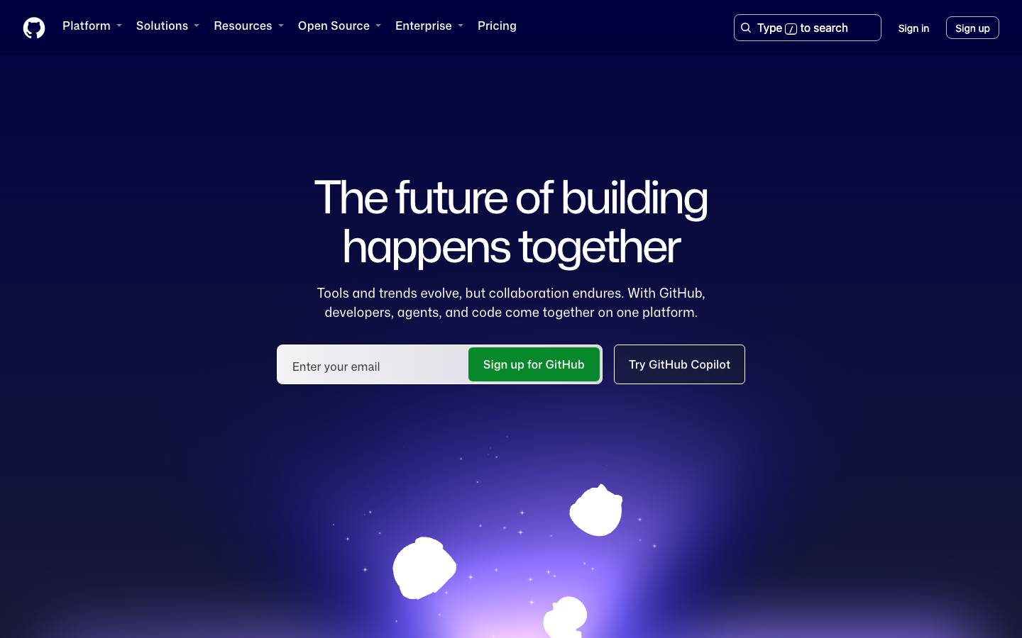
Started from
github.comPreview
the remixed design systemSwitch between the rendered Visual preview and the Raw DESIGN.md.
Github Remix
Remix of github.com. The colors, fonts and shapes were edited in DesignMD. The token block above has the current values. The sections below were written for the original, so they may still mention it.
1. Visual Theme & Atmosphere
GitHub's design system embodies a modern, developer-centric aesthetic rooted in clarity and collaboration. The interface balances sophisticated minimalism with technical precision, leveraging deep dark tones alongside bright, clean whites to create high-contrast, accessible experiences. The visual language prioritizes content and functionality over ornamentation, with subtle depth and carefully calibrated spacing that guides attention without distraction. Animated elements and gradient accents (particularly the purple-to-teal spectrum visible in hero sections) introduce warmth and forward momentum, signaling innovation and AI-powered capabilities. The typography uses custom Mona Sans font—both monospace and variable weights—to convey technical authority while maintaining approachability. Across dark and light themes, the system maintains consistent semantic meaning through color roles, ensuring users can parse information hierarchy and interaction states instantly.
Key Characteristics
- High-contrast dark and light theme support with semantic color roles
- Custom Mona Sans typography (variable weight and fixed-weight variants) for technical credibility
- Precise spacing grid (4px, 8px, 12px, 16px, 24px, 32px) ensuring predictable layouts
- Minimal, flat component architecture with subtle elevation via shadows rather than 3D effects
- Accessible color palette with error (
#CF222E), warning (#D29922), and informational states - Clean borders and rounded corners (6px–12px) applied strategically to inputs, cards, and buttons
- Multi-layered depth system enabling modals, dropdowns, and sticky navigation without visual chaos
2. Color Palette & Roles
Primary
- Canvas Default (
#FFFFFF): Main light theme background; applied to page surfaces and default containers (used 2344 times) - Canvas Dark (
#010409): Deep dark theme background for hero sections and full-page dark experiences (used 426 times) - Canvas Overlay Dark (
#000000): Absolute black for maximum contrast text, icons, and dark mode neutral text (used 2972 times)
Accent Colors
- Accent Bright (
#F0F6FC): Light blue-tinted background for highlighted sections, subtle callouts, and feature emphasis in light theme - Accent Muted (
#0000): Transparent black overlay for semi-transparent overlays and disabled states
Interactive
- CTA Primary (
#1F6FEB): Bright blue for primary call-to-action buttons and linked text; signals actionable primary intent - CTA Secondary (
#0969DA): Deeper blue for secondary actions and visited link states - Success (
#2EA043): Bright green for positive actions, success states, and confirmations (visible in "Sign up for GitHub" button) - Warning (
#D29922): Amber/gold for cautionary alerts and warning states (used 50 times) - Error (
#CF222E): Bold red for destructive actions, error messages, and danger states (used 54 times)
Neutral Scale
- Text Primary (
#24292E): Near-black text for all primary body copy and headings in light theme - Text Secondary (
#656C76): Medium gray for secondary information, metadata, and supporting text (used 120 times) - Text Tertiary (
#59636E): Lighter gray for muted labels and supplementary content (used 128 times) - Text Subdued (
#9198A1): Very light gray for disabled text and deeply recessed information (used 56 times)
Surface & Borders
- Border Subtle (
#D1D9E0): Fine dividing line for cards and section separators; maintains visual separation without heaviness (used 72 times) - Border Secondary (
#D2D9D4): Muted green-tinted border for secondary surfaces and alternate containers (used 49 times) - Border Tertiary (
#58635B): Darker muted border for tertiary surfaces in dark mode (used 381 times) - Border Dark (
#25292E): Dark border for dark theme containers, providing clear edge definition (used 189 times)
Semantic / Status
- Information (
#0969DA): Informational callouts and status indicators - Success Green (
#2EA043): Confirmation badges and success messaging - Caution Amber (
#D29922): Warning badges and attention-requiring information - Danger Red (
#CF222E): Error badges and destructive confirmations
3. Typography Rules
Font Family
- Primary: Mona Sans (variable weight and fixed-weight VF variant)
- Fallback stack:
-apple-system, BlinkMacSystemFont, "Segoe UI", "Roboto", "Oxygen", "Ubuntu", "Fira Sans", "Droid Sans", "Helvetica Neue", sans-serif
- Fallback stack:
- Secondary: Mona Sans VF (variable weight)
- Same fallback stack; used for UI labels, captions, and inline text
Hierarchy
| Role | Font | Size | Weight | Line Height | Letter Spacing | Notes |
|---|---|---|---|---|---|---|
| Display XL | Mona Sans | 64px | 800 | 68px | Normal | Hero headlines; maximum visual impact |
| Display Large | Mona Sans | 64px | 425 | 69.12px | Normal | Large hero titles; primary page messaging |
| Display Medium | Mona Sans | 56px | 440 | 61.6px | Normal | Secondary hero text; large section headers |
| Display Small | Mona Sans | 40px | 460 | 48px | Normal | Feature section headers |
| Heading 1 | Mona Sans | 56px | 440 | 61.6px | Normal | Page titles; primary section headers |
| Heading 2 | Mona Sans VF | 24px | 600 | 36px | Normal | Secondary section headers |
| Heading 3 | Mona Sans | 22px | 480–600 | 30.8px | Normal | Tertiary headers; subsection titles (480 regular, 600 bold variant) |
| Heading 4 | Mona Sans | 20px | 600 | 30px | Normal | Card titles; emphasis text |
| Heading 5 | Mona Sans | 14px | 600 | 21px | Normal | Small labels and button text |
| Body XL | Mona Sans | 28px | 480 | 37.8px | Normal | Large body text; intro paragraphs |
| Body Large | Mona Sans | 18px | 400 | 27px | Normal | Primary body paragraphs; default reading text |
| Body Regular | Mona Sans | 16px | 400 | 24px | Normal | Standard paragraph text; form labels |
| Body Small | Mona Sans VF | 14px | 400 | 21px | Normal | Secondary body; captions; metadata |
| Caption | Mona Sans VF | 12px | 400 | 18px | Normal | Smallest text; timestamps; helper text |
| Button | Mona Sans / Mona Sans VF | 16px | 400–500 | 24px | Normal | Call-to-action buttons; button labels (400 light, 500 medium) |
| Link | Mona Sans VF | 14px | 400 | 21px | Normal | Inline hyperlinks and action text |
Principles
- Use Mona Sans for all interface text to maintain technical, modern aesthetic aligned with developer tooling
- Maintain strict hierarchy by varying weight (400 regular, 480 medium, 500 medium-bold, 600 bold, 800 extra-bold) rather than introducing new fonts
- Ensure minimum 27px line height for body text to maximize readability and reduce cognitive load
- Headings should use higher weights (480–800) to create clear visual hierarchy and improve scannability
- Smaller text (14px and below) must use slightly tighter line-height (21px) to prevent visual sprawl
- Reserve weight 800 exclusively for dominant display headlines; use weight 600 for primary section headers
- Apply consistent 16px button text across all interactive elements for predictable finger targets on touch devices
4. Component Stylings
Buttons
Primary Button
- Background:
#1F6FEB - Text Color:
#FFFFFF - Font: Mona Sans, 16px, weight 500
- Line Height: 24px
- Padding:
8px 12px - Border Radius:
6px - Border:
1px solid #1F6FEB - Box Shadow: None
- Height: 40px
- Hover State:
- Background:
#0969DA - Box Shadow:
rgba(0, 0, 0, 0.15) 0px 0px 0px 1px inset
- Background:
- Active State:
- Background:
#0860D0
- Background:
- Disabled State:
- Background:
#9198A1 - Text Color:
#FFFFFF - Opacity:
0.50 - Cursor:
not-allowed
- Background:
Secondary Button
- Background:
#FFFFFF - Text Color:
#24292E - Font: Mona Sans, 16px, weight 400
- Line Height: 24px
- Padding:
8px 12px - Border Radius:
6px - Border:
1px solid #D1D9E0 - Box Shadow: None
- Height: 40px
- Hover State:
- Background:
#F6F8FA - Border Color:
#D0D7DE
- Background:
- Active State:
- Background:
#EAEEF2
- Background:
- Focus State:
- Box Shadow:
0px 0px 0px 3px rgba(9, 105, 218, 0.1)
- Box Shadow:
Ghost / Outline Button
- Background:
rgba(0, 0, 0, 0) - Text Color:
#1F6FEB - Font: Mona Sans VF, 14px, weight 400
- Line Height: 21px
- Padding:
4px 12px - Border Radius:
8px - Border:
1px solid #B6BFBA - Box Shadow: None
- Height: 32px
- Hover State:
- Background:
rgba(31, 111, 235, 0.08) - Border Color:
#1F6FEB
- Background:
- Active State:
- Background:
rgba(31, 111, 235, 0.15)
- Background:
Cards & Containers
Default Card
- Background:
#FFFFFF - Text Color:
#24292E - Font: Mona Sans, 14px, weight 400
- Line Height: 21px
- Padding:
24px - Border Radius:
6px - Border:
1px solid #D1D9E0 - Box Shadow:
rgba(209, 217, 224, 0.25) 0px 0px 0px 1px, rgba(37, 41, 46, 0.04) 0px 6px 12px -3px, rgba(37, 41, 46, 0.12) 0px 6px 18px 0px - Hover State:
- Background:
#FAFBFC - Box Shadow:
rgba(209, 217, 224, 0.35) 0px 0px 0px 1px, rgba(37, 41, 46, 0.06) 0px 6px 14px -3px, rgba(37, 41, 46, 0.15) 0px 8px 20px 0px
- Background:
Dark Card (Dark Theme)
- Background:
#010409 - Text Color:
#F0F6FC - Font: Mona Sans VF, 14px, weight 400
- Line Height: 21px
- Padding:
24px - Border Radius:
6px - Border:
1px solid #25292E - Box Shadow:
rgba(0, 0, 0, 0.15) 0px 0px 0px 1px inset
Pricing Card (Featured)
- Background:
#FFFFFF - Text Color:
#24292E - Font: Mona Sans, 14px, weight 400
- Line Height: 21px
- Padding:
32px - Border Radius:
12px - Border:
2px solid #1F6FEB - Box Shadow:
rgba(0, 0, 0, 0.01) 0px 100px 80px 0px, rgba(0, 0, 0, 0.02) 0px 41px 33px 0px, rgba(0, 0, 0, 0.02) 0px 22px 17px 0px, rgba(0, 0, 0, 0.03) 0px 12px 10px 0px, rgba(0, 0, 0, 0.04) 0px 6px 5px 0px, rgba(0, 0, 0, 0.07) 0px 2px 2px 0px
Inputs & Forms
Text Input
- Background:
#FFFFFF - Text Color:
#24292E - Font: Mona Sans, 16px, weight 400
- Line Height: 24px
- Padding:
8px 12px - Border Radius:
8px - Border:
1px solid #D1D9E0 - Box Shadow: None
- Height: 41px
- Min Width: 260px
- Placeholder Color:
#9198A1 - Focus State:
- Border Color:
#1F6FEB - Box Shadow:
0px 0px 0px 3px rgba(31, 111, 235, 0.1) - Outline: None
- Border Color:
- Disabled State:
- Background:
#F6F8FA - Text Color:
#9198A1 - Cursor:
not-allowed
- Background:
- Error State:
- Border Color:
#CF222E - Box Shadow:
0px 0px 0px 3px rgba(207, 34, 46, 0.1)
- Border Color:
Email Input (Large)
- Background:
#FFFFFF - Text Color:
#24292E - Font: Mona Sans, 16px, weight 400
- Line Height: 24px
- Padding:
12px 16px - Border Radius:
6px - Border:
1px solid #D1D9E0 - Height: 48px
- Min Width: 280px
- Placeholder: "Enter your email"
- Focus State:
- Border Color:
#1F6FEB - Box Shadow:
0px 0px 0px 3px rgba(31, 111, 235, 0.1)
- Border Color:
Navigation
Top Navigation Bar
- Background:
#FFFFFF - Text Color:
#24292E - Font: Mona Sans, 16px, weight 400
- Line Height: 24px
- Padding:
16px 32px - Border Radius: 0px
- Border:
1px solid #D1D9E0(bottom edge) - Height: 64px
- Box Shadow: None
- Link Items:
- Text Color:
#24292E - Font Size: 14px
- Font Weight: 400
- Hover Background:
#F6F8FA - Active Text Color:
#1F6FEB - Padding:
8px 12px - Border Radius:
4px
- Text Color:
Dark Navigation Bar
- Background:
#010409 - Text Color:
#F0F6FC - Border:
1px solid #25292E(bottom edge) - Link Items Hover:
- Background:
rgba(255, 255, 255, 0.10)
- Background:
Search Input (Navigation)
- Background:
#F6F8FA - Text Color:
#24292E - Font: Mona Sans VF, 14px, weight 400
- Line Height: 21px
- Padding:
8px 12px - Border Radius:
6px - Border:
1px solid #D1D9E0 - Width: 240px
- Height: 32px
- Placeholder Color:
#656C76 - Focus State:
- Background:
#FFFFFF - Border Color:
#1F6FEB - Box Shadow:
0px 0px 0px 3px rgba(31, 111, 235, 0.1)
- Background:
Badges
Badge – Success
- Background:
rgba(46, 160, 67, 0.15) - Text Color:
#2EA043 - Font: Mona Sans, 12px, weight 600
- Line Height: 18px
- Padding:
4px 8px - Border Radius:
12px - Border: None
Badge – Warning
- Background:
rgba(210, 153, 34, 0.15) - Text Color:
#D29922 - Font: Mona Sans, 12px, weight 600
- Line Height: 18px
- Padding:
4px 8px - Border Radius:
12px - Border: None
Badge – Error
- Background:
rgba(207, 34, 46, 0.15) - Text Color:
#CF222E - Font: Mona Sans, 12px, weight 600
- Line Height: 18px
- Padding:
4px 8px - Border Radius:
12px - Border: None
Badge – Neutral
- Background:
#F0F6FC - Text Color:
#24292E - Font: Mona Sans, 12px, weight 600
- Line Height: 18px
- Padding:
4px 8px - Border Radius:
12px - Border: None
Links & Text Links
Primary Link
- Text Color:
#1F6FEB - Font: Mona Sans VF, 14px, weight 400
- Line Height: 21px
- Text Decoration: None
- Cursor: pointer
- Hover State:
- Text Color:
#0969DA - Text Decoration**:
underline
- Text Color:
- Visited State:
- Text Color**:
#0860D0
- Text Color**:
- Focus State:
- Box Shadow**:
0px 0px 0px 3px rgba(31, 111, 235, 0.1) - Outline**: None
- Box Shadow**:
Secondary Link (Ghost)
- Text Color:
#656C76 - Font: Mona Sans VF, 14px, weight 400
- Line Height: 21px
- Hover State:
- Text Color**:
#24292E - Text Decoration**:
underline
- Text Color**:
5. Layout Principles
Spacing System
The base spacing unit is 4px. All spacing values scale in multiples of 4 to ensure consistent rhythm and alignment.
- 4px: Minimal internal padding; tight component spacing; icon-adjacent margins
- 8px: Micro spacing; button internal padding; small gaps between inline elements
- 12px: Small padding; label-to-input spacing; minor section gaps
- 16px: Standard padding; medium spacing; primary content padding inside containers
- 20px: Gap between related content blocks
- 24px: Large padding; primary gap between section groups; card internal spacing
- 32px: Extra-large padding; major section spacing; container margins
- 40px: Hero section gaps; large feature spacing
- 48px: Section separator spacing
- 64px: Extra-large section padding; full-width container internal spacing
- 80px: Page-level spacing; hero section vertical gaps
- 128px: Maximum spacing; page boundary margins
Grid & Container
- Max Container Width: 1280px (applies to full-width sections; breakpoint at 1200px content width)
- Content Gutter: 32px on left and right sides at desktop breakpoints
- Column Strategy: 12-column flexible grid; components span 1–12 columns depending on breakpoint
- Section Pattern:
- Hero sections span full-width with 80px vertical padding (top and bottom)
- Content sections use centered container with 64px padding; 32px on mobile
- Feature grids: 2 columns at desktop, 1 column at tablet, stack at mobile
Whitespace Philosophy
Whitespace is strategic and intentional, creating visual breathing room and emphasizing content hierarchy. Large gaps (24px–48px) separate distinct sections; medium gaps (16px–20px) relate subsections; small gaps (8px–12px) connect closely related elements. Dark theme sections (hero, feature showcase) use generous whitespace to showcase animated backgrounds and gradient accents. Light theme sections maintain consistent padding to reduce cognitive load and guide eye movement down the page.
Border Radius Scale
- 0px: No rounding; for full-width containers, navigation bars, and sharp geometric emphasis
- 4px: Minimal rounding; rarely used
- 6px: Standard rounding; buttons, cards, badges, and small UI components
- 8px: Medium rounding; text inputs, dropdowns, and medium-sized containers
- 12px: Large rounding; featured/prominent cards, pricing cards, and hero-level containers
- 16px: Extra-large rounding; image corners and full-width image blocks (sometimes paired with 0px on one corner for asymmetry)
- 60px: Pill-shaped buttons; fully rounded appearance for special-case CTAs
Border Widths
- 1px (Thin): Standard borders for inputs, cards, and subtle dividers
- 2px (Medium): Emphasis borders on featured/recommended cards and active states
- 3px (Thick): Focus ring outlines and accessibility indicators; rarely applied as edge border
6. Depth & Elevation
| Level | Treatment | Use |
|---|---|---|
| Flat (Base) | No shadow; box-shadow: none | Backgrounds, static text, navigation bars, light theme containers |
| Raised (Level 1) | rgba(209, 217, 224, 0.25) 0px 0px 0px 1px, rgba(37, 41, 46, 0.04) 0px 6px 12px -3px, rgba(37, 41, 46, 0.12) 0px 6px 18px 0px | Cards, dropdowns, small popovers |
| Floating (Level 2) | rgba(0, 0, 0, 0.01) 0px 100px 80px 0px, rgba(0, 0, 0, 0.02) 0px 41px 33px 0px, rgba(0, 0, 0, 0.02) 0px 22px 17px 0px, rgba(0, 0, 0, 0.03) 0px 12px 10px 0px, rgba(0, 0, 0, 0.04) 0px 6px 5px 0px, rgba(0, 0, 0, 0.07) 0px 2px 2px 0px | Large featured cards, navigation menus, pricing panels |
| Modal / Overlay | rgba(209, 217, 224, 0) 0px 0px 0px 1px, rgba(37, 41, 46, 0.32) 0px 56px 112px 0px | Modals, dialogs, full-screen overlays |
| Focus Ring | rgba(0, 0, 0, 0.15) 0px 0px 0px 1px inset | Button focus states, active interactive elements |
GitHub's shadow system uses layered, subtle shadows to build depth without overwhelming the interface. Shadows are composed of multiple blur radii and opacity values to simulate realistic light falloff. The smallest shadows (Level 1) use tight blur and low opacity for close proximity; larger shadows (Level 2) use broader blur and moderate opacity to suggest greater distance. Inset shadows (Focus Ring) create tactile button press states without lifting off the page.
Opacity Levels
- 8% (
0.08): Extremely subtle overlay; hover states on neutral backgrounds - 30% (
0.30): Light tint; disabled states, muted backgrounds - 50% (
0.50): Medium transparency; secondary overlays, reduced-emphasis elements - 57% (
0.57): Custom opacity for specific muted states - 58% (
0.58): Custom opacity for specific disabled or secondary states - 60% (
0.60): Moderately transparent; semi-opaque backgrounds, backdrop blurs
Z-index / Layering
- Base (1): Static page content, body text, standard components
- Sticky (2): Sticky headers, persistent navigation, scroll-locked elements
- Floating (3): Cards that overlay content; lifted but not modal
- Dropdown (32–99): Dropdown menus and popovers at varying depths
- 32: Standard dropdowns
- 91–92: Secondary dropdown layers, nested menus
- 98–99: Top-level dropdowns and tooltips
- Modal (100+): Full-screen modals, overlay backdrops, notification toasts
7. Do's and Don'ts
Do
- Use Mona Sans exclusively for all interface text; maintain consistent font weight hierarchy (400 regular, 600 bold, 800 extra-bold)
- Apply semantic color roles (primary CTA in
#1F6FEB, error in#CF222E, success in#2EA043) across all interfaces to enable instant user recognition - Respect the 4px spacing grid rigorously; never use arbitrary spacing values that break alignment
- Maintain minimum 24px line-height for all body text to ensure readability and reduce cognitive strain
- Use subtle shadows (Level 1 with multi-layer blur) for cards and dropdowns; reserve heavy shadows (Level 2) for featured panels and pricing cards only
- Style focus states with blue outlines (
0px 0px 0px 3px rgba(31, 111, 235, 0.1)) for keyboard navigation and accessibility - Test all color combinations against WCAG AA contrast ratios (minimum 4.5:1 for text, 3:1 for UI components)
- Ensure touch targets are minimum 44px high and wide; use 40px buttons as the standard baseline
- Group related form fields with 12–16px vertical spacing; use
<label>tags and properaria-*attributes - Apply consistent border-radius per component type: 6px for buttons and cards, 8px for inputs, 12px for featured components
Don't
- Never introduce additional fonts; do not use serif fonts, script fonts, or icon fonts without proper fallbacks
- Avoid using
#000000or#FFFFFFas pure text color; use semantic dark (#24292E) and light (#F0F6FC) variants for softer contrast - Never apply heavy drop shadows to non-modal elements; avoid multi-layer shadows for simple cards
- Don't override focus ring styles; maintain the
0px 0px 0px 3pxoutline for all interactive elements - Avoid spacing values that are not multiples of 4px; never use 13px, 17px, 23px gaps
- Don't apply multiple semantic colors to a single component (e.g., don't mix error red and warning amber in one button state)
- Never disable hover effects on desktop; interactive elements must respond visually to pointer events
- Avoid
z-indexvalues above 100 unless required for modals or toasts; keep layering predictable and minimal - Don't apply
border-radius: 50%to non-circular elements; reserve extreme rounding for pill-shaped buttons only (60px) - Never reduce line-height below 1.2x font size; maintain readable text spacing even for small captions
- Avoid using opacity alone to indicate disabled state; always pair with color change or border modification
8. Responsive Behavior
Breakpoints
| Name | Width | Key Changes |
|---|---|---|
| Mobile | < 640px | Single-column layout; 32px side padding; 16px vertical spacing; 14px body text; navigation collapses to hamburger |
| Tablet | 640px–1023px | 2-column grid; 24px side padding; 20px vertical spacing; 16px body text; sidebar navigation collapses; hero scales down |
| Desktop | 1024px–1439px | 3–4 column grid; 32px side padding; 24–32px vertical spacing; 18px body text; full-width navigation; dual-pane layouts enabled |
| Wide | ≥ 1440px | Full 12-column grid; 48px side padding; 32px–64px vertical spacing; 18px body text; max-width containers applied; full sidebar navigation visible |
Touch Targets
- Minimum Size: 44px × 44px for all interactive elements (buttons, links, form controls)
- Recommended Size: 48px × 48px for primary actions; provides comfortable tapping on mobile devices
- Spacing: Minimum 8px clearance between adjacent touch targets to prevent mis-taps
- Button Text: Minimum 16px for all button labels; never reduce below 14px without strong justification
- Link Sizing: Inline links should be padded with 4–8px if standing alone; if embedded in text, ensure underline or color contrast
Collapsing Strategy
- Hero Section: Scales typography down (64px → 48px h1; 40px → 32px h3) at tablet; stacks email input and buttons vertically on mobile
- Navigation: Dropdown menu items collapse into hamburger icon (<640px); search input moves to dedicated search screen or modal
- Card Grids: 4-column desktop → 2-column tablet → 1-column mobile; adjust padding from 24px (desktop) → 20px (tablet) → 16px (mobile)
- Feature Sections: 2-column layout at desktop; single column + full-width image stack at mobile; maintain 20px gap between text and image
- Pricing Cards: Horizontal layout at desktop; vertical stack on mobile; ensure featured card (blue border) remains prominent at all sizes
- Tables & Data: Horizontal scroll on mobile; stack cells vertically at <640px; reduce font size from 16px → 14px
- Buttons: Full-width buttons on mobile (100% width); constrained width on desktop; maintain 40px height consistently
- Spacing: Reduce all spacing by 25% at tablet breakpoint; reduce by 50% at mobile breakpoint (e.g., 32px → 24px → 16px)
9. Agent Prompt Guide
Quick Color Reference
- Primary CTA:
#1F6FEB(bright blue for "Sign up for GitHub" and main action buttons) - Secondary CTA:
#0969DA(deeper blue for secondary actions and visited links) - Success:
#2EA043(green for positive states and confirmations) - Error:
#CF222E(red for destructive actions and error messages) - Warning:
#D29922(amber for cautions and alerts) - Text Primary (light):
#24292E(near-black; main body text and headings) - Text Primary (dark):
#FFFFFF(white; hero and dark sections) - Text Secondary:
#656C76(gray; supporting information) - Text Tertiary:
#9198A1(light gray; disabled and recessed text) - Background Light:
#FFFFFF(page default) - Background Dark:
#010409(hero and dark sections) - Border Subtle:
#D1D9E0(light gray; card and input borders) - Surface Accent:
#F0F6FC(light blue; highlight sections and callouts)
Iteration Guide
-
Use Mona Sans exclusively — all UI text must be Mona Sans (variable or fixed weight). Fallback to system font stack (
-apple-system, BlinkMacSystemFont, "Segoe UI"...) only if Mona Sans fails to load. -
Typography Hierarchy: Display headlines are 56–64px weight 440–800; Section headers (H2) are 24px weight 600; Body text is 16–18px weight 400; Labels/captions are 12–14px weight 400. Never deviate from these sizes without explicit design review.
-
Colors are semantic — Never use arbitrary hex values. Always map color intent to semantic role: primary actions →
#1F6FEB, errors →#CF222E, text →#24292E. Ensure 4.5:1 contrast ratio for all text; 3:1 for UI components. -
Spacing follows 4px grid — All margins, padding, gaps must be multiples of 4: 4, 8, 12, 16, 20, 24, 32, 40, 48, 64, 80, 128px. Never use arbitrary values like 13px or 17px.
-
Border radius by component: Buttons & cards use 6px; inputs use 8px; featured cards use 12px; images use 16px; pill buttons use 60px. Apply consistently across all variants.
-
Shadows tier by elevation: Base (none) → Level 1 cards (small multi-layer blur) → Level 2 featured panels (large blur) → Modal inset (focus ring). Never mix shadow styles on same component.
-
Focus states use blue ring — All keyboard-accessible elements must have
box-shadow: 0px 0px 0px 3px rgba(31, 111, 235, 0.1)on focus. Pair withoutline: noneto suppress browser default. -
Touch targets minimum 44px — Buttons, links, form inputs must be ≥44px tall and wide. Use 40px as baseline for buttons; ensure 8px clearance between adjacent targets.
-
Dark and light theme support — Background swaps between
#FFFFFF(light) and#010409(dark); text swaps between#24292E(light) and#F0F6FC(dark). All semantic colors remain constant across themes; only base backgrounds and text invert. -
Responsive breakpoints: Mobile <640px, Tablet 640–1023px, Desktop 1024–1439px, Wide ≥1440px. Scale typography, padding, and layout proportionally; maintain readability at all sizes.
Make it yours
Change the colors, fonts and corners of Github Remix, and save your own DESIGN.md. Free.
Remix history
Where it came from
Discover · Aug 9, 2026
- Github RemixThis remix
Remix · by Krishna K. · Oct 31, 2026
Remixed from this
No public remixes yet. Be the first to make one.
Remix it