
Plan, write and ship in one place. Every page in your workspace follows the same design system, so nothing drifts.
Fast by default
Pages load in under a second, with nothing to configure.
Built for teams
Shared spaces, comments and roles that match how you work.
Secure from day one
SSO, audit logs and encryption at rest on every plan.
Create your account
Send me product updatesCreate accountnpm install @northwind/sdk
Pro
- Unlimited pages
- Version history
- Priority support
Started from
huggingface.coPreview
the remixed design systemSwitch between the rendered Visual preview and the Raw DESIGN.md.
Huggingface Remix
Remix of huggingface.co. The colors, fonts and shapes were edited in DesignMD. The token block above has the current values. The sections below were written for the original, so they may still mention it.
1. Visual Theme & Atmosphere
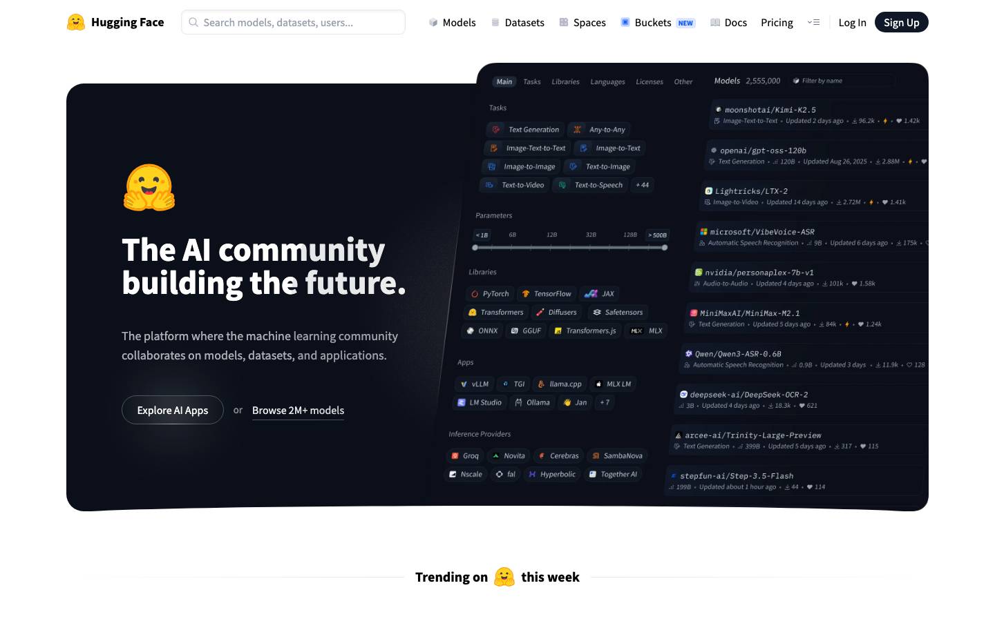
Hugging Face's design system embodies a forward-thinking, inclusive approach to AI community building. It balances warmth and accessibility with sophisticated simplicity, using a predominantly monochromatic palette punctuated by the iconic yellow hugging emoji. The visual language prioritizes clarity and focus, avoiding unnecessary decoration while maintaining an approachable, human-centered feel. Dark hero sections with bright call-to-actions create dramatic contrast, drawing users into collaborative AI tools and resources. The system feels professional yet approachable, technical yet inclusive—perfectly matching the platform's mission to democratize artificial intelligence through open source.
Key Characteristics
- Clean, minimal monochromatic foundation with strategic black and white contrast
- High-contrast UI elements ensure accessibility and focus hierarchy
- Generous whitespace and breathing room reduce cognitive load
- Warm, human-centered tone through subtle accent colors and emoji branding
- Performance-focused simplicity with no unnecessary ornamentation
- Community-forward design that feels collaborative rather than corporate
2. Color Palette & Roles
Primary
- Black (
#000000): Primary text, dark backgrounds, dominant UI element. Most frequently used color across the system for typography and interactive states. - White (
#FFFFFF): Default background surfaces, text contrast, primary button text on dark backgrounds.
Interactive
- Deep Navy (
#0B0F19): Subtle accent for hero sections and atmospheric depth; rarely used but establishes the brand's technical sophistication.
Neutral Scale
- Neutral Gray (
#F3F3F3): Inferred light surface background for cards and containers; provides subtle visual separation without harshness. - Medium Gray (
#808080): Inferred secondary text and disabled states; maintains hierarchy without overwhelming the interface. - Dark Gray (
#333333): Inferred body text alternative when maximum contrast is needed; optional for specific contexts.
Surface & Borders
- Light Border (
#E5E5E5): Inferred subtle card and input borders; maintains visual structure without dominating the design. - Light Surface (
#FAFAFA): Inferred light card and container backgrounds; distinguishes content zones from main background.
3. Typography Rules
Font Family
Primary: Source Sans Pro, -apple-system, BlinkMacSystemFont, "Segoe UI", Roboto, sans-serif Secondary: IBM Plex Mono, "Courier New", monospace (for code and technical content)
Hierarchy
| Role | Font | Size | Weight | Line Height | Letter Spacing | Notes |
|---|---|---|---|---|---|---|
| Display XL | Source Sans Pro | 72px | 700 | 72px | 0px | Hero section headlines; used sparingly |
| Display LG | Source Sans Pro | 48px | 700 | 48px | 0px | Large section headers |
| Display MD | Source Sans Pro | 36px | 700 | 40px | 0px | Primary page heading |
| Heading 1 | Source Sans Pro | 30px | 700 | 36px | 0px | Major section titles |
| Heading 1 Alt | Source Sans Pro | 24px | 600 | 32px | 0px | Alternative heading size |
| Heading 2 | Source Sans Pro | 20px | 600 | 28px | 0px | Subsection headers |
| Heading 2 Alt | Source Sans Pro | 18px | 600 | 28px | 0px | Smaller subsections |
| Heading 3 | Source Sans Pro | 20px | 700 | 28px | 0px | Tertiary headers; higher weight |
| Body LG | Source Sans Pro | 24px | 400 | 32px | 0px | Large body text for emphasis |
| Body | Source Sans Pro | 20px | 400 | 28px | 0px | Primary body copy |
| Body MD | Source Sans Pro | 18px | 400 | 28px | 0px | Standard body and card content |
| Body Emphasized | Source Sans Pro | 18px | 700 | 28px | 0px | Emphasized inline text within body |
| Body SM | Source Sans Pro | 16px | 400 | 24px | 0px | Secondary body text |
| Small | Source Sans Pro | 14px | 400 | 20px | 0px | Captions, metadata, helper text |
| Link | Source Sans Pro | 16px | 400 | 24px | 0px | Hyperlink default style |
| Button | Source Sans Pro | 18px | 500 | 28px | 0px | Primary and secondary buttons |
| Button SM | Source Sans Pro | 16px | 400 | 24px | 0px | Small button variant |
| Button XS | Source Sans Pro | 14px | 400 | 20px | 0px | Extra-small button or badge text |
| Code | IBM Plex Mono | 14px | 400 | 20px | 0px | Code blocks and inline code |
| Code LG | IBM Plex Mono | 15.04px | 400 | 24px | 0px | Larger code context |
Principles
- Hierarchy through weight and size: The system uses bold weights (600, 700) for structural headings and 400 for readable body text.
- Consistent line height: All text maintains generous line height (1.4–1.5x font size) for legibility and breathing room.
- Accessible contrast: All text meets WCAG AA minimum contrast ratios against background colors.
- Proportional scaling: Font sizes follow a deliberate scale; no arbitrary sizes in production.
- Monospace for technical content: IBM Plex Mono is reserved for code, data, and technical references.
4. Component Stylings
Buttons
Primary Button
- Background:
#000000 - Text Color:
#FFFFFF - Font: Source Sans Pro, 18px, weight 500
- Padding:
10px 24px - Border Radius:
3.35544e+07px(fully rounded pill shape) - Border:
0px solid - Box Shadow:
rgb(255, 255, 255) 0px 0px 0px 3px inset, oklch(0.872 0.01 258.338) 0px 0px 0px 4px inset, rgba(0, 0, 0, 0.1) 0px 10px 15px -3px, rgba(0, 0, 0, 0.1) 0px 4px 6px -4px - Height:
48px - Line Height:
28px - Hover: Darken background to
#1A1A1A - Active: Add subtle inset shadow; maintain white outline ring
Secondary Button (Ghost on Light)
- Background:
#F3F3F3(light gray) - Text Color:
#0B0F19(deep navy, inferred from brand accent) - Font: Source Sans Pro, 18px, weight 500
- Padding:
10px 24px - Border Radius:
3.35544e+07px - Border:
0px solid - Box Shadow:
rgb(255, 255, 255) 0px 0px 0px 3px, oklch(0.928 0.006 264.531) 0px 0px 0px 4px - Height:
48px - Line Height:
28px - Hover: Lighten background to
#EBEBEB - Active: Add subtle shadow; maintain structural ring
Tertiary Button (Link Style)
- Background:
rgba(0, 0, 0, 0)(transparent) - Text Color:
#000000 - Font: Source Sans Pro, 14px, weight 400
- Padding:
0px 8px 0px 0px - Border Radius:
0px - Border:
0px solid - Box Shadow:
none - Height:
20px - Line Height:
20px - Hover: Add underline or subtle text color shift to lighter gray
- Active: Maintain underline; adjust opacity to
0.7
Small Button Variant
- Background:
#FFFFFF - Text Color:
oklch(0.551 0.027 264.364)(subtle blue-gray) - Font: Source Sans Pro, 14px, weight 400
- Padding:
4px 10px 4px 8px - Border Radius:
3.35544e+07px(pill shape) - Border:
1px solid oklch(0.967 0.003 264.542)(very light gray border) - Box Shadow:
none - Height:
30px - Line Height:
20px - Hover: Add subtle background shift to
#F9F9F9
Cards & Containers
Default Card
- Background:
#FFFFFF - Text Color:
#000000 - Font: Source Sans Pro, 16px, weight 400
- Padding:
0px(layout dependent) - Border Radius:
0px - Border:
1px solid #E5E5E5(inferred light border) - Box Shadow:
rgba(0, 0, 0, 0.05) 0px 1px 2px 0px - Line Height:
24px - Hover: Lift shadow to
rgba(0, 0, 0, 0.08) 0px 2px 4px 0px
Pricing Card
- Background:
#FFFFFF - Text Color:
#000000 - Font: Source Sans Pro, 16px, weight 400
- Padding:
40px 24px(inferred from screenshots) - Border Radius:
0px(larger corner radius for emphasis) - Border:
1px solid #E5E5E5 - Box Shadow:
rgba(0, 0, 0, 0.05) 0px 1px 2px 0px - Line Height:
24px - Most Popular Badge: Position absolute top-right with gradient background (
linear-gradient(135deg, #FFB366, #66FF99)) and bold black text
Hero Card (Dark Background)
- Background:
#0B0F19(deep navy) - Text Color:
#FFFFFF - Font: Source Sans Pro, 16px–18px, weight 400
- Padding:
80px 64px(generous internal spacing) - Border Radius:
24px(inferred from screenshots) - Border:
1px solid rgba(255, 255, 255, 0.1) - Box Shadow:
noneorrgba(0, 0, 0, 0.3) 0px 10px 30px 0px - Line Height:
24px–28px - Content: Align left; include heading, subheading, and CTA buttons
Glassmorphism Card (Overlay)
- Background:
rgba(255, 255, 255, 0.4)oroklab(0.999994 0.0000455678 0.0000200868 / 0.4)(very light with transparency) - Text Color:
#000000 - Font: Source Sans Pro, 16px, weight 400
- Padding:
24px(inferred) - Border Radius:
0pxor0px - Border:
1px solid rgba(0, 0, 0, 0.05)oroklab(0.928 -0.000571842 -0.00597269 / 0.7) - Box Shadow:
noneor backdrop-filter blur effect - Line Height:
24px - Usage: Feature cards or section overlays with semi-transparent appearance
Inputs & Forms
Text Input (Default)
- Background:
#FFFFFF - Text Color:
#000000 - Font: Source Sans Pro, 16px, weight 400
- Padding:
8px 12px 8px 32px(left padding for icon) - Border Radius:
0px - Border:
1px solid oklch(0.928 0.006 264.531)(light gray) - Box Shadow:
rgba(0, 0, 0, 0.05) 0px 2px 4px 0px inset(subtle inset shadow) - Height:
36px - Line Height:
24px - Focus: Add outline
2px solid #000000or subtle blue focus ring - Hover: Lighten border slightly; maintain shadow
Search Input (Large)
- Background:
#FFFFFF - Text Color:
#000000 - Font: Source Sans Pro, 16px, weight 400
- Padding:
8px 40px(symmetric padding for search icon) - Border Radius:
3.35544e+07px(fully rounded) - Border:
1px solid oklab(0.928 -0.000571842 -0.00597269 / 0.7)(subtle border) - Box Shadow:
none - Height:
42px - Line Height:
24px - Focus: Add focus ring or shadow for visibility
- Placeholder: Color
#999999, font-size 16px
Search Input (Small)
- Background:
#FFFFFF - Text Color:
#000000 - Font: Source Sans Pro, 14px, weight 400
- Padding:
8px 12px 8px 32px - Border Radius:
3.35544e+07px - Border:
1px solid oklch(0.928 0.006 264.531) - Box Shadow:
rgba(0, 0, 0, 0.05) 0px 2px 4px 0px inset - Height:
32px - Line Height:
20px - Usage: Secondary search or filter input
Navigation
Top Navigation Bar
- Background:
#FFFFFF - Text Color:
#000000 - Font: Source Sans Pro, 16px, weight 400
- Padding:
16px 24px(inferred vertical/horizontal padding) - Border Radius:
0px - Border:
1px solid #E5E5E5(bottom border only, inferred) - Box Shadow:
noneorrgba(0, 0, 0, 0.05) 0px 1px 2px 0px - Height:
auto(typically 56–64px total) - Line Height:
24px - Logo: 32px × 32px with text "Hugging Face" at 16px weight 600
- Links: Padding
8px 12px, no decoration, color#000000 - Active Link: Underline or background highlight at
#F3F3F3 - Primary CTA (Sign Up): Use Primary Button style (
#000000background,#FFFFFFtext, 18px weight 500, padding10px 24px)
Navigation Link Hover
- Background:
#F3F3F3 - Text Color:
#000000 - Transition:
background-color 0.2s ease
5. Layout Principles
Spacing System
Base Unit: 4px
Scale:
4px: Tight spacing (rarely used; icon margins)8px: XS gap (inline element spacing)12px: Small padding (input padding, badge internal)16px: Small margin (component gaps, padding baseline)20px: Medium margin (section padding inside cards)24px: Standard padding (card internal spacing, section gutters)32px: Large margin (section separation)40px: Extra-large padding (container internal spacing)48px: XL margin (major section spacing)56px: XXL padding (hero section internal)64px: Hero spacing (large card padding)80px: Major section separation (between page sections)
Usage Context:
- Components (buttons, inputs):
8px–12pxinternal padding - Cards:
24px–40pxinternal padding - Sections:
32px–80pxvertical margins between sections - Containers:
40px–64pxhorizontal/vertical padding for full-width sections
Grid & Container
Max Width: 1280px (inferred from typical web standards; adjust to actual container widths observed)
Column Strategy:
- 12-column grid system (inferred standard)
- Mobile: Single column, full bleed (100% – 16px padding each side)
- Tablet: 2–4 columns with 16px gutters
- Desktop: Full 12-column with 24px gutters
Section Patterns:
- Hero: Full viewport height, centered content, dark background (
#0B0F19or#000000), white text - Feature Grid: Cards in 3-column layout (desktop), 2-column (tablet), 1-column (mobile) with 24px gap
- Pricing Cards: 3 columns (desktop), 1-column stacked (mobile) with 32px gap
- Content Section: Max-width centered container with 40px horizontal padding
Whitespace Philosophy
Hugging Face employs generous, intentional whitespace to reduce cognitive load and guide user attention. Sections breathe; content does not feel cramped. Whitespace hierarchy:
- Within components:
8px–12px(tight but breathable) - Between related elements:
16px–24px(visual grouping) - Between sections:
48px–80px(major content separation) - Margins on hero text: Large line-height (
1.2–1.5) and line-spacing for readability
Border Radius Scale
0px: Minimal softness (rare, subtle image corners)4px: Small containers (badge, minimal card accent)6px: Input alternative (form fields in some contexts)0px: Default radius (cards, containers, standard inputs)0px: Elevated radius (large cards, pricing cards, image corners)24px: Extra-large radius (inferred from hero cards)3.35544e+07px: Fully rounded (pill-shape buttons, full-width search inputs)
Border Widths
1px: Standard border (cards, inputs, light accents)2px: Medium border (focus rings, emphasis accents)3px: Focus ring (visual feedback on keyboard navigation, inferred)
6. Depth & Elevation
| Level | Treatment | Use |
|---|---|---|
| Base (0) | No shadow | Flat components, typography-only sections |
| Raised (1) | rgba(0, 0, 0, 0.05) 0px 1px 2px 0px | Cards, light UI elements |
| Elevated (2) | rgba(0, 0, 0, 0.05) 0px 2px 4px 0px inset | Input focus, slight lift on hover |
| Mid (3) | rgba(0, 0, 0, 0.1) 0px 1px 3px 0px, rgba(0, 0, 0, 0.1) 0px 1px 2px -1px | Dropdowns, popovers, light elevation |
| High (4) | rgba(0, 0, 0, 0.04) 0px 10px 20px 0px, rgba(0, 0, 0, 0.04) 0px 2px 6px 0px, rgba(0, 0, 0, 0.04) 0px 0px 1px 0px | Modals, toasts, major components |
| Hero (5) | rgba(0, 0, 0, 0.3) 0px 10px 30px 0px or custom deep shadow | Dark hero sections over imagery |
Shadow Philosophy: Hugging Face uses subtle, refined shadows that create depth without drama. Shadows are soft, neutral, and never harsh. The system emphasizes flatness with minimal elevation; depth is achieved through color and layout rather than aggressive shadow stacking. Inset shadows (on inputs, buttons) create tactile, interactive feedback.
Opacity Levels
0.25(25%): Disabled text, very faint overlays0.40(40%): Muted secondary elements, subtle text color0.50(50%): Half-transparent overlays, hover states for muted elements0.60(60%): Medium transparency (inferred)0.75(75%): Slightly opaque foreground elements0.90(90%): Near-full opacity, slight transparency for atmosphere
Usage: Disabled states use 0.50 opacity. Text hierarchy uses opacity to create visual weight without changing font size. Overlays on backgrounds use 0.25–0.40 opacity for subtle depth.
Z-index / Layering
1(Base): Default stacking context, main content2(Elevated): Raised cards, hovered elements5(Floating): Sticky headers, floating action buttons10(Dropdown): Dropdowns, popovers over base content20(Sticky): Sticky navigation, persistent overlays40(Modal): Modals, major overlays above all content
Layering Strategy: Use minimal z-index values; avoid excessive nesting. Organize layers clearly: base content → floating UI → overlays → modals. Ensure focus management aligns with z-index hierarchy.
7. Do's and Don'ts
Do
- Maintain high contrast: All text must meet WCAG AA standards (4.5:1 minimum for body text).
- Use generous padding and margins: Spacing clarifies hierarchy and reduces cognitive load.
- Prefer weight and size over color for hierarchy: Use bold fonts (600, 700) and larger sizes to guide attention, not color alone.
- Keep inputs and buttons pill-shaped: Use
border-radius: 3.35544e+07pxfor pill buttons and search inputs; maintain this distinctive style. - Prioritize simplicity: Remove decorative elements that don't serve a functional purpose.
- Use Source Sans Pro for all UI text: Maintain consistent typography across the platform; reserve IBM Plex Mono only for code.
- Stack shadows subtly: Apply soft, minimal shadows (
0px 1px 2px,0px 2px 4px) rather than aggressive elevation effects. - Align interactive elements to the grid: Use consistent 4px or 8px spacing for buttons, inputs, and navigation.
- Test across all breakpoints: Verify responsive behavior on mobile, tablet, and desktop before shipping.
- Provide clear focus states: Ensure keyboard navigation is obvious with visible focus rings (2px solid outline or subtle shadow shift).
Don't
- Don't use colors beyond the core palette: Stick to black, white, navy, and inferred grays. Avoid introducing new accent colors without approval.
- Don't use serif fonts: Source Sans Pro and IBM Plex Mono are the only approved typefaces; avoid Serif, Georgia, or other decorative families.
- Don't create overly large shadows: Shadows should be subtle (max
rgba(0, 0, 0, 0.1)blur/spread) to maintain a clean, modern aesthetic. - Don't crowd UI with elements: Leave breathing room; dense layouts undermine the system's clarity and accessibility.
- Don't override focus states: Always provide visible focus indicators for keyboard users; never set
outline: nonewithout a custom replacement. - Don't use decorative images without purpose: Every visual element should support hierarchy or communicate function.
- Don't break the spacing scale: All margins and padding should be multiples of 4px (4, 8, 12, 16, 20, 24, 32, 40, 48, 56, 64, 80).
- Don't mix rounded and sharp corners inconsistently: Apply radius rules consistently: 0px for cards,
3.35544e+07pxfor buttons, 0px for navigation bars. - Don't use more than 2–3 font weights simultaneously: Limit to 400 (regular), 600 (semibold), and 700 (bold) to avoid visual chaos.
- Don't place critical CTAs in low-contrast areas: Primary buttons should always use the Primary Button style (
#000000background,#FFFFFFtext).
8. Responsive Behavior
Breakpoints
| Breakpoint | Width | Key Changes |
|---|---|---|
| Mobile | 320px–480px | Single-column layout; full-width cards; 16px horizontal padding; collapse navigation to hamburger; large tap targets (44px minimum); reduce font sizes by 2–4px |
| Mobile Large | 481px–768px | 2-column grid for cards; 24px horizontal padding; navigation may remain horizontal if simplified |
| Tablet | 769px–1024px | 2–3 column grid; 32px horizontal padding; full navigation bar; optimize image sizes for tablet resolution |
| Desktop | 1025px–1440px | Full 3-column grid; 40–64px horizontal padding; max-width container at 1280px; all features visible |
| Desktop Large | 1441px+ | Center content with max-width; maintain 1280px container; add lateral padding |
Touch Targets
- Minimum size:
44px × 44px(mobile touch targets) - Buttons:
48px height(desktop),44px height(mobile) - Inputs:
36px–42px height(comfortable typing) - Navigation links:
44px tallwith 12px horizontal padding - Icons within buttons:
20px × 20pxwith surrounding padding to reach 44px target - Spacing between targets: At least
12pxgap to prevent accidental touches
Collapsing Strategy
- Hero section: Stack text and CTA vertically on mobile; maintain 40px padding.
- Feature cards: 1 column on mobile, 2 on tablet, 3 on desktop; stack cards with 20px gap on mobile, 24px on desktop.
- Pricing cards: Full-width stack on mobile with bottom margin; 2 columns on tablet; 3 columns on desktop.
- Navigation: Horizontal on desktop and tablet; collapse to hamburger icon on mobile (320px–480px breakpoint).
- Search input: Full-width on mobile with 16px side padding; fixed width on desktop (320px–400px).
- Buttons: Full-width on mobile with 16px side padding; auto-width on desktop.
- Whitespace: Reduce margins and padding by 20–30% on mobile; maintain hierarchy but compress vertical space.
- Typography: Keep heading sizes consistent; reduce body text by 2px on mobile (16px instead of 18px) for improved readability.
- Containers: Full-width on mobile with 16px padding; max-width 1280px centered on desktop with 40px padding.
9. Agent Prompt Guide
Quick Color Reference
- Primary CTA: Black (
#000000) background with white text - Secondary CTA: Light gray (
#F3F3F3) background with navy text - Background: White (
#FFFFFF) - Hero Background: Deep Navy (
#0B0F19) - Text (Headings): Black (
#000000) - Text (Body): Black (
#000000) - Text (Secondary): Medium Gray (
#808080, inferred) - Borders: Light Gray (
#E5E5E5, inferred) - Disabled State: 50% opacity with original color
Iteration Guide
- Always use Source Sans Pro for UI and IBM Plex Mono for code. No exceptions; maintain typographic consistency.
- Apply spacing in multiples of 4px: All padding, margin, and gaps must align to the 4px base unit. Examples: 8, 12, 16, 20, 24, 32, 40, 48, 56, 64, 80.
- Primary buttons are pill-shaped black (
#000000) with white text, 18px weight 500, padding 10px 24px, height 48px. Copy this exactly for all primary CTAs. - Cards default to white background with 1px light gray border and subtle shadow
rgba(0, 0, 0, 0.05) 0px 1px 0px 0px. Add 0px border radius; increase to 0px for emphasis. - Search inputs are full-width pill-shaped (
border-radius: 3.35544e+07px) with 0px vertical and 40px horizontal padding; height 42px on desktop, 36px on mobile. - Hero sections use deep navy (
#0B0F19) background with white text; padding 80px 64px; border-radius 24px; include heading, subheading, and 1–2 CTAs. - Focus states require visible indicators: Use 2px solid outline, subtle shadow lift, or background color shift; never remove focus without a replacement.
- Maintain high contrast: Body text (16–20px) must have minimum 4.5:1 contrast ratio; larger text (24px+) needs 3:1 minimum.
- Responsive collapsing: 1 column on mobile (320–480px), 2 columns on tablet (481–1024px), 3 columns on desktop (1025px+); adjust padding from 16px mobile to 40px desktop.
- All font sizes are explicit px values; no relative units (rem, em) without a documented scale. Example: 18px body, 24px heading, 72px display. Convert to px always.
Make it yours
Change the colors, fonts and corners of Huggingface Remix, and save your own DESIGN.md. Free.
Remix history
Where it came from
Discover · Aug 9, 2026
- Huggingface RemixThis remix
Remix · by Daniel A. · Oct 30, 2026
Remixed from this
No public remixes yet. Be the first to make one.
Remix it