
Plan, write and ship in one place. Every page in your workspace follows the same design system, so nothing drifts.
Fast by default
Pages load in under a second, with nothing to configure.
Built for teams
Shared spaces, comments and roles that match how you work.
Secure from day one
SSO, audit logs and encryption at rest on every plan.
Create your account
Send me product updatesCreate accountnpm install @northwind/sdk
Pro
- Unlimited pages
- Version history
- Priority support
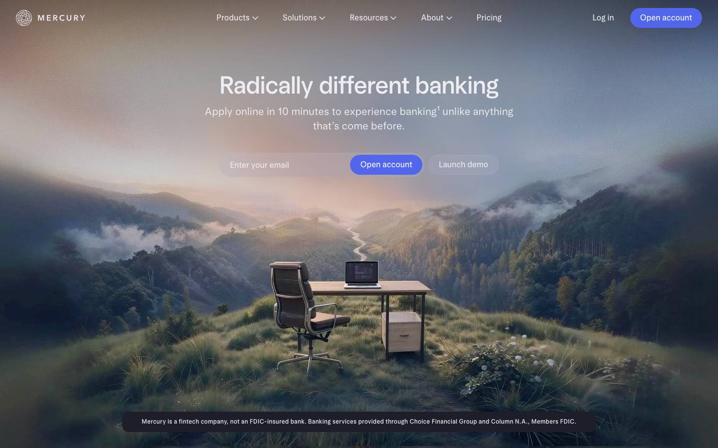
Started from
mercury.comPreview
the remixed design systemSwitch between the rendered Visual preview and the Raw DESIGN.md.
Mercury Remix
Remix of mercury.com. The colors, fonts and shapes were edited in DesignMD. The token block above has the current values. The sections below were written for the original, so they may still mention it.
1. Visual Theme & Atmosphere
Mercury's design system embodies a modern fintech aesthetic that balances professional banking credibility with approachable, forward-thinking minimalism. The visual language embraces subtle sophistication through a restrained color palette of deep navy backgrounds, soft lavender accents, and crisp white typography. The atmosphere is calm and purposeful, with generous whitespace and geometric precision creating a sense of clarity and control. The brand projects confidence in complexity simplified—ideal for users managing business finances without friction. The design favors clean typography, soft shadow work, and a focus on human-scale interactions that feel less corporate and more like a trusted digital partner.
Key Characteristics
- Minimalist dark mode-first aesthetic with navy foundations
- Soft, approachable accent colors (lavender, periwinkle) balanced against stark neutrals
- Precise geometric forms with generous breathing room
- Warm, human typography that softens technical complexity
- Subtle elevation and shadow treatment for nuanced depth
- Restrained, purposeful use of color for focus and hierarchy
2. Color Palette & Roles
Primary
- Primary Interactive (
#5266EB): Core call-to-action and primary engagement surfaces; used for "Open account" buttons and key conversion points - Primary Overlay (
#9CB4E8): Semi-transparent interactive states at 20% opacity; applied to secondary buttons and tertiary interactions
Accent Colors
- Accent Soft (
#AFB2CE): Neutral bridge color between primary and background; used for supporting typography and subtle dividers - Accent Light (
#EDEDF3): Lightest accent surface; applied to input backgrounds and subtle UI separations
Interactive
- Interactive Ghost (
#810404): Secondary action states and minimal borders; conveys subtle affordance - Interactive Tertiary (
#272735): Tertiary action backgrounds; used for subdued navigation items
Neutral Scale
- Text Primary (
#000000): Dominant text color across all typographic hierarchies; applied to body copy and primary headings - Text Inverse (
#EDEDF3): Light text on dark backgrounds; used in navigation, CTAs, and dark mode content - Text Tertiary (
#C3C3CC): Disabled, hint, and secondary label text; indicates lower priority information - Neutral White (
#FFFFFF): Pure white for card backgrounds and elevated surfaces
Surface & Borders
- Surface Dark (
#810404): Navigation background and dark section containers - Surface Darker (
#272735): Alternative dark surface; secondary navigation or grouped content areas - Border Subtle (
#EBEBEB): Minimal border treatment on light surfaces - Border Muted (
#F5F5F5): Inert dividers and separator lines
3. Typography Rules
Font Family
Primary: Arcadia Display (font-family: 'arcadia-display', system-ui, -apple-system, sans-serif)
Secondary: Arcadia (font-family: 'arcadia', system-ui, -apple-system, sans-serif)
Hierarchy
| Role | Font | Size | Weight | Line Height | Letter Spacing | Notes |
|---|---|---|---|---|---|---|
| Display 1 (H1) | Arcadia Display | 49px | 480 | 54px | Normal | Hero headlines; maximum visual impact |
| Display 2 (H2) | Arcadia Display | 42px | 480 | 48px | Normal | Section headings; strong visual hierarchy |
| Heading 3 | Arcadia | 16px | 400 | 24px | Normal | Subsection titles; moderate prominence |
| Body Large | Arcadia Display | 21px | 480 | 25px | Normal | Feature copy; marketing and editorial content |
| Body Regular | Arcadia | 16px | 420 | 24px | Normal | Primary reading text; standard paragraphs |
| Button | Arcadia | 16px | 420 | 16px | Normal | Interactive labels; all button variants |
| Small / Caption | Arcadia | 12px | 480 | 17px | Normal | Supporting text; fine print and labels |
| UI Small | Arcadia | 14px | 420 | 14px | Normal | Secondary labels; compact UI text |
Principles
- Weight hierarchy reinforces meaning: Display faces use weight 480 for dominance; secondary text uses 400–420 for visual rest
- Line-height provides rhythm: Generous leading (1.1–1.5×) on all text creates breathing room and readability
- Size progression is intentional: Eight-tier hierarchy prevents decision paralysis and creates clear scan paths
- Typeface pairing balances warmth: Arcadia Display adds personality to headings; Arcadia provides neutral legibility in UI
- Small text remains readable: Minimum size of 12px ensures accessibility; weights increase slightly at smaller sizes for compensation
4. Component Stylings
Buttons
Primary Button (Full-Width CTA)
- Background:
#5266EB - Text Color:
#EDEDF3 - Font Size:
16px - Font Weight:
420 - Font Family:
Arcadia - Padding:
0px 20px - Height:
40px - Border Radius:
40px - Border:
none - Box Shadow:
none - Line Height:
16px - Hover State: Opacity
0.9on background; subtle forward movement via transformtranslateY(-1px) - Active State: Opacity
0.8 - Disabled State: Background
rgba(156, 180, 232, 0.2), Text Color#C3C3CC
Secondary Button (Ghost / Tertiary CTA)
- Background:
rgba(156, 180, 232, 0.2)(20% opacity of#9CB4E8) - Text Color:
#EDEDF3 - Font Size:
14px - Font Weight:
420 - Font Family:
Arcadia - Padding:
0px 16px - Height:
32px - Border Radius:
40px - Border:
none - Box Shadow:
none - Line Height:
14px - Hover State: Background opacity increases to
0.3 - Active State: Background opacity
0.15
Minimal Navigation Button
- Background:
transparent - Text Color:
#EDEDF3 - Font Size:
16px - Font Weight:
420 - Font Family:
Arcadia - Padding:
0px 20px - Height:
40px - Border Radius:
40px - Border:
none - Box Shadow:
none - Line Height:
16px - Hover State: Background
rgba(156, 180, 232, 0.1), slight scale1.02 - Active State: Text Color
#9CB4E8
Cards & Containers
Hero Card (Full-Width Section)
- Background:
transparent(image overlay) - Padding:
0px - Border Radius:
0px - Border:
none - Height:
auto(min447px) - Box Shadow:
none
Content Card (Contained Section)
- Background:
#FFFFFF - Padding:
32px - Border Radius:
0px - Border:
1px solid #EBEBEB - Box Shadow:
rgba(28, 28, 35, 0.02) 0px 10px 16px 0px, rgba(28, 28, 35, 0.04) 0px 6px 10px 0px, rgba(28, 28, 35, 0.09) 0px 0px 3px 0px - Min Height:
auto
Dark Container (Section Background)
- Background:
#810404 - Padding:
72px 32px - Border Radius:
0px - Border:
none - Box Shadow:
none - Text Color:
#EDEDF3
Inputs & Forms
Email Input
- Background:
transparent - Text Color:
#EDEDF3 - Font Size:
16px - Font Weight:
420 - Font Family:
Arcadia - Padding:
0px 20px - Height:
46px - Border Radius:
32px 0px 0px 32px(left-rounded for paired button) - Border:
1px solid rgba(156, 180, 232, 0.3) - Placeholder Color:
rgba(237, 237, 243, 0.5) - Focus State: Border Color
#9CB4E8, Box Shadow0px 0px 0px 2px rgba(82, 102, 235, 0.1) - Line Height:
16px
Input Group (Input + Button)
- Display:
flex - Gap:
0px(adjacent elements) - Height:
46px - Border Radius: Input left
32px, Button right32px - Background:
rgba(156, 180, 232, 0.1)(grouped container)
Navigation
Top Navigation Bar
- Background:
#810404 - Padding:
16px 32px - Height:
72px - Border Radius:
0px - Border:
none - Box Shadow:
rgba(86, 86, 118, 0.1) 0px 0px 6px 0px - Display:
flex - Align Items:
center - Justify Content:
space-between
Nav Link (Default)
- Background:
transparent - Text Color:
#EDEDF3 - Font Size:
16px - Font Weight:
400 - Font Family:
Arcadia - Padding:
0px - Border Radius:
4px - Line Height:
24px - Hover State: Text Color
#9CB4E8, underline2px solid #9CB4E8(bottom) - Active State: Text Color
#5266EB
Nav Link (Badge/Secondary)
- Background:
rgba(156, 180, 232, 0.2) - Text Color:
#EDEDF3 - Font Size:
14px - Font Weight:
420 - Font Family:
Arcadia - Padding:
0px 16px - Height:
32px - Border Radius:
40px - Line Height:
14px - Hover State: Background opacity
0.3
Links
Inline Link (Light Text)
- Background:
transparent - Text Color:
#EDEDF3 - Font Size:
16px - Font Weight:
400 - Font Family:
Arcadia - Text Decoration:
underline - Text Decoration Color:
rgba(156, 180, 232, 0.5) - Line Height:
24px - Hover State: Text Decoration Color
#9CB4E8
Inline Link (Dark Text)
- Background:
transparent - Text Color:
#000000 - Font Size:
14px - Font Weight:
420 - Font Family:
Arcadia - Text Decoration:
underline - Text Decoration Color:
rgba(82, 102, 235, 0.3) - Line Height:
14px - Hover State: Text Decoration Color
#5266EB, color#5266EB
5. Layout Principles
Spacing System
Base Unit: 4px
Spacing Scale:
4px– Micro spacing; internal component padding8px– Compact spacing; tight groupings12px– Small gap; related elements16px– Base spacing; standard padding and margins24px– Medium gap; grouped sections32px– Large padding; card and container boundaries40px– Extra-large gap; major section separation72px– Hero padding; full-height sections
Usage Context:
- Micro (
4px): Between icon and text, nested component gaps - Compact (
8px): Inline element spacing, density-optimized layouts - Small (
12px): Button groups, form field spacing - Base (
16px): Default padding on inputs, navigation height divisor - Medium (
24px): Row gaps in grids, space between stacked sections - Large (
32px): Card padding, container side margins - Extra-Large (
40px): Section breaks, grid row gaps - Hero (
72px): Full-width section padding, landing page spacing
Grid & Container
- Max Width:
1440pxfor full-bleed layouts (navigation and hero) - Container Max Width:
1024pxfor content sections - Column Strategy: 12-column grid with
16pxcolumn gap - Section Patterns: Full-width header (dark background), centered content containers (white/light background), full-width footer (dark background)
- Gutter:
32pxleft/right on desktop;16pxon tablet;12pxon mobile
Whitespace Philosophy
Mercury prioritizes substantial whitespace to communicate clarity and control. Generous margins separate sections, allowing users to process information deliberately. Internal padding within components prevents visual cramping; external margins create breathing room between content blocks. The system avoids dense layouts, instead using negative space to guide visual hierarchy and reduce cognitive load.
Border Radius Scale
4px– Minimal accent; link focus states, subtle UI elements32px– Semi-rounded; inputs and rounded containers40px– Full rounding; pill buttons and compact badges0px– Sharp edges; cards, sections, and hero containers (modern, precise aesthetic)
Border Widths
- Thin:
1px– Standard borders on inputs, card separators, and minimal UI elements - Subtle:
1px solid #EBEBEB– Very light dividers on light backgrounds - Muted:
1px solid rgba(156, 180, 232, 0.3)– Input borders with slight color depth
6. Depth & Elevation
| Level | Treatment | Use |
|---|---|---|
| Base | No shadow | Backgrounds, hero sections, primary surfaces |
| Navigation | rgba(86, 86, 118, 0.1) 0px 0px 6px 0px | Top bar; subtle downward hint |
| Hover | rgba(28, 28, 35, 0.02) 0px 10px 16px 0px, rgba(28, 28, 35, 0.04) 0px 6px 10px 0px, rgba(28, 28, 35, 0.09) 0px 0px 3px 0px | Cards and containers on hover; moderate lift |
| Elevated | rgba(0, 0, 0, 0.05) 0px 0px 3px 0px, rgba(0, 0, 0, 0.05) 0px 8px 12px 0px, rgba(0, 0, 0, 0.05) 0px 12px 20px 0px | Modals, overlays, and floating elements; strong separation |
Shadow Philosophy: Mercury uses highly restrained shadow work to maintain visual clarity. Most UI elements are shadowless, reserving subtle depth treatment for navigation and interactive states. Multi-layer shadow compositions create dimensional layers without visual noise—base shadows define subtle definition, mid-layer shadows indicate elevation, and top shadows provide key-light definition. This three-part shadow system communicates depth while preserving the clean, minimal aesthetic.
Opacity Levels
- Disabled / Inactive:
0.24(24%) – Reduced prominence for non-interactive or disabled states - Hover / Active:
0.70(70%) – Increased opacity on hover to signal interactivity
Z-index / Layering
- Base Content:
z-index: 1– Body text, card content, standard layout layers - Grouped Content:
z-index: 2– Grouped sections and contained components - Sticky Elements:
z-index: 3– Sticky navigation and anchored components - Floating Elements:
z-index: 5– Floating action buttons and persistent UI - Dropdown Menus:
z-index: 10– Select menus and nested dropdowns - Modal / Overlay Background:
z-index: 20– Semi-transparent overlay layers - Modal / Dialog Content:
z-index: 99– Topmost dialog and alert content
7. Do's and Don'ts
Do
- Use the primary color (
#5266EB) sparingly. Reserve it for high-priority CTAs and key conversion moments; overuse dilutes impact. - Pair dark backgrounds with light text systematically. Use
#810404or#272735with#EDEDF3to maintain contrast and readability. - Apply spacing in multiples of
4px. This ensures rhythmic consistency and simplifies responsive scaling. - Layer components using the z-index scale. Never jump z-index values; maintain the defined stacking order.
- Use Arcadia Display for headlines and Arcadia for body/UI. The pairing balances personality with legibility.
- Communicate disabled states via opacity (
0.24) and color desaturation. Never remove interactive affordance; always indicate state clearly. - Nest inputs into input groups when paired with buttons. Use
border-radiusadjustments and flex layout to create unified components. - Apply multi-layer shadows only to elevated elements. Use the navigation, hover, and elevated shadow tokens—don't create custom shadow values.
Don't
- Don't use
#5266EBfor body text or secondary UI. The contrast is insufficient; use#000000or#EDEDF3instead. - Don't add rounded corners to full-width hero sections. Maintain the
0pxradius for cards and hero containers to preserve the sharp, modern aesthetic. - Don't exceed
72pxpadding on any standard section. Hero sections are an exception; standard content should use16px–32px. - Don't apply shadows to every interactive element. Limit shadow use to navigation and elevated cards; most UI should remain flat.
- Don't mix Arcadia Display with body-sized text. Reserve Arcadia Display for Display 1–2 roles only; use Arcadia for all other text.
- Don't use both
#810404and#272735in adjacent sections. Choose one background consistently per layout; switch colors only when moving between major sections. - Don't deviate from the border radius scale. Use
4px,32px,40px, or0px; custom radii fragment the visual system. - Don't create new button states beyond the defined primary, secondary, and ghost variants. Stick to the three patterns; extend via size or icon usage only.
8. Responsive Behavior
Breakpoints
| Breakpoint | Width | Key Changes |
|---|---|---|
| Mobile | 320px–767px | Single-column layout; 16px gutter; stacked navigation; 32px section padding |
| Tablet | 768px–1023px | Two-column grid; 24px gutter; horizontal navigation; 40px section padding |
| Desktop | 1024px–1439px | Three+ column grid; 32px gutter; full navigation; 72px section padding |
| Large Desktop | 1440px+ | Max-width 1440px container; centered layout; full-feature navigation |
Touch Targets
- Minimum Height:
44pxfor all interactive elements (buttons, inputs, links) - Minimum Width:
44pxfor icon buttons and small inputs - Spacing Between Targets:
8pxminimum to prevent accidental touches - Button Padding: Minimum
12pxvertical,20pxhorizontal on mobile;16pxvertical,24pxhorizontal on desktop
Collapsing Strategy
- Navigation: Condense multi-level navigation into a hamburger menu at
768pxbreakpoint; maintain top bar at16pxpadding on mobile - Hero Section: Reduce heading size from
49px(desktop) to32px(tablet) to24px(mobile); adjust line-height proportionally - Cards: Stack multi-column card grids into single columns below
768px; reduce padding from32pxto16pxon mobile - Input Groups: Collapse email + button pairs into stacked layout on mobile (input
100%width, button below); maintain adjacent layout on tablet and above - Spacing: Reduce all gaps by half on mobile:
24px→12px,40px→20px,72px→36px - Typography: Reduce body font size from
21pxto18pxon tablet;16pxon mobile
9. Agent Prompt Guide
Quick Color Reference
- Primary CTA: Primary Interactive (
#5266EB) - Secondary CTA / Hover State: Primary Overlay (
#9CB4E8) at 20% opacity - Navigation Background: Surface Dark (
#810404) - Text on Dark: Text Inverse (
#EDEDF3) - Body Text: Text Primary (
#000000) - Disabled / Hint Text: Text Tertiary (
#C3C3CC) - Card Background: Neutral White (
#FFFFFF) - Input Border: Primary Overlay (
#9CB4E8) at 30% opacity
Iteration Guide
-
Start with the color foundation. Every UI layer begins with either
#810404(dark navigation/sections) or#FFFFFF(content cards). Assign text color based on background:#EDEDF3on dark,#000000on light. -
Apply typography hierarchy strictly. Use Arcadia Display (
49px, weight 480) for H1; Arcadia (42px, weight 480) for H2; Arcadia (16px, weight 400) for body. Never deviate to custom sizes; infer missing roles from the eight-tier table. -
Build buttons in three variants only. Primary button:
#5266EBbackground,40pxheight,40pxborder-radius,0px 20pxpadding. Secondary: 20% opacity of#9CB4E8,32pxheight,40pxborder-radius. Ghost: transparent,#EDEDF3text, same sizing as primary. -
Space components using the 4px base unit. Padding inside components uses
16px–32px; gaps between sections use24px–72px. Never use arbitrary values; snap all spacing to the scale. -
Apply shadows conservatively. Use the navigation shadow (
rgba(86, 86, 118, 0.1) 0px 0px 6px 0px) only on the top bar. Use the elevated shadow for cards and modals. Most UI remains shadowless. -
Stack elements vertically on mobile. At
768pxand below, reduce padding by 50%, collapse multi-column grids to single-column, and stack input + button pairs vertically. -
Maintain the z-index scale. Never exceed
z-index: 99. Use the defined layers: base (1), grouped (2), sticky (3), floating (5), dropdown (10), modal background (20), modal content (99). -
Validate contrast. Text on
#810404must use#EDEDF3(WCAG AAA compliant); text on#FFFFFFmust use#000000. Accent text can use#5266EBonly if 18pt+ or bold weight. -
Disable states reduce to 24% opacity and desaturated color. Apply
opacity: 0.24and change text to#C3C3CC. Never remove the button or input from the DOM; always indicate disabled state visually. -
Test the responsive breakpoints at 320px, 768px, 1024px, and 1440px. Verify that navigation collapses, spacing reduces proportionally, typography scales, and input groups reflow correctly at each tier.
Make it yours
Change the colors, fonts and corners of Mercury Remix, and save your own DESIGN.md. Free.
Remix history
Where it came from
Discover · Aug 9, 2026
- Mercury RemixThis remix
Remix · by AFS -. · Oct 30, 2026
Remixed from this
No public remixes yet. Be the first to make one.
Remix it