Plan, write and ship in one place. Every page in your workspace follows the same design system, so nothing drifts.
Fast by default
Pages load in under a second, with nothing to configure.
Built for teams
Shared spaces, comments and roles that match how you work.
Secure from day one
SSO, audit logs and encryption at rest on every plan.
Create your account
Send me product updatesCreate accountnpm install @northwind/sdk
Pro
- Unlimited pages
- Version history
- Priority support
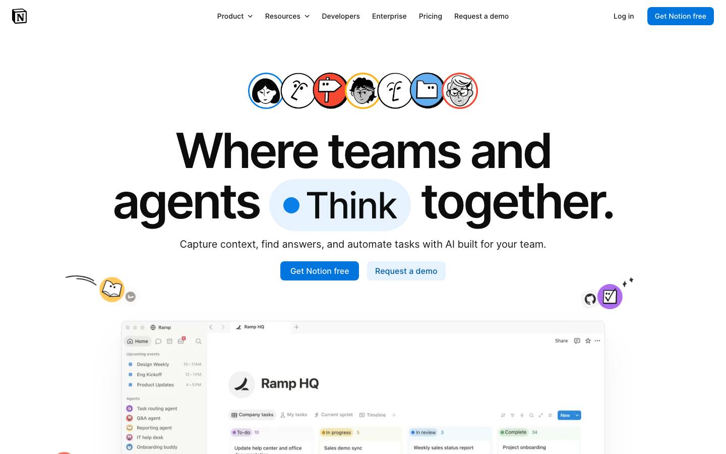
Started from
notion.soPreview
the remixed design systemSwitch between the rendered Visual preview and the Raw DESIGN.md.
Notion — Calm Green
Remix of notion.so. The colors, fonts and shapes were edited in DesignMD. The token block above has the current values. The sections below were written for the original, so they may still mention it.
1. Visual Theme & Atmosphere
Notion's design system embodies a modern, collaborative, and intelligent workspace aesthetic. The visual personality is clean and minimalist, with purposeful use of bright accent colors that convey action and possibility. The design prioritizes clarity and usability through generous whitespace, subtle micro-interactions, and a carefully balanced neutral foundation that allows content and data to take center stage. The system communicates professionalism and innovation through its precise typography, accessible color contrasts, and intuitive component hierarchy. Playful touches—such as the diverse character avatars and colorful status badges—inject personality while maintaining enterprise-grade polish.
Key Characteristics
- Clean, minimalist aesthetic with purposeful whitespace
- Bright, confident primary blue as the dominant action color
- Accessible, high-contrast neutral palette grounded in black and white
- Modern, friendly typography using Inter for consistency
- Subtle, layered shadows for depth without visual noise
- Data-forward design that prioritizes content legibility
- Collaborative energy through diverse, inclusive iconography
- Enterprise-ready with playful, human-centered details
2. Color Palette & Roles
Primary
- Primary Blue (
#C2410C): Dominant call-to-action color for primary buttons, links, and key interactive elements. Used 137 times across the system. - Primary Blue Light (
#097FE8): Secondary primary shade for hover states and supporting UI elements requiring distinction from the dominant primary.
Accent Colors
- Teal (
#27918D): Accent color for status indicators, badges, and complementary UI elements. - Purple (
#9849E8): Accent for secondary actions and special feature callouts. - Orange (
#FF6D00): Warm accent for highlighted status and attention-drawing elements. - Sky Blue (
#62AEF0): Light accent for supporting visual hierarchy and background fills. - Deep Blue (
#1313BA): Dark accent reserved for premium or high-priority states. - Dark Blue (
#005BAB): Secondary accent for navigation and structural emphasis.
Interactive
- Primary Button Background (
#C2410C): Filled primary buttons and high-priority CTAs. - Secondary Button Background (
#E6F3FE): Soft secondary button variant with subtle blue tint. - Secondary Button Text (
#005BAB): Text color for secondary buttons and tertiary links.
Neutral Scale
- Black (
#1C1917): Primary text, icons, and foreground elements. Used 5039 times, the most frequent token. - Near Black (
#57534E): Slightly warmed alternative to pure black for softer text passages. - Dark Gray (
#615D59): Tertiary text and disabled states. - Medium Gray (
#A39E98): Placeholder text, hints, and subtle UI elements. - Off White (
#F7F2EA): Minimal background fill, nearly white with warm undertone. - Light Gray (
#F6F5F4): Secondary background fill for subtle sections. - White (
#FFFCF7): Primary background color for main content areas and cards. Used 609 times.
Surface & Borders
- Light Blue Surface (
#F2F9FF): Card and container background for light, airy sections. - Border Stroke (
rgba(28, 25, 23, 0.05)): Subtle border color for card and container edges. - Input Border (
rgba(28, 25, 23, 0.08)): Slightly darker border for form inputs and interactive fields.
Semantic / Status
- Error / Danger (
#F64932): Error states, validation failures, and destructive actions. - Warning (
#FFB110): Warning states and cautionary notifications. - Success / Complete (
#27918D): Success confirmations and completed status indicators.
3. Typography Rules
Font Family
Primary Font Stack: Inter, -apple-system, BlinkMacSystemFont, 'Segoe UI', 'Helvetica Neue', sans-serif
Secondary Font Stack: Inter, system-ui, sans-serif (fallback for code and monospace contexts if needed)
Hierarchy
| Role | Font | Size | Weight | Line Height | Letter Spacing | Notes |
|---|---|---|---|---|---|---|
| Display XL | Inter | 96px | 600 | 100px | 0px | Hero section headings, page titles |
| Display LG | Inter | 64px | 700 | 64px | 0px | Large hero headings |
| Heading LG | Inter | 54px | 700 | 56px | 0px | Section headings, major CTAs |
| Heading MD | Inter | 42px | 700 | 48px | 0px | Subsection headings |
| Heading SM | Inter | 32px | 700 | 40px | 0px | Card headings, secondary headings |
| Subheading | Inter | 22px | 700 | 28px | 0px | Feature titles, h3 elements |
| Heading XS | Inter | 18px | 700 | 28px | 0px | h5 elements, small headings |
| Body | Inter | 16px | 400 | 24px | 0px | Body text, paragraph copy, default text |
| Body Emphasis | Inter | 16px | 500 | 24px | 0px | Emphasis within body text, button labels |
| Body Small | Inter | 14px | 400 | 20px | 0px | Secondary text, labels |
| Body Small Bold | Inter | 14px | 500 | 20px | 0px | Span elements, small labels |
| Caption | Inter | 12px | 500 | 16px | 0px | List items, tiny labels, helper text |
Principles
- Hierarchy through weight and size: Use bold weights (600–700) for headings; regular (400) for body; medium (500) for emphasis and UI labels.
- Line height consistency: Maintain 1.5× line-height ratio for body text (16px = 24px) and proportional scaling for display sizes to ensure readability.
- Font pairing: Inter is the sole typeface across the system, ensuring consistency and reducing cognitive load.
- Contrast and accessibility: All text meets WCAG AA standards with sufficient contrast against backgrounds.
- Responsive scaling: Maintain hierarchy across breakpoints; reduce heading sizes by 10–20% on mobile while preserving weight distinctions.
4. Component Stylings
Buttons
Primary Button
- Background:
#C2410C - Text Color:
#FFFCF7 - Font Size:
16px - Font Weight:
500 - Padding:
6px 15px - Border Radius:
8px - Border:
1px solid rgba(255, 252, 247, 0) - Height:
38px - Line Height:
24px - Box Shadow:
none - Hover State: Background brightens to
#097FE8, shadow adds subtle lift - Active State: Background darkens to
#005BAB, no shadow - Disabled State: Background becomes
rgba(28, 25, 23, 0.1), text colorrgba(28, 25, 23, 0.4), cursor not-allowed
Secondary Button
- Background:
#E6F3FE - Text Color:
#005BAB - Font Size:
16px - Font Weight:
500 - Padding:
6px 15px - Border Radius:
8px - Border:
1px solid rgba(255, 252, 247, 0) - Height:
38px - Line Height:
24px - Box Shadow:
none - Hover State: Background darkens to
#D6E8FD, text color remains#005BAB - Active State: Background becomes
#C0DFFB, text color#003F7F
Ghost / Tertiary Button
- Background:
rgba(28, 25, 23, 0) - Text Color:
rgba(28, 25, 23, 0.898) - Font Size:
16px - Font Weight:
400 - Padding:
5px 10px(compact) or6px 15px(standard) - Border Radius:
4pxor8px - Border:
0px none - Height:
30px(compact) or36px(standard) - Line Height:
24px - Box Shadow:
none - Hover State: Background becomes
rgba(28, 25, 23, 0.05), text darkens - Active State: Background becomes
rgba(28, 25, 23, 0.1)
Icon Button
- Background:
rgba(28, 25, 23, 0)(default) orrgba(28, 25, 23, 0.05)(hover) - Text Color:
rgba(28, 25, 23, 0.6) - Padding:
11px 11px - Border Radius:
0pxor4px - Height:
auto - Width:
auto - Hover State: Background
rgba(28, 25, 23, 0.05), text colorrgba(28, 25, 23, 0.898)
Cards & Containers
Light Blue Card
- Background:
#F2F9FF - Text Color:
rgba(28, 25, 23, 0.898) - Font Size:
16px - Font Weight:
400 - Padding:
16px 16px - Border Radius:
8px - Border:
1px solid rgba(28, 25, 23, 0.05) - Box Shadow:
none - Height:
256px - Width:
254px - Line Height:
24px
Neutral Card (No Background)
- Background:
rgba(28, 25, 23, 0) - Text Color:
rgba(28, 25, 23, 0.95) - Padding:
0px 0px - Border Radius:
0px - Border:
0px none - Box Shadow:
none
Card with Rounded Top
- Background:
rgba(28, 25, 23, 0) - Text Color:
rgba(28, 25, 23, 0.898) - Padding:
0px 0px - Border Radius:
8px 8px 0px 0px - Border:
0px none - Height:
126px - Width:
220px - Line Height:
0px
Inputs & Forms
Text Input
- Background:
rgba(28, 25, 23, 0)(transparent) or#FFFCF7(solid variant) - Text Color:
rgba(28, 25, 23, 0.95) - Font Size:
16px - Font Weight:
400 - Padding:
7px 10px 7px 30px(with icon) or11px 46px 11px 12px(search) - Border Radius:
5pxor6px - Border:
1px solid rgba(28, 25, 23, 0.08) - Height:
100%or44px(standard) - Width:
100% - Line Height:
24px - Box Shadow:
none(default) orrgba(28, 25, 23, 0.016) 0px 0.7px 1.462px 0px, rgba(28, 25, 23, 0.03) 0px 3px 9px 0px(search variant) - Focus State: Border color
#C2410C, box shadow adds blue glow - Disabled State: Background
rgba(28, 25, 23, 0.05), text colorrgba(28, 25, 23, 0.4), cursor not-allowed
Navigation
Top Navigation Bar
- Background:
#FFFCF7 - Text Color:
rgba(28, 25, 23, 0.898) - Font Size:
16px - Font Weight:
400 - Padding:
0px 0px - Border Radius:
0px - Border:
0px none - Box Shadow:
rgba(28, 25, 23, 0) 0px 1px 0px 0px - Height:
64px - Width:
1440px - Line Height:
24px - Hover State (nav items): Text color
#C2410C, background subtle gray
Links
Primary Link
- Background:
rgba(28, 25, 23, 0) - Text Color:
#C2410C - Font Size:
16px - Font Weight:
400 - Padding:
0px 0px - Border Radius:
0px - Border:
0px none - Box Shadow:
none - Line Height:
24px - Hover State: Text color
#097FE8, underline appears - Visited State: Text color
#005BAB
Small Link
- Background:
rgba(28, 25, 23, 0) - Text Color:
#C2410C - Font Size:
12px - Font Weight:
500 - Line Height:
16px - Hover State: Text color
#097FE8, slight underline
5. Layout Principles
Spacing System
Base Unit: 4px
Scale:
4px: Micro-spacing, gap between inline elements8px: Tight spacing, compact component gaps12px: Small spacing, form field gaps16px: Standard padding, component internal spacing20px: Medium gap, section separators24px: Card and container padding28px: Comfortable spacing, section headers32px: Large spacing, content section margins36px: Extra spacing, between major sections64px: Large gap, between distinct content areas80px: Extra-large margin, hero section spacing124px: Massive padding, hero container spacing
Usage Context:
- Tight UI (forms, inputs):
4px–12pxgaps and padding - Standard components (buttons, cards):
16pxpadding - Content sections:
24px–32pxspacing - Hero and marketing:
64px–124pxspacing
Grid & Container
Max Width: 1440px for full-width content
Column Strategy: 12-column grid for larger layouts; fluid for smaller. Cards and content blocks use 3–4 column layouts on desktop, collapsing to single column on mobile.
Section Patterns:
- Hero sections: Full-width with
124pxtop/bottom padding, centered content - Content rows: Max-width container with
32pxleft/right margin on desktop - Card grids: 3–4 cards per row on desktop,
20pxgap between cards
Whitespace Philosophy
Generous whitespace is intentional and functional. The system embraces negative space to reduce cognitive load and prioritize content. Large breathing room around heroes and CTAs guides user attention. Interior component spacing (padding) is consistent at 16px, creating visual rhythm. Margins between sections scale with content hierarchy, with larger gaps signaling distinct topic shifts.
Border Radius Scale
0px: Structural elements, navigation bars4px: Compact buttons, icon buttons, tight UI5px: Form inputs, search fields6px: Alternative input variant8px: Standard cards, most components, primary buttons8px 8px 0px 0px: Cards with squared bottoms9999px: Pill-shaped buttons, rounded badges100%: Circular avatars and iconography
Border Widths
- Thin (
1px): Default border stroke for cards, inputs, and buttons - Medium (
2px): Emphasis borders for highlighted cards and active states
6. Depth & Elevation
| Level | Treatment | Use |
|---|---|---|
| Base (1) | No shadow | Flat backgrounds, neutral surfaces |
| Level 2 (2) | rgba(28, 25, 23, 0) 0px 1px 0px 0px | Navigation bars, subtle borders |
| Level 3 (3) | rgba(28, 25, 23, 0.01) 0px 0.175px 1.041px 0px, rgba(28, 25, 23, 0.02) 0px 0.8px 2.925px 0px, rgba(28, 25, 23, 0.027) 0px 2.025px 7.847px 0px, rgba(28, 25, 23, 0.04) 0px 4px 18px 0px | Dropdowns, floating panels, subtle lift |
| Level 4 (4) | rgba(28, 25, 23, 0.2) 0px 2px 7px 0px | Modals, overlays, high prominence |
| Level 5 (5) | rgba(28, 25, 23, 0.04) 0px 4px 18px 0px, rgba(28, 25, 23, 0.027) 0px 2.025px 7.84688px 0px, rgba(28, 25, 23, 0.02) 0px 0.8px 2.925px 0px, rgba(28, 25, 23, 0.01) 0px 0.175px 1.04062px 0px, rgba(255, 252, 247, 0.6) 0px 0px 1px 0px | Custom elevated surfaces, layered UI, soft glow |
Shadow Philosophy: Notion employs a subtle, multi-layer shadow system that creates depth without visual harshness. Shadows use low opacity black with layered blur values to mimic natural light diffusion. A white inner highlight (seen in Level 5) adds luminosity and prevents cards from appearing sunken. Shadows scale with component hierarchy: navigation is nearly flat, dropdowns have gentle lift, and modals cast pronounced shadows.
Opacity Levels
5%(0.05): Very subtle hover states, light background tints10%(0.10): Disabled button backgrounds, very faint overlays20%(0.20): Modal overlays, semi-transparent backgrounds40%(0.40): Disabled text, secondary placeholder color50%(0.50): Medium-emphasis overlays, secondary icon color80%(0.80): Near-opaque text, high-contrast secondary elements100%(1.0): Primary text and foreground elements
Z-index / Layering
- Base Layer (
z-index: 1): Content, cards, default elements - Elevated Content (
z-index: 2): Overlays above base content - Floating Elements (
z-index: 3): Tooltips, small floating UI - High Floating (
z-index: 4): Popovers, expanded menus - Dropdown / Floating (
z-index: 10): Dropdown menus, select popups - Sticky Elements (
z-index: 100): Sticky headers, fixed navigation - High Sticky (
z-index: 500): High-priority sticky elements, persistent overlays - Modal / Dialog (
z-index: 1000): Modals, dialogs, highest priority UI
7. Do's and Don'ts
Do
- Use primary blue (
#C2410C) for all primary CTAs to maintain action recognition and consistency across the product. - Maintain
16pxpadding inside cards and containers as the system standard; this creates visual rhythm and breathing room. - Layer shadows intentionally: Base elements have no shadow; elevated components use multi-layer shadows with transparent black layers.
- Pair heading and body text logically: Use Display XL/LG for heroes, Heading SM/MD for feature titles, Body for paragraphs.
- Respect whitespace: Use generous spacing (
32px–64px) between major sections to reduce cognitive load. - Apply consistent
8pxborder radius to most interactive components (buttons, cards, inputs) unless a specific design calls for alternatives. - Test text contrast: Ensure all text meets WCAG AA standards (4.5:1 for normal text, 3:1 for large text).
- Use semantic color mapping: Status colors (error red, warning yellow, success teal) must align with their semantic meaning.
Don't
- Don't use pure black text on colored backgrounds without checking contrast; use
rgba(28, 25, 23, 0.898)or white as appropriate. - Don't overuse accent colors (purple, orange, teal); reserve them for badges, status indicators, or secondary features.
- Don't apply drop shadows to flat UI elements unless they float or overlay; most cards and containers should be shadow-free.
- Don't mix font families outside the Inter system; consistency is key to visual cohesion.
- Don't compress whitespace in hero sections; the large
64px–124pxspacing is intentional and supports content hierarchy. - Don't create custom button sizes; stick to the
38px(primary) and36px(secondary) standard heights. - Don't apply border radius smaller than
4pxexcept in rare cases; micro-radii appear unfinished. - Don't nest more than 3 levels of z-index in typical layouts; excessive layering signals poor hierarchy.
8. Responsive Behavior
Breakpoints
| Name | Width | Key Changes |
|---|---|---|
| Mobile | < 640px | Single column, reduced padding (12px), smaller headings (−20%), stacked navigation |
| Tablet | 640px–1024px | Two-column grid for cards, 16px padding, adjusted spacing (20px–24px), hamburger menu |
| Desktop | 1024px–1440px | Three-column card grids, standard 16px padding, full spacing scale, full navigation |
| Wide | > 1440px | Four-column grids possible, max-width container enforced at 1440px, standard spacing maintained |
Touch Targets
- Minimum touch target size:
44px × 44px(equivalent to ~11mm at standard 96 DPI) - Button height on mobile: Ensure primary buttons are at least
44pxtall for comfortable touch - Link/icon hit area: Aim for
48px × 48pxon mobile;36px × 36pxacceptable on desktop - Form input minimum height:
44pxon mobile,38pxon desktop - Spacing between clickable elements: Minimum
8pxgap to prevent accidental adjacent taps
Collapsing Strategy
- Hero sections: Reduce heading sizes by 15–20% on tablet, 25–30% on mobile; maintain Display XL for true heroes, collapse to Heading LG on mobile.
- Multi-column grids: Collapse from 4 columns (desktop) → 2 columns (tablet) → 1 column (mobile); maintain
20pxgap on all sizes. - Navigation: Full horizontal nav on desktop → hamburger menu icon on tablet/mobile; preserve primary actions (CTA buttons) in mobile header.
- Padding: Reduce from
16px(desktop) to12px(tablet) to8px(mobile) for card interiors on constrained screens. - Spacing: Large gaps (
64px,80px) reduce to36px–48pxon tablet,24px–32pxon mobile while preserving visual hierarchy. - Typography: Body text remains
16pxfor legibility; headings scale proportionally; line-height increases slightly on mobile for readability.
9. Agent Prompt Guide
Quick Color Reference
- Primary CTA Background: Primary Blue (
#C2410C) - Primary CTA Text: White (
#FFFCF7) - Secondary CTA Background: Light Blue Surface (
#E6F3FE) - Secondary CTA Text: Dark Blue (
#005BAB) - Main Text: Black (
#1C1917) - Secondary Text: Medium Gray (
#A39E98) - Heading Text: Black (
#1C1917) - Card Background (Accent): Light Blue Surface (
#F2F9FF) - Card Background (Neutral): White (
#FFFCF7) - Card Border: Border Stroke (
rgba(28, 25, 23, 0.05)) - Input Border: Input Border (
rgba(28, 25, 23, 0.08)) - Error State: Error Red (
#F64932) - Warning State: Warning Yellow (
#FFB110) - Success State: Teal (
#27918D) - Disabled Element:
rgba(28, 25, 23, 0.1)background,rgba(28, 25, 23, 0.4)text - Hover Overlay (Light):
rgba(28, 25, 23, 0.05)background - Modal Overlay:
rgba(28, 25, 23, 0.2)withz-index: 1000
Iteration Guide
-
Primary buttons are always
#C2410Cwith white text,16pxfont,500weight,6px 15pxpadding,8pxradius,38pxheight. No exceptions; this is the system's action anchor. -
All card padding defaults to
16px 16pxwith#F2F9FFbackground and1px solid rgba(28, 25, 23, 0.05)border. Use8pxborder radius unless specified otherwise (e.g., rounded-top cards use8px 8px 0px 0px). -
Section spacing scales from
32px(comfortable) to64px(emphatic) to80px–124px(hero). Hero sections reserve the largest spacing; maintain proportional scale across breakpoints by multiplying by0.5–0.75on mobile. -
Typography hierarchy uses Inter exclusively: Display XL (96px, 600) → Heading LG (64px, 700) → Heading SM (32px, 700) → Body (16px, 400). Always match weight to size; heavier weights signal higher priority.
-
Forms use
44pxinput height with11px 46px 11px 12pxpadding,6pxradius,1px solid rgba(28, 25, 23, 0.08)border. Focus state adds blue glow; disabled state becomesrgba(28, 25, 23, 0.05)background. -
Shadows follow a 5-level elevation system: Base (none) → Navigation (1px line) → Dropdowns (multi-layer subtle) → Modals (
0px 2px 7pxwithrgba(28, 25, 23, 0.2)) → Custom elevated surfaces (Level 5 with white inner glow). -
Z-index reserves: 1 (base) → 10 (dropdowns) → 100 (sticky) → 500 (high sticky) → 1000 (modals). Never exceed 1000; if nesting requires higher values, restructure HTML hierarchy.
-
Responsive breakpoints collapse as: Desktop (3–4 col grid,
16pxpadding) → Tablet (2 col,16pxpadding) → Mobile (1 col,12pxpadding). Headings reduce by 20–30% on mobile; spacing contracts by 50% (e.g.,64px→32px). -
Ghost buttons are transparent with
rgba(28, 25, 23, 0.898)text; hover addsrgba(28, 25, 23, 0.05)background. Never add borders to ghost buttons; let the hover state provide visual feedback. -
Link colors default to
#C2410C(primary blue); visited links become#005BAB(dark blue). Underlines appear on hover; maintain minimum12pxline-height for accessibility.
Make it yours
Change the colors, fonts and corners of Notion — Calm Green, and save your own DESIGN.md. Free.