
Plan, write and ship in one place. Every page in your workspace follows the same design system, so nothing drifts.
Fast by default
Pages load in under a second, with nothing to configure.
Built for teams
Shared spaces, comments and roles that match how you work.
Secure from day one
SSO, audit logs and encryption at rest on every plan.
Create your account
Send me product updatesCreate accountnpm install @northwind/sdk
Pro
- Unlimited pages
- Version history
- Priority support
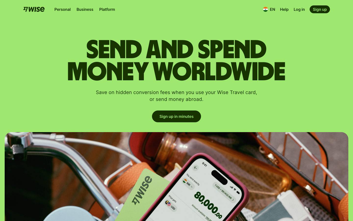
Started from
wise.comPreview
the remixed design systemSwitch between the rendered Visual preview and the Raw DESIGN.md.
Wise Remix
Remix of wise.com. The colors, fonts and shapes were edited in DesignMD. The token block above has the current values. The sections below were written for the original, so they may still mention it.
1. Visual Theme & Atmosphere
Wise's design system embodies modern fintech confidence with a bold, energetic personality. The visual language combines vibrant lime greens with deep forest tones, creating a sense of growth, trust, and forward momentum in global money movement. The design emphasizes clarity and accessibility while maintaining a premium, contemporary feel that appeals to both individual users and institutional clients. Generous whitespace, clear typography hierarchy, and thoughtful use of accent colors create an approachable yet sophisticated digital experience. The system balances playful optimism (through bright lime accents) with financial gravitas (through deep, rich blacks and greens), signaling both innovation and reliability.
Key Characteristics
- Bold, high-contrast color palette anchored in deep forest green
- Vibrant lime green accents for emphasis and calls-to-action
- Clean, sans-serif typography with generous spacing
- Accessible, modern interface supporting global audiences
- Premium yet approachable aesthetic
- Strong emphasis on clarity and simplicity
- Institutional credibility paired with contemporary design
- Responsive, touch-friendly interactive elements
2. Color Palette & Roles
Primary
- Deep Forest Green (
#005F69): Primary brand color used throughout UI for text, backgrounds, and primary actions; conveys trust and financial stability - Dark Neutral Black (
#0E0F0C): Secondary dark color for high-contrast text and structural elements; used for typography and dense UI regions - Darkest Forest (
#053F47): Deepest dark variant for emphasis and premium UI moments; highest contrast option
Accent Colors
- Lime Green (
#005F69): Primary accent for highlights, badges, and secondary CTAs; creates energy and draws attention - Soft Lime (
#E2F6D5): Light lime for backgrounds, hover states, and subtle highlighting; maintains brand recognition with reduced intensity - Cyan Teal (
#A0E1E1): Secondary accent for highlights and interactive elements; provides visual variety and modern feel - Warm Yellow (
#FADC65): Tertiary accent for special highlights and featured content; warm and inviting
Interactive
- Warning Yellow (
#FFD11A): Warning states, alerts, and cautionary indicators; draws attention to important notices - Error Red (
#CB272F): Primary error state and danger indicators; communicates critical issues and destructive actions - Error Dark Red (
#B8232B): Secondary error variant for emphasis within error states
Neutral Scale
- Medium Gray (
#454745): Mid-tone neutral for secondary text, disabled states, and subtle UI elements - Pure White (
#FFFFFF): Primary background and card surfaces; creates clean, open layouts - Charcoal Black (
#21231D): Strong neutral for body text and detailed information; slightly warmer than pure black
Surface & Borders
- Pure Black (
#000000): Strongest contrast option for critical text and structural elements - Light Green Surface (
#E2F6D5): Soft background for contextual highlighting and light brand-colored zones
3. Typography Rules
Font Family
Primary Font: Inter
- Weight range: 400, 500, 600, 700, 800, 900
- Fallback stack:
Inter, -apple-system, BlinkMacSystemFont, 'Segoe UI', sans-serif - Used for body text, UI labels, navigation, and most interface elements
Display Font: Wise Sans
- Weight range: 700, 900
- Fallback stack:
'Wise Sans', Inter, -apple-system, BlinkMacSystemFont, 'Segoe UI', sans-serif - Used for massive headlines and hero text that requires maximum impact
Hierarchy
| Role | Font | Size | Weight | Line Height | Letter Spacing | Notes |
|---|---|---|---|---|---|---|
| Display XL | Wise Sans | 105px | 900 | 90px | 0px | Massive hero headlines; sparingly used |
| Display L | Wise Sans | 89px | 900 | 76px | 0px | Large hero sections; bold brand moments |
| Display M | Inter | 61px | 600 | 67px | 0px | Medium display size; softer than Wise Sans |
| H1 Large | Wise Sans | 100px | 700 | 92px | 0px | Large hero titles; strong visual impact |
| H1 Medium | Wise Sans | 58px | 900 | 50px | 0px | Primary section heading; striking presence |
| H2 | Inter | 35px | 600 | 44px | 0px | Secondary heading; primary content structure |
| H3 Large | Inter | 25px | 600 | 32px | 0px | Large subsection heading |
| H3 Medium | Inter | 20px | 700 | 24px | 0px | Standard subsection; strong hierarchy support |
| H3 Small | Inter | 18px | 600 | 26px | 0px | Small subsection; labels for content blocks |
| H4 | Inter | 20px | 600 | 28px | 0px | Tertiary heading; feature names and callouts |
| Body Large | Inter | 17px | 400 | 27px | 0px | Primary body text; main content paragraphs |
| Body | Inter | 16px | 400 | 24px | 0px | Standard body copy; forms and UI text |
| Label | Inter | 14px | 400 | 22px | 0px | Form labels and secondary labels |
| Small | Inter | 13px | 600 | 20px | 0px | Small text; metadata and captions |
| Tiny | Inter | 12px | 500 | 16px | 0px | Smallest readable size; helper text |
| Input Large | Wise Sans | 49px | 400 | 74px | 0px | Large form input text; prominent entry fields |
| Input XL | Wise Sans | 52px | 400 | 78px | 0px | Extra-large form input; money amount entry |
| Button | Inter | 18px | 400 | 26px | 0px | Primary button text |
| Button Small | Inter | 13px | 400 | normal | 0px | Compact button text |
| Link | Inter | 16px | 400 | 24px | 0px | Inline and standalone links |
| Span Accent | Inter | 16px | 600 | 24px | 0px | Emphasized inline text; accent spans |
Principles
- Use Wise Sans exclusively for hero-scale display text (105px+); maximizes brand identity in high-impact moments
- Pair Inter body text with Wise Sans headlines to create visual hierarchy and breathing room
- Maintain minimum 24px line height for body text (17px) to ensure readable, accessible paragraphs
- Use 600+ weights sparingly for emphasis; 400 weight is standard for body and UI
- Ensure 16px minimum for interactive elements (buttons, links) for touch accessibility
- Apply letter-spacing only for display text; body text uses default spacing
- Large input fields (49px+) use Wise Sans for distinctive data entry moments
- All font sizes are fixed pixel values; scale responsively via media queries, not relative units
4. Component Stylings
Buttons
Primary Button
- Background:
#005F69 - Text Color:
#FFFFFF - Font: Inter, 18px, 600 weight
- Padding:
19px 24px - Border Radius:
9999px - Border:
1px solid #005F69 - Height:
72px - Line Height:
32px - Hover: Darken background to
#053F47, maintain white text - Active: Reduce padding to
17px 22px, maintain height - Disabled: Set opacity to
0.5, cursor not-allowed
Primary Button (Lime Variant)
- Background:
#005F69 - Text Color:
#005F69 - Font: Inter, 18px, 600 weight
- Padding:
19px 24px - Border Radius:
9999px - Border:
1px solid #005F69 - Height:
72px - Line Height:
32px - Hover: Background lightens to
#21231D, text remains lime - Active: Background returns to
#005F69, text brightens to#FFFFFF
Secondary Button
- Background:
rgba(0, 0, 0, 0)(transparent) - Text Color:
#005F69 - Font: Inter, 18px, 600 weight
- Padding:
8px 12px - Border Radius:
9999px - Border:
0px none - Height:
32px - Line Height:
26px - Hover: Background becomes
rgba(0, 95, 105, 0.15) - Active: Background becomes
rgba(0, 95, 105, 0.25)
Ghost Button (Link-like)
- Background:
rgba(0, 0, 0, 0) - Text Color:
#005F69 - Font: Inter, 16px, 600 weight
- Padding:
0px - Border Radius:
0px - Border:
0px none - Height:
24px - Line Height:
24px - Hover: Add underline with
border-bottom: 2px solid #005F69 - Active: Underline weight increases; color remains stable
Badge Button
- Background:
#005F69 - Text Color:
#005F69 - Font: Inter, 12px, 700 weight
- Padding:
4px 16px - Border Radius:
100px - Border:
0px none - Height:
26px - Line Height:
18px - Hover: Darken background to
#8FD860 - Active: Background becomes
#7FC850
Icon Button (Circular)
- Background:
rgba(0, 0, 0, 0) - Text Color:
#005F69 - Font: Icon font, 14px
- Padding:
0px(center icon within circle) - Border Radius:
50% - Border:
0px none - Height:
36px - Width:
36px - Line Height:
normal - Hover: Background becomes
rgba(0, 95, 105, 0.2) - Active: Background becomes
rgba(0, 95, 105, 0.35)
Cards & Containers
Card Default (Bordered)
- Background:
rgba(0, 0, 0, 0)(transparent) - Text Color:
#005F69 - Font: Inter, 18px, 600 weight
- Padding:
0px - Border Radius:
10px - Border:
1px solid rgba(0, 95, 105, 0.12) - Height:
auto(example 395px) - Width:
374px - Line Height:
26px - Box Shadow:
none - Hover: Border opacity increases to
0.2
Card Divided (Top Section)
- Background:
rgba(0, 0, 0, 0) - Text Color:
#005F69 - Font: Inter, 18px, 600 weight
- Padding:
0px - Border Radius:
10px 10px 0px 0px - Border:
0px none - Height:
220px - Width:
372px - Line Height:
26px - Used for image-based cards where top section is visual
Card Content (Bottom Section)
- Background:
rgba(0, 0, 0, 0) - Text Color:
#005F69 - Font: Inter, 18px, 600 weight
- Padding:
16px - Border Radius:
0px - Border:
0px none - Height:
173px - Width:
372px - Line Height:
26px - Pairs with divided card top section
Card Elevated (Alternative)
- Background:
rgba(0, 0, 0, 0)(transparent with shadow) - Text Color:
#005F69 - Font: Inter, 18px, 600 weight
- Padding:
0px - Border Radius:
10px - Border:
1px solid rgba(14, 15, 12, 0.12) - Height:
auto - Width:
374px - Line Height:
26px - Box Shadow:
rgba(0, 95, 105, 0.08) 0px 8px 24px 0px
Inputs & Forms
Text Input Large
- Background:
#FFFFFF - Text Color:
#000000 - Font: Inter, 14px, 400 weight
- Padding:
12px 20px - Border Radius:
100px - Border:
1px solid rgba(14, 15, 12, 0.1) - Height:
43px - Width:
280px(responsive) - Line Height:
normal - Focus: Border color becomes
#005F69, box-shadow0 0 0 3px rgba(0, 95, 105, 0.2) - Placeholder: Color
rgba(0, 0, 0, 0.4) - Disabled: Background
rgba(0, 0, 0, 0.05), border becomes dashed, cursor not-allowed
Amount Input Large (Wise Sans)
- Background:
rgba(0, 0, 0, 0) - Text Color:
#005F69 - Font: Wise Sans, 49px, 400 weight
- Padding:
0px - Border Radius:
0px - Border:
0px none - Height:
49px - Width:
auto - Line Height:
74px - Focus: Add
border-bottom: 2px solid #005F69 - Placeholder: Color
rgba(0, 95, 105, 0.4)
Amount Input XL (Wise Sans)
- Background:
rgba(0, 0, 0, 0) - Text Color:
#005F69 - Font: Wise Sans, 52px, 400 weight
- Padding:
0px - Border Radius:
0px - Border:
0px none - Height:
52px - Width:
auto - Line Height:
78px - Focus: Add
border-bottom: 2px solid #005F69 - Placeholder: Color
rgba(0, 95, 105, 0.4)
Navigation
Header Navigation
- Background:
rgba(0, 0, 0, 0)(transparent) - Text Color:
#005F69 - Font: Inter, 18px, 400 weight
- Padding:
0px - Border Radius:
0px - Border:
0px none - Height:
76px - Width:
100% - Line Height:
26px - Hover: Add subtle background
rgba(0, 95, 105, 0.1)on nav items - Active: Text weight becomes 600, underline with
border-bottom: 2px solid #005F69
Breadcrumb Navigation
- Background:
rgba(0, 0, 0, 0) - Text Color:
#0E0F0C - Font: Inter, 16px, 400 weight
- Padding:
0px - Border Radius:
0px - Border:
0px none - Height:
0px(uses text-only layout) - Width:
100% - Line Height:
24px - Separator Color:
#454745(forward slash) - Active Link: Weight becomes 600, color
#005F69
Links
Primary Link (Button-styled)
- Background:
#005F69 - Text Color:
#FFFFFF - Font: Inter, 20px, 600 weight
- Padding:
19px 24px - Border Radius:
9999px - Border:
1px solid #005F69 - Height:
72px - Width:
auto - Line Height:
32px - Hover: Background darkens to
#053F47
Secondary Link (Button-styled)
- Background:
#005F69 - Text Color:
#005F69 - Font: Inter, 20px, 600 weight
- Padding:
19px 24px - Border Radius:
9999px - Border:
1px solid #005F69 - Height:
72px - Width:
auto - Line Height:
32px - Hover: Background becomes
#21231D, text lightens
Text Link
- Background:
rgba(0, 0, 0, 0) - Text Color:
#005F69 - Font: Inter, 18px, 600 weight
- Padding:
0px - Border Radius:
2px - Border:
0px none - Height:
20px - Width:
auto - Line Height:
26px - Hover: Add
border-bottom: 1px solid #005F69 - Active: Color becomes
#053F47
Small Link
- Background:
rgba(0, 0, 0, 0) - Text Color:
#005F69 - Font: Inter, 18px, 600 weight
- Padding:
8px 12px - Border Radius:
9999px - Border:
0px none - Height:
32px - Width:
auto - Line Height:
26px - Hover: Background becomes
rgba(0, 95, 105, 0.15)
5. Layout Principles
Spacing System
Base Unit: 8px
Scale:
- 4px (micro-spacing; rarely used)
- 8px (tight component spacing; gaps, small padding)
- 12px (compact spacing; form labels, icon spacing)
- 16px (standard padding; cards, inputs, sections)
- 20px (breathing room; section margins)
- 24px (generous padding; card content, containers)
- 28px (section spacing; content block gaps)
- 32px (large margin; major section separation)
- 36px (extra spacing; featured section gaps)
- 56px (premium padding; hero containers)
- 92px (large margin; page section breaks)
- 100px (maximum margin; header and footer spacing)
Usage Context:
- 4px: Icon-to-text gaps, micro button padding
- 8px: Component gaps, flex row spacing, tight lists
- 12px: Form field spacing, utility padding
- 16px: Standard card padding, button icon margins, form control gaps
- 20px: Section margins, content block spacing
- 24px: Card content area padding, feature block separation
- 28px–36px: Section-to-section spacing, content flow gaps
- 56px+: Hero section padding, full-width container breathing room
Grid & Container
Max Width: 1440px (full container; aligns with navigation baseline)
Column Strategy:
- 12-column grid at desktop (1440px)
- 8-column grid at tablet (768px)
- Single column at mobile (375px+)
Section Patterns:
- Full-bleed hero with centered max-width content
- Fixed-width card grids (2–4 columns) with 16px gutters
- Asymmetric layouts pairing content (8 cols) + sidebar (4 cols)
- Centered text blocks with max-width 720px for reading comfort
Whitespace Philosophy
Wise embraces generous whitespace to communicate premium positioning and reduce cognitive load. Every section is surrounded by breathing room (minimum 56px padding on desktop). Text blocks are never wider than 720px to maintain readability. Vertical rhythm follows the 8px base unit, creating visual harmony. Empty space is intentional and valued; it reduces clutter and guides user focus to primary actions.
Border Radius Scale
- 0px: Form inputs, structured cards, rigid UI elements
- 2px: Small text links, subtle indicator borders
- 10px: Card containers, modular content blocks
- 24px: Featured cards, elevated components
- 28px: Image overlays, rounded image corners (
28.1539pxprecise) - 50%: Avatar circles, icon buttons (true circles)
- 100px: Pill buttons, rounded form inputs (9999px equivalent)
Border Widths
- Thin:
1px(default card borders, input focus states, link underlines) - Medium:
2px(active/focus indicators, strong visual separators, button outlines)
6. Depth & Elevation
| Level | Treatment | Use |
|---|---|---|
| Base | No shadow; box-shadow: none | Standard cards, buttons, flat UI elements |
| Raised (Small) | rgba(0, 95, 105, 0.08) 0px 8px 24px 0px | Hover states on cards, gentle elevation |
| Elevated (Medium) | rgba(0, 0, 0, 0.1) 0px 12px 40px 0px | Dropdowns, popovers, overlays |
| Prominent (Large) | rgba(0, 0, 0, 0.06) 0px 4px 24px 0px | Navigation bars, sticky headers, high-priority containers |
| Modal | rgba(0, 0, 0, 0.15) 0px 16px 56px 0px | Modal dialogs, full-screen overlays (inferred) |
Shadow Philosophy: Wise uses subtle, soft shadows rooted in the brand's forest-green palette for main elevation levels. Shadows increase in blur and spread as depth increases, but maintain a natural, non-dramatic appearance. This keeps the interface modern and flat-friendly while providing essential depth cues. Shadows rarely use pure black; they inherit the dark green primary color at reduced opacity, reinforcing brand cohesion.
Opacity Levels
- 0.45 (45%): Subtle hover states, light interactive feedback
- 0.50 (50%): Medium-emphasis disabled or secondary states
- 0.60 (60%): Prominent semi-transparent overlays, strong emphasis
- 0.70 (70%): Significant transparency for modals, overlay backgrounds
- 0.85 (85%): Near-opaque states, readable text on semi-transparent surfaces
- 1.00 (100%): Full opacity; default for all UI elements
Z-index / Layering
- Base (1–5): Main content, cards, default elements
- Dropdown (10): Popovers, non-modal overlays, first-layer interactions
- Dropdown (99): Floating menus, priority dropdowns
- Sticky (100): Sticky navigation, persistent headers
- Sticky (200): High-priority sticky elements (e.g., floating action buttons)
- Modal (1040): Full-screen modals, dialog overlays, highest user-facing layer
7. Do's and Don'ts
Do
- Use lime green (
#005F69) sparingly for primary CTAs and badges; it's high-energy and draws maximum attention - Pair deep forest green with white for the highest contrast and readability; it's the core brand combination
- Apply 16px minimum padding to all interactive elements for touch accessibility
- Use Inter for body text and UI labels exclusively; it's proven readable at all scales on this system
- Reserve Wise Sans for display text 58px and above to maximize brand impact without degrading readability
- Maintain 1.5–1.75 line height ratio for body paragraphs (17px text = 27.2px line height)
- Stack spacing in multiples of 8px to ensure visual harmony and predictable layouts
- Include ample whitespace around major sections (56px–100px margins) to reduce cognitive load
- Use the full 12-column grid to maintain alignment and consistent gutters
- Apply hover states consistently across all interactive elements with background or opacity changes
- Keep button padding symmetrical (vertical and horizontal) for professional appearance
- Use box shadows for depth, not borders, except for form inputs and card separators
Don't
- Don't use pure black (
#000000) for primary UI text; use#005F69or#0E0F0Cinstead for brand consistency - Don't apply both a border and shadow to the same element (choose one depth cue)
- Don't exceed 720px width for body text blocks; readability drops significantly
- Don't use opacity below 0.45 for interactive elements; they become invisible or inaccessible
- Don't stack buttons vertically in a row; use horizontal arrangement or separate them into distinct actions
- Don't apply border-radius below 10px for card containers (keeps them clean and modern)
- Don't set font sizes below 12px for body text (accessibility and readability fail)
- Don't use more than 3 font sizes in a single content block (visual chaos)
- Don't apply line-height below 24px for any text size (breathing room is mandatory)
- Don't use the warning yellow (
#FFD11A) for primary brand moments; reserve it for alerts only - Don't center full-width text blocks (hard to read); center only headlines and CTAs
- Don't use
letter-spacingon body text; it's reserved for display typography - Don't combine multiple accent colors in a single component (stick to primary green + one accent)
- Don't reduce button padding for "compact" variants; maintain minimum
8px 12pxfor touchability
8. Responsive Behavior
Breakpoints
| Name | Width | Key Changes |
|---|---|---|
| Mobile | 375px–599px | Single-column layout, 16px padding, 56px section margins, larger touch targets (48px+) |
| Tablet | 600px–1023px | 2-column grid, 24px padding, 8-column grid system, balanced card layouts |
| Desktop | 1024px–1439px | 3–4-column grids, 56px padding, 12-column grid, side-by-side content + sidebar patterns |
| Large Desktop | 1440px+ | Max-width container enforced at 1440px, center-aligned with equal side margins |
Touch Targets
- Minimum size:
44px × 44px(buttons, icon buttons, interactive areas) - Comfortable size:
48px × 48px(mobile buttons, primary CTAs) - Compact size:
32px × 32px(secondary buttons, icon-only actions; minimum acceptable) - Spacing: Minimum
8pxseparation between touch targets to prevent accidental taps - Form inputs: Minimum
43pxheight for text fields to ensure comfortable keyboard entry - Links: Minimum
16pxline-height for standalone links; inline links may be smaller
Collapsing Strategy
- Hero headlines: Scale from 100px (desktop) → 60px (tablet) → 48px (mobile) using
font-size: clamp() - Section headings: Scale from 58px (desktop) → 40px (tablet) → 32px (mobile)
- Body text: Fixed at 17px (desktop) / 16px (tablet) / 14px (mobile)
- Card grids: 3–4 columns (desktop) → 2 columns (tablet) → 1 column (mobile)
- Padding: 56px (desktop) → 32px (tablet) → 16px (mobile)
- Container width: Full-width on mobile/tablet; max-width 1440px on desktop
- Navigation: Horizontal menu (desktop) → Horizontal with dropdown (tablet) → Hamburger menu (mobile)
- Forms: Full-width inputs on mobile (padding: 16px); constrained width on desktop (280px)
- Spacing between sections: 100px (desktop) → 56px (tablet) → 32px (mobile)
9. Agent Prompt Guide
Quick Color Reference
- Primary CTA: Deep Forest Green (
#005F69) - CTA Text: Lime Green (
#005F69) or White (#FFFFFF) - Background: Pure White (
#FFFFFF) - Heading Text: Deep Forest Green (
#005F69) - Body Text: Dark Neutral Black (
#0E0F0C) or Charcoal (#21231D) - Secondary Text: Medium Gray (
#454745) - Borders: Charcoal with 0.12 opacity (
rgba(0, 95, 105, 0.12)) - Hover Accents: Lime Green (
#005F69) - Alerts: Warning Yellow (
#FFD11A) - Errors: Error Red (
#CB272F) - Disabled: Apply 0.5 opacity to any element
- Focus: Box-shadow with lime green at
0.2opacity
Iteration Guide
-
Always start with Deep Forest Green (
#005F69) for primary buttons, text, and structural elements; it's the system's anchor color appearing 4287 times across the site. -
Use Inter for all UI except hero text 58px+; then switch to Wise Sans for maximum brand impact. Inter is versatile; Wise Sans is reserved for hero moments.
-
Pair background and text using max contrast: white background + dark green text, or dark green background + white/lime text. Never pair similar brightness levels.
-
Maintain minimum
16pxpadding for clickable elements and ensure48pxheight for mobile buttons; accessibility and touch usability are non-negotiable. -
Apply box shadows from the Forest Green palette (
rgba(0, 95, 105, 0.08)for subtle;0.1for medium); pure black shadows break the brand feel. -
Scale spacing in 8px increments across all margins and padding; violating this rule breaks the visual grid and feels unprofessional.
-
Constrain line-heights to 1.5–1.75× font size for body text; tighter line-height reduces readability, looser wastes space.
-
Use lime green (
#005F69) only for emphasis: badges, accent text, hover states. Overuse dilutes the brand signal. -
Implement focus states with 3px box-shadow using
rgba(0, 95, 105, 0.3)(lime green at medium opacity) for keyboard navigation accessibility. -
Collapse layouts to single-column on mobile (375px–599px), maintain 2-column on tablet (600px–1023px), and enable 3–4-column grids on desktop. Use CSS
clamp()for smooth scaling. -
Never underline links by default; add underline only on hover or focus. Use color alone to identify links in body text.
-
Enforce max-width 1440px on desktop with auto margins to center content; prevents horizontal scrolling on large screens.
Make it yours
Change the colors, fonts and corners of Wise Remix, and save your own DESIGN.md. Free.