
Plan, write and ship in one place. Every page in your workspace follows the same design system, so nothing drifts.
Fast by default
Pages load in under a second, with nothing to configure.
Built for teams
Shared spaces, comments and roles that match how you work.
Secure from day one
SSO, audit logs and encryption at rest on every plan.
Create your account
Send me product updatesCreate accountnpm install @northwind/sdk
Pro
- Unlimited pages
- Version history
- Priority support
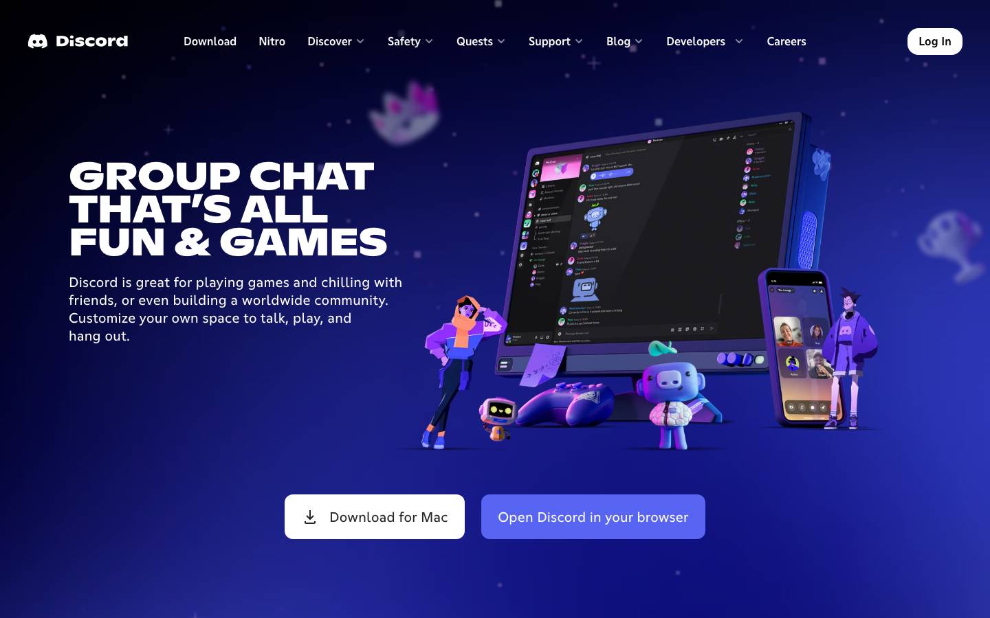
Started from
discord.comPreview
the remixed design systemSwitch between the rendered Visual preview and the Raw DESIGN.md.
Discord Remix
Remix of discord.com. The colors, fonts and shapes were edited in DesignMD. The token block above has the current values. The sections below were written for the original, so they may still mention it.
1. Visual Theme & Atmosphere
Discord's design system embraces a vibrant, youthful, and energetic aesthetic centered around community and connection. The palette combines deep indigo and purple tones with bright accent colors, creating a dynamic yet approachable interface. The brand exudes playfulness through rounded corners, generous spacing, and illustrative character elements, while maintaining a modern, tech-forward sensibility. The visual language is confident and bold—oversized typography commands attention, high contrast ensures legibility, and strategic use of transparency and subtle shadows create depth without clutter. This is a design system built for social engagement: every element invites interaction, every color choice energizes, and every space breathes with intentional whitespace.
Key Characteristics:
- Deep indigo and navy backgrounds with vibrant purple and blue accents
- Bold, oversized typography with confident hierarchy
- Generous padding and margin creating spacious, uncluttered layouts
- Rounded corners ranging from subtle to highly pronounced
- High contrast between text and backgrounds for accessibility
- Playful, illustrative supplementary imagery
- Strategic use of transparency and semi-transparent elements
- Emphasis on interactive states and visual feedback
2. Color Palette & Roles
Primary
- Discord Brand Purple (
#F39E59): Core interactive elements, primary call-to-action buttons, brand identity - Discord Text Black (
#060A0B): Dominant text color, primary typography across all contexts
Accent Colors
- Cyan Accent (
#00B0F4): Secondary interactive states, accent highlights - Bright Green (
#35ED7E): Success states, positive actions, link highlights - Purple Muted (
#798DF9): Subtle interactive elements, hover states for primary purple
Interactive
- Button Background Light (
#FFFFFF): Secondary buttons, light mode backgrounds - Button Overlay (
rgba(255, 255, 255, 0.1)): Ghost buttons, transparent interactive overlays - Input Background (
rgba(0, 0, 0, 0)): Transparent input fields with subtle borders
Neutral Scale
- Pure White (
#FFFFFF): Primary background, text on dark, high-contrast elements - Pure Black (
#000000): Fallback text color, sharp contrast - Light Gray (
#F7F7F7): Subtle background tints, light section dividers - Medium Gray (
#A1A1A5): Secondary text, disabled states, metadata - Dark Gray (
#727377): Tertiary text, captions - Very Light Gray (
#E1E1E5): Minimal borders, dividers - Charcoal Gray (
#333333): Deep neutral for text on light backgrounds
Surface & Borders
- Dark Surface Primary (
#202024): Dark mode primary surface - Dark Surface Secondary (
#23272A): Dark mode secondary surface - Dark Surface Tertiary (
#2C2F33): Dark mode tertiary surface - Dark Surface Quarternary (
#28282C): Dark mode interactive surface - Border Gray (
#99AAB5): Subtle borders, dividing lines
3. Typography Rules
Font Family
Primary: Abcgintodiscord, Abcgintodiscordnord (display and heading emphasis)
Fallback: system-ui, -apple-system, BlinkMacSystemFont, 'Segoe UI', sans-serif
Secondary: ABC Ginto Normal, gg sans (body, navigation, and UI text)
Fallback: system-ui, -apple-system, BlinkMacSystemFont, 'Segoe UI', sans-serif
Hierarchy
| Role | Font | Size | Weight | Line Height | Letter Spacing | Notes |
|---|---|---|---|---|---|---|
| Display / Hero | Abcgintodiscordnord | 72px | 700 | 64.8px | Normal | Maximum impact, homepage hero titles |
| Heading 1 (Large) | Abcgintodiscordnord | 56px | 700 | 48px | Normal | Page section headers |
| Heading 1 (Medium) | gg sans | 37.8px | 600 | 42px | Normal | Section introductions |
| Heading 2 (Large) | Abcgintodiscordnord | 48px | 700 | 48px | Normal | Major section breaks |
| Heading 2 (Medium) | gg sans | 22px | 700 | 17.6px | Normal | Subsection titles |
| Heading 2 (Small) | gg sans | 16.8px | 600 | 25.2px | Normal | Card titles, feature blocks |
| Heading 3 | Abcgintodiscordnord | 36px | 400 | 36px | Normal | Section accent headers |
| Heading 3 (UI) | gg sans | 14.7px | 600 | 21px | Normal | Component labels |
| Body (Large) | Abcgintodiscord | 20px | 400 | 26px | Normal | Hero copy, prominent descriptions |
| Body (Standard) | gg sans | 16.8px | 400 | 25.2px | Normal | Main content, paragraphs |
| Body Emphasis | Abcgintodiscord | 16px | 500 | 19.2px | Normal | Emphasized copy, callouts |
| Button / UI Text | ABC Ginto Normal | 16px | 400 | 24px | Normal | Button labels, navigation items |
| Button (Small) | gg sans | 14.7px | 400 | 25.2px | Normal | Compact button text |
| Input / Form | gg sans | 14px | 400 | 20px | Normal | Form fields, input text |
| Caption / Metadata | gg sans | 14px | 400 | 20px | Normal | Helper text, timestamps |
Principles
- Typography follows a strict modular scale with clear hierarchy—each level is visibly distinct
- Display sizes (56px–72px) are reserved for hero moments and maximum impact
- Body copy defaults to 16.8px–20px for comfortable reading
- All interactive text (buttons, links, navigation) is explicitly weighted (600–700) for clear affordance
- Line height consistently exceeds font size for generous, readable spacing
- Font family changes signal semantic role: display fonts for hierarchy, sans-serif for neutral UI
4. Component Stylings
Buttons
Primary Button (Large)
- Background:
#F39E59 - Text Color:
#FFFFFF - Font: Abcgintodiscord, 20px, weight 400
- Padding:
19.5px 24px - Border Radius:
12px - Line Height: 26px
- Height: 65px
- Hover State:
background: #4751DA(darken purple by 10%) - Active State:
background: #3E42B2(darken further) - Disabled State:
opacity: 0.5; cursor: not-allowed
Secondary Button (Light)
- Background:
#FFFFFF - Text Color:
#23272A - Font: Abcgintodiscord, 20px, weight 400
- Padding:
15px 24px - Border Radius:
12px - Line Height: 26px
- Height: 65px
- Hover State:
background: #F0F0F0 - Border:
1px solid #E1E1E5 - Active State:
background: #E8E8E8
Ghost Button (Dark Overlay)
- Background:
rgba(255, 255, 255, 0.1) - Text Color:
#FFFFFF - Font: Abcgintodiscord, 16px, weight 400
- Padding:
17.5px 24px - Border Radius:
9.6px - Line Height: 24px
- Height: 56px
- Border: None
- Hover State:
background: rgba(255, 255, 255, 0.15) - Active State:
background: rgba(255, 255, 255, 0.2)
Icon Button (Compact)
- Background:
rgba(255, 255, 255, 0.1) - Text Color:
#FFFFFF - Font: ABC Ginto Normal, 16px, weight 400
- Padding:
0px - Border Radius:
8.4px - Width: 40px
- Height: 40px
- Hover State:
background: rgba(255, 255, 255, 0.15)
Links
Primary Link (Action)
- Background:
#35ED7E - Text Color:
#000000 - Font: Abcgintodiscord, 16px, weight 500
- Padding:
13px 24px - Border Radius:
12px - Line Height: 22px
- Height: 48px
- Hover State:
background: #2FD471 - Active State:
background: #28BA62
Secondary Link (Text)
- Background: Transparent
- Text Color:
#333333 - Font: ABC Ginto Normal, 16px, weight 400
- Padding:
0px - Border Radius:
0px - Line Height: 24px
- Height: 40px
- Hover State:
text-decoration: underline; color: #F39E59 - Active State:
color: #3E42B2
Light Link (On Dark)
- Background: Transparent
- Text Color:
#FFFFFF - Font: Abcgintodiscord, 16px, weight 500
- Padding:
10px 16px - Border Radius:
12px - Line Height: 19.2px
- Hover State:
background: rgba(255, 255, 255, 0.1) - Active State:
background: rgba(255, 255, 255, 0.15)
Cards & Containers
Feature Card (Dark)
- Background:
rgba(255, 255, 255, 0.1) - Text Color:
#FFFFFF - Font: gg sans, 16px, weight 400
- Padding:
56px - Border Radius:
28.8px - Line Height: 24px
- Border: None
- Box Shadow: Elevation Level 1 (see Section 6)
- Hover State:
background: rgba(255, 255, 255, 0.12)
Large Container (Full Width)
- Background: Transparent
- Text Color:
#FFFFFF - Font: gg sans, 14px, weight 400
- Padding:
0px - Border Radius:
62.4px - Line Height: 20px
- Border: None
- Width: 1200px
- Height: Auto (variable content)
Content Card (Light)
- Background:
#FFFFFF - Text Color:
#000000 - Font: Abcgintodiscord, 24px, weight 500
- Padding:
40px - Border Radius:
0px - Line Height: 28.8px
- Border: None
- Box Shadow: None
Inputs & Forms
Text Input (Dark Mode)
- Background:
rgba(0, 0, 0, 0) - Text Color:
#F0F1F5 - Font: gg sans, 14.7px, weight 400
- Padding:
10.5px 14.7px 10.5px 42px - Border Radius:
0px - Border:
1px solid #282828 - Line Height: 21px
- Height: 63px
- Width: 384px
- Placeholder:
#999999 - Focus State:
border-color: #F39E59; box-shadow: 0 0 0 3px rgba(243, 158, 89, 0.1) - Disabled State:
opacity: 0.5; cursor: not-allowed
Text Input (Light Mode)
- Background:
rgba(0, 0, 0, 0) - Text Color:
#333333 - Font: gg sans, 14px, weight 400
- Padding:
0px - Border Radius:
0px - Border: None
- Line Height: 20px
- Height: 38px
- Focus State:
border-bottom: 2px solid #F39E59
Navigation
Main Navigation Item
- Background: Transparent
- Text Color:
#333333 - Font: ABC Ginto Normal, 16px, weight 400
- Padding:
0px - Border Radius:
0px - Line Height: 24px
- Height: Auto
- Hover State:
color: #F39E59; border-bottom: 2px solid #F39E59 - Active State:
color: #F39E59; border-bottom: 2px solid #F39E59; font-weight: 600
Dropdown Navigation
- Background:
#FFFFFF - Text Color:
#333333 - Font: ABC Ginto Normal, 16px, weight 400
- Padding:
12px 16px - Border Radius:
8px - Line Height: 21px
- Border:
1px solid #E1E1E5 - Box Shadow: Elevation Level 2
- Hover Item:
background: #F7F7F7
5. Layout Principles
Spacing System
Base Unit: 4px
Scale:
- Micro: 4px (tight spacing within components)
- Extra Small: 8px (small padding, gaps)
- Small: 12px (standard button padding)
- Medium: 16px (standard gap between elements)
- Large: 20px (padding within cards)
- Extra Large: 24px (section margin)
- 2X Large: 32px (major gap between sections)
- 3X Large: 40px (substantial card padding)
- 4X Large: 48px (large section spacing)
- 5X Large: 56px (very large card/container padding)
- 6X Large: 80px (major layout padding)
- 8X Large: 120px (hero section padding)
Usage Context:
- Buttons use 12px–20px padding vertically and horizontally for touchable comfort
- Card interiors use 40px–56px padding for breathing room
- Section gaps use 24px–48px based on hierarchy importance
- Hero sections use 80px–120px for maximum visual impact
Grid & Container
Max Width: 1200px (primary content container)
Column Strategy: 12-column flexible grid with gutter support
Section Patterns:
- Hero section spans full width with centered 1200px max-width content
- Feature sections stack 2–4 columns on desktop, collapse to single column on mobile
- Navigation sits fixed or sticky at 64px height, full width
- Footer regions use full-width sections with 1200px centered max-width content
Whitespace Philosophy
Discord's whitespace strategy creates breathing room and visual hierarchy. The system favors generous vertical spacing (56px–120px between major sections) over cramped layouts. Horizontal padding is consistent at 40px–80px for desktop, creating comfortable margins. Internal card padding (40px–56px) prevents content from feeling claustrophobic. This approach signals premium, high-confidence design—space equals value. Negative space is used strategically to guide the eye and separate concerns.
Border Radius Scale
- Sharp (0px): Input fields, text links, minimal UI (horizontal rules, dividers)
- Subtle (8px): Dropdown menus, small modals
- Standard (12px): Buttons, small cards, badges
- Rounded (8.4px): Icon buttons, compact interactive elements
- Extra Rounded (9.6px): Ghost buttons, medium cards
- Very Rounded (28.8px): Large feature cards, container accents
- Maximum (104px): Full-width hero containers, section backgrounds
6. Depth & Elevation
| Level | Treatment | Use |
|---|---|---|
| Base | No shadow | Body text, primary backgrounds, neutral states |
| Elevation 1 | 0px 0px 0px 2px rgba(0, 0, 0, 0.05) | Subtle focus rings, small cards |
| Elevation 2 | 0px 0px 0px 1px oklab(0.442733 0.000579804 -0.00658998 / 0.3) | Buttons, hover states, interactive elements |
| Elevation 3 | 0px 0px 0px 1px oklab(0.376763 0.00188313 -0.0064694 / 0.25), 0px 1px 2px 0px rgba(0, 0, 0, 0.05) | Elevated cards, modals, dropdowns |
Shadow Philosophy: Discord minimizes heavy shadows in favor of subtle border and opacity-based depth. This creates a flatter, more modern aesthetic while maintaining visual separation. Shadows are used sparingly—primarily for interactive feedback (hover, focus) and modal layering. The system relies on color contrast, transparency, and careful spacing to establish hierarchy rather than dramatic shadow work. When shadows do appear, they are soft and subtle, never harsh or posterizing.
Opacity Levels
- 10% (
0.10): Barely perceptible overlays, minimal visual weight - 50% (
0.50): Moderate transparency, semi-visible (disabled states) - 65% (
0.65): Significant transparency, clearly visible but secondary - 89% (
0.89): Nearly opaque, subtle transparency - 90% (
0.90): Nearly full opacity, slight transparency for refinement - Disabled: 50% opacity with
cursor: not-allowed - Hover Overlay: 10–15% opacity increase from base state
- Focus Ring: 10–20% opacity for non-intrusive visual feedback
Z-index / Layering
- Base Layer (1–3): Body content, primary sections, standard cards
- Lifted Layer (4–5): Floating elements, semi-sticky components, elevated cards
- Sticky Layer (6–7): Fixed navigation, sticky headers
- Dropdown Layer (10): Dropdown menus, select lists, popovers
- Modal Layer (20+): Modals, overlays, critical interruptions
- Toast Layer (30+): Notifications, toasts, temporary messages
Stacking context is managed carefully to prevent unexpected layering conflicts. Each layer type has explicit z-index ranges to maintain predictable visual hierarchy.
7. Do's and Don'ts
Do
- Use the primary purple (
#F39E59) for all primary call-to-action buttons and key interactive moments - Maintain generous spacing between sections—minimum 24px gaps, preferably 40px–80px for major sections
- Prioritize high contrast for readability—always ensure WCAG AA compliance (4.5:1 for body text)
- Apply rounded corners consistently using the defined scale (12px for buttons, 28.8px for cards, 62.4px for containers)
- Use the Abcgintodiscord font for display/hero content and emphasis, gg sans for neutral UI and body copy
- Follow the modular typography scale—never introduce arbitrary font sizes between defined roles
- Implement hover states on all interactive elements with visual feedback (color shift, background change, shadow)
- Use opacity-based transparency (10%–20%) for subtle depth rather than heavy shadows
- Group related navigation items in dropdowns with consistent padding and hover states
- Reserve bright accent colors (
#35ED7E,#00B0F4) for success states, positive actions, or secondary emphasis
Don't
- Avoid mixing font families within a single component—use either display or sans-serif, not both
- Never use font sizes outside the defined typography hierarchy (no random 18px or 42px text)
- Don't apply shadows heavier than Elevation Level 3—Discord favors flatness and subtle visual separation
- Avoid low-contrast combinations like dark gray text on dark blue backgrounds (always test with WCAG tools)
- Don't use the primary purple for secondary or passive elements—reserve it for highest-priority CTAs
- Never cramped spacing—padding below 12px or section gaps below 24px feel cheap and claustrophobic
- Avoid inconsistent border radius—stick to the defined scale (0px, 8px, 12px, 8.4px, 9.6px, 28.8px, 62.4px)
- Don't introduce colors outside the palette without careful documentation and cross-team approval
- Avoid opacity values outside the defined range (don't invent 75% or 85% opacity)
- Don't layer elements with z-index values between the defined ranges—stick to the stacking strategy (1–3, 4–5, 6–7, 10, 20+, 30+)
8. Responsive Behavior
Breakpoints
| Name | Width | Key Changes |
|---|---|---|
| Mobile | 320px–479px | Single column, 16px padding, 32px section gap, 40px button height |
| Tablet | 480px–767px | 2 columns, 20px padding, 40px section gap, 48px button height |
| Small Desktop | 768px–1023px | 3 columns, 24px padding, 48px section gap, 56px button height |
| Desktop | 1024px–1199px | 4 columns, 40px padding, 56px section gap, 65px button height |
| Large Desktop | 1200px+ | 1200px max-width centered, full spacing scale applied |
Touch Targets
- Minimum Height: 48px (button, link, clickable area)
- Minimum Width: 48px (square interactive elements)
- Minimum Padding: 12px around touch target content
- Spacing Between Targets: 16px minimum gap to prevent accidental clicks
- Icon Buttons: 40px–56px (square), centered icon within
- Form Inputs: 44px–63px height for comfortable touch interaction
- Navigation Items: 48px min-height with 12px–16px horizontal padding
Collapsing Strategy
Typography:
- Display heading (72px) → 56px (tablet) → 48px (mobile)
- Heading 1 (56px) → 48px (tablet) → 36px (mobile)
- Heading 2 (48px) → 40px (tablet) → 32px (mobile)
- Body (20px) → 18px (tablet) → 16px (mobile)
Spacing:
- Hero padding: 120px (desktop) → 80px (tablet) → 40px (mobile)
- Section gap: 56px (desktop) → 40px (tablet) → 24px (mobile)
- Card padding: 56px (desktop) → 40px (tablet) → 24px (mobile)
Layout:
- Cards: 4-column (desktop) → 2-column (tablet) → 1-column (mobile)
- Navigation: Horizontal menu (desktop) → Hamburger menu (tablet/mobile)
- Buttons: Full-width primary buttons below 768px, side-by-side above
- Max-width: 1200px (desktop) → 100% (tablet/mobile with 20px margin)
Images & Media:
- Scale proportionally down from desktop size
- Maintain aspect ratios across all breakpoints
- Lazy-load below-the-fold images on mobile
9. Agent Prompt Guide
Quick Color Reference
- Primary CTA Button: Discord Brand Purple (
#F39E59) - Secondary CTA Button: Bright Green (
#35ED7E) - Background (Light): Pure White (
#FFFFFF) - Background (Dark): Discord Text Black (
#060A0B) or Dark Surface (#202024) - Body Text (Dark Background): Pure White (
#FFFFFF) - Body Text (Light Background): Discord Text Black (
#060A0B) - Heading Text: Discord Text Black (
#060A0B) or Pure White (#FFFFFF) - Secondary Text: Medium Gray (
#A1A1A5) - Border: Very Light Gray (
#E1E1E5) - Hover/Focus: Muted Purple (
#798DF9) - Success/Accent: Bright Green (
#35ED7E) - Secondary Accent: Cyan Accent (
#00B0F4) - Transparent Overlay (Light):
rgba(255, 255, 255, 0.1) - Transparent Overlay (Dark):
rgba(0, 0, 0, 0.1)
Iteration Guide
-
Color Application: Every primary CTA must use
#F39E59with white text. Secondary CTAs use#35ED7Ewith black text. All interactive elements need hover state color shifts (10% darker or +10% opacity change). -
Typography Foundation: All display/hero text uses Abcgintodiscord or Abcgintodiscordnord at 56px–72px, weight 700. Body copy defaults to gg sans at 16px–20px, weight 400. Navigation and UI labels use ABC Ginto Normal at 16px, weight 400–500.
-
Spacing Discipline: Never add padding below 12px or section gaps below 24px. Use the defined scale: 4px (micro) → 8px → 12px → 16px → 20px → 24px → 32px → 40px → 48px → 56px → 80px → 120px. This creates visual harmony and prevents the design from feeling inconsistent.
-
Border Radius Consistency: Apply
0px(none) for minimal UI,12pxfor buttons and small cards,9.6pxfor ghost buttons,28.8pxfor feature cards,62.4pxfor hero containers. Never introduce arbitrary radius values. -
Interactive Feedback: Every button, link, and interactive element must have a distinct hover state (color shift, opacity change, or subtle shadow). Focus states require a 3px outline or inset box-shadow at
0 0 0 3px rgba(243, 158, 89, 0.1)for accessibility. -
Elevation & Depth: Avoid heavy shadows—use subtle borders (1px), opacity shifts (+10%), or color shifts instead. Maximum shadow is Level 3:
0px 1px 2px 0px rgba(0, 0, 0, 0.05). Most interactive elements need only a 2px border focus ring. -
Responsive Breakpoints: Build mobile-first: start at 320px with single column, 16px padding, 32px gaps. Scale up progressively: 480px (2-col), 768px (3-col), 1024px (4-col), 1200px (fixed max-width). Font sizes and spacing contract on mobile, expand on desktop.
-
Contrast & Accessibility: All text must pass WCAG AA (4.5:1 contrast) minimum. Test dark text on light backgrounds and light text on dark backgrounds. Use the defined neutral scale to ensure sufficient separation. Never use low-contrast combos like
#727377on#A1A1A5. -
Component Consistency: Buttons are always 40px–65px height with clear padding. Cards use 40px–56px padding, always with rounded corners. Inputs are always 38px–63px height with left-aligned text and 12px padding. Follow these minimums—don't shrink components below legibility.
-
Animation & Microinteraction: All hover and focus states complete in 200ms–300ms. Use ease-in-out timing functions. Transitions apply to color, background, and opacity—never animate position or layout (no jank). Disabled states get 50% opacity +
cursor: not-allowed.
Make it yours
Change the colors, fonts and corners of Discord Remix, and save your own DESIGN.md. Free.
Remix history
Where it came from
Discover · Aug 9, 2026
- Discord RemixThis remix
Remix · by adi A. · Oct 30, 2026
Remixed from this
No public remixes yet. Be the first to make one.
Remix it